


Delivering a web experience to a financial expert

Services
Strategy
Website Design & Development
Client
Spark Capital
Sector
BFSI
Question
How do you make a finance brand’s experience feel new in this sea of jaded, templatised websites?
Answer
You lead with a new take on visuals, and stay true to the brand’s core message.
Spark Capital is one of the country's most prestigious financial advisory firms, spanning operations across multiple cities in India and Dubai. Despite exemplary work in wealth management, investment banking and asset management, its digital presence was drab, and lacked any kind of 'spark'.
In an industry constantly talking about trust and partnership, most financial brands end up saying the same things in slightly different ways. The challenge was to find a brand idea that captured not just what Spark Capital does, but how and why it does it differently.
The strategic process uncovered three principles at the heart of the firm: Driving Freewill, the belief that clarity enables consistent, confident decisions; Embracing Serendipity, staying prepared so you never miss unexpected opportunities; and Harmony with Natural Laws, working with the fundamental rhythms of economics rather than against them.
What emerged was a single thread running through each principle. When practiced with consistency, trust compounds, opportunities compound, and wealth compounds. That insight became the brand idea: Power Of Compounding. It positioned Spark Capital as a firm that builds extraordinary outcomes through steady, deliberate action over time.
A web experience sprinkled with a bit of ‘spark’

Simpler navigation between offerings.
The information architecture is thoughtfully structured to simplify complex financial content, enabling users to navigate effortlessly, discover relevant offerings, and engage with clarity.
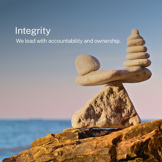
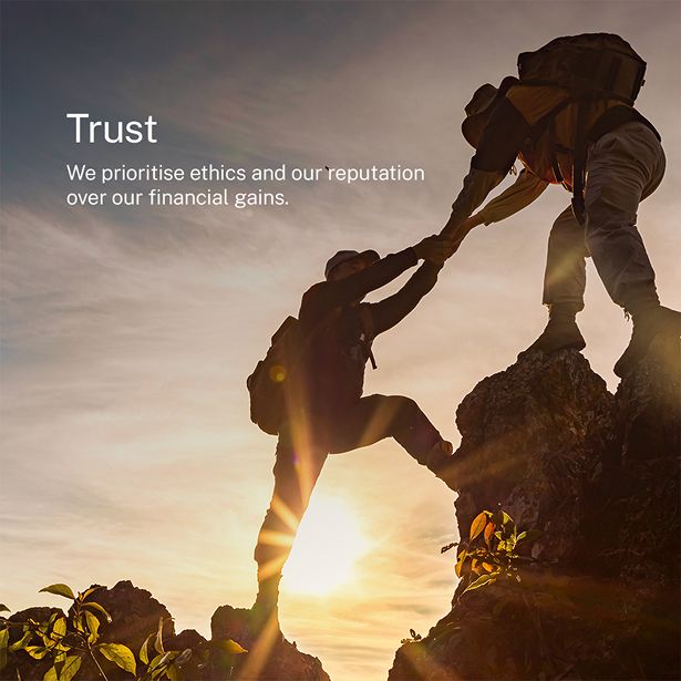
A clean, minimalist design language is paired with a carefully curated mix of human-centric and nature-led imagery. This balance softens the perception of financial services while reinforcing trust and approachability.
The platform is built to stay dynamic and relevant, with frequent updates across reports, newsletters, and market insights. Regulatory and compliance information is easy to access to ensure transparency.
Imagery that breaks through the clutter


Icons that carry meaning
Thin lines, coral accents, and forms built around what each value actually says. Each icon was crafted to carry its own meaning at a glance, so the content around it lands faster and stays longer.
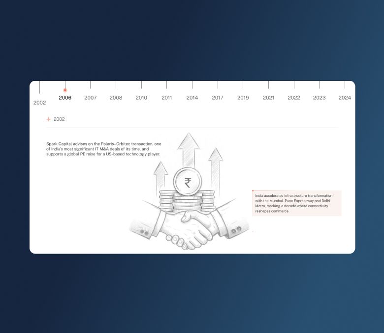
Growth, drawn by hand
The sketch treatment turns a milestone section into a story. Hand-drawn illustrations give Spark Capital's journey a crafted, archival quality, one that feels earned rather than assembled.


Like our work? Give us a little ting.
