


Designing a digital experience as honest as their ice cream
Services
Website Design & Development
Photography
Client
NIC Ice Cream
Sector
Food & Beverages
Question
In a competitive world of ice cream brands, how do you make one feel like a friend?
Answer
You start with something honest, crafted with care and made for shared moments of camaraderie
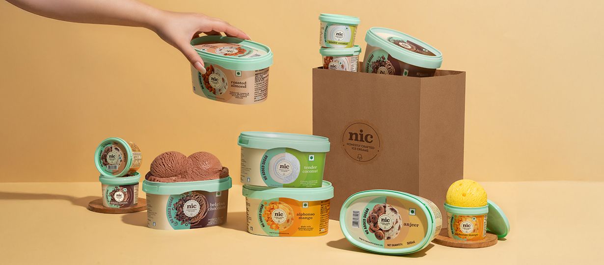
NIC Ice Cream stands for something more than indulgence. Its strength lies in the quality of its ingredients, the care in its craft, and the understanding that ice cream is more than a simple dessert. It is joy shared, recommended and revisited.
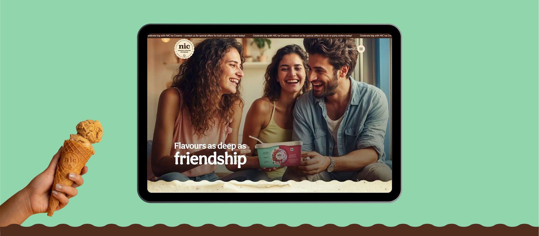
Translating this into a digital experience required measured expression. The objective was to build a space that carried the same sense of ease and authenticity people associate with the brand. The website was structured around two distinct user behaviours. Those who arrive knowing exactly what they want, and those who browse with curiosity. The information architecture and navigation were designed to serve both without compromise, ensuring that neither journey felt like a detour.
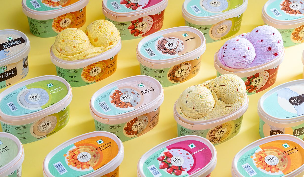
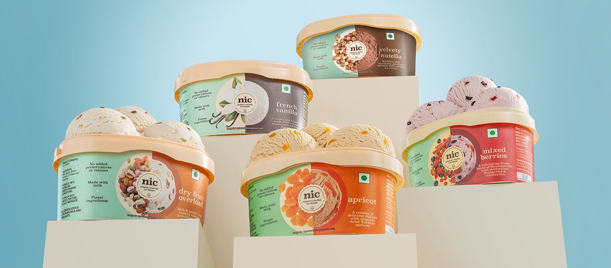
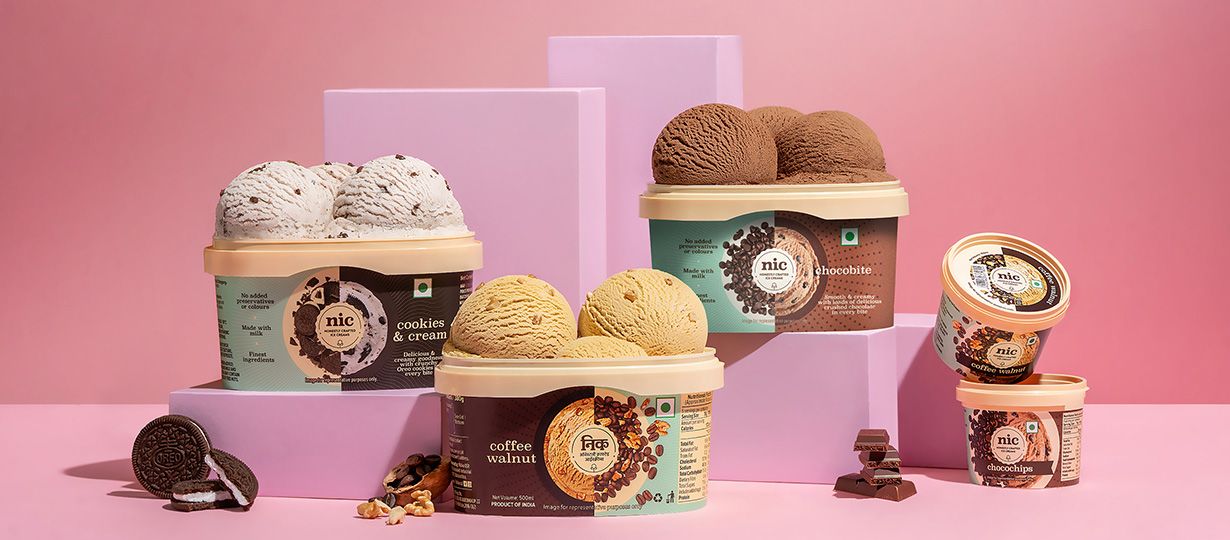
Visually, every design decision was derived from the product itself. Colour, texture, and hierarchy were all drawn from the ice cream, keeping the experience grounded in what NIC actually makes. All photography and production was handled in-house, ensuring complete alignment between the product, the brand and the final output.
Made with all heart and real ingredients
The motion across the site has the same quality as the product, easy to enjoy, impossible to ignore. GIFs that bring flavours alive, animations that carry you through, and interactions that reward every scroll.
All design elements are derived from the ice cream itself. Colours come from real ingredients. Textures reflect what you actually get. This keeps the experience immersive, and instantly recognisable.
The experience is designed for both intent and discovery. Users can quickly land on what they want, or browse flavours without losing direction, through navigation and structure that simplifies both.
The taste of it, before the taste
Related case studies
Like our work? Give us a little ting.
