


Changing the face of corporate leadership


Services
Strategy
Identity
Website Design & Development
Client
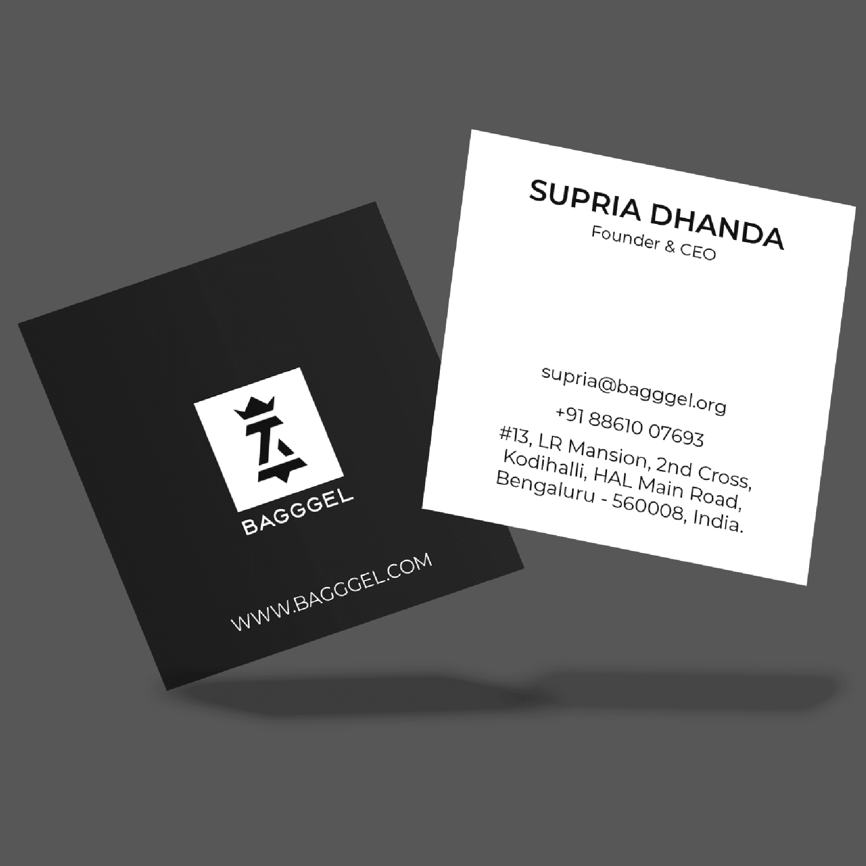
BAGGGEL
Sector
Corporate & Institutions
Question
How do you turn a brand, named after a type of bread, into a symbol of power for women in corporate leadership?
Answer
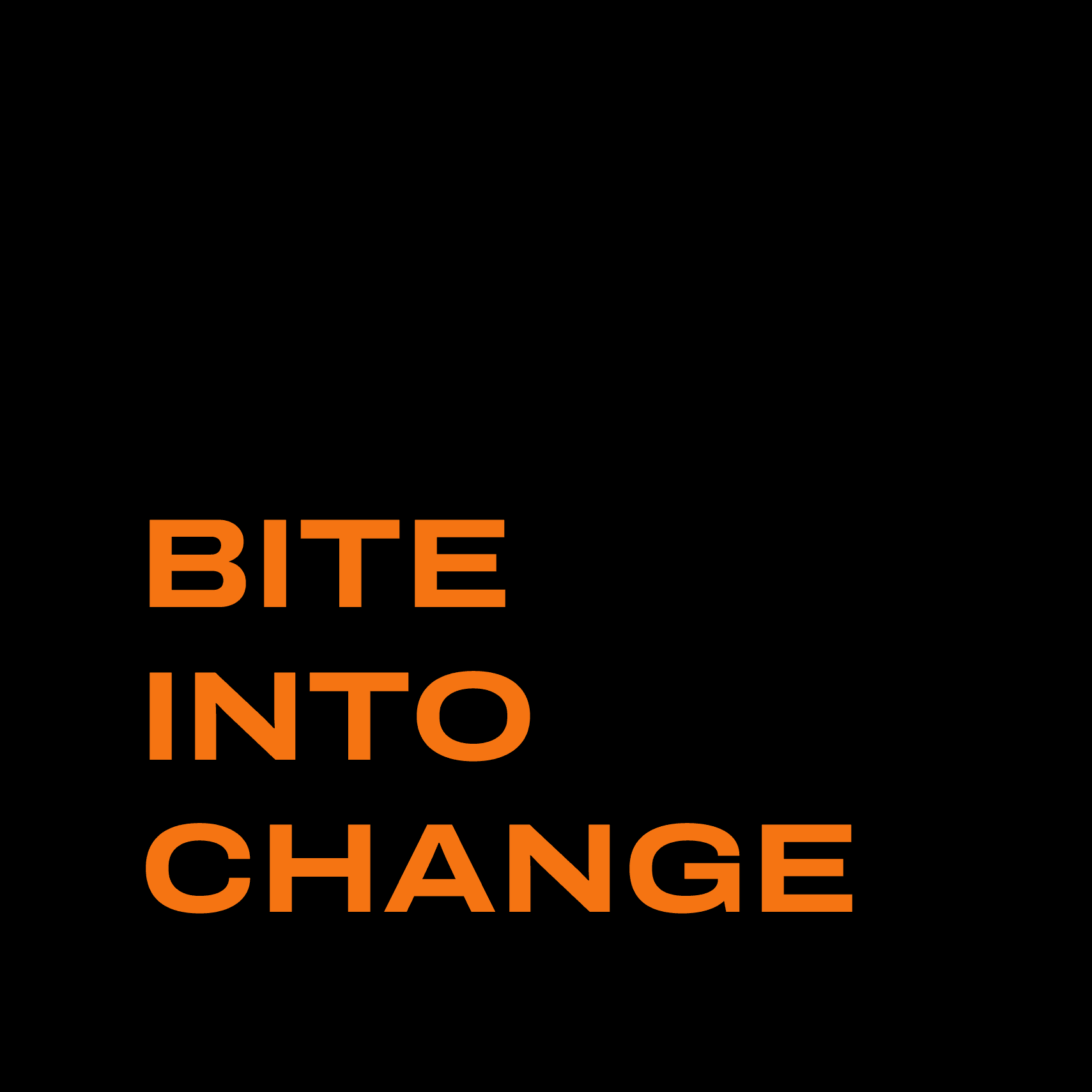
By owning the name and redefining it as a mindset, one that drives women to bite into change.
BAGGGEL is an exclusive networking platform for women in leadership positions, enabling them to excel in C-suite roles confidently. They aim to rewrite the corporate narrative where women are underrepresented, underestimated, and underpaid.
Unlike the competitors, BAGGGEL stands out with a rebellious spirit and a hunger for a balanced world. They believe in the goodness of greed when claiming what’s rightfully owed and recognise that men and women must come together, not as allies, but as partners, to tackle gender imbalances.
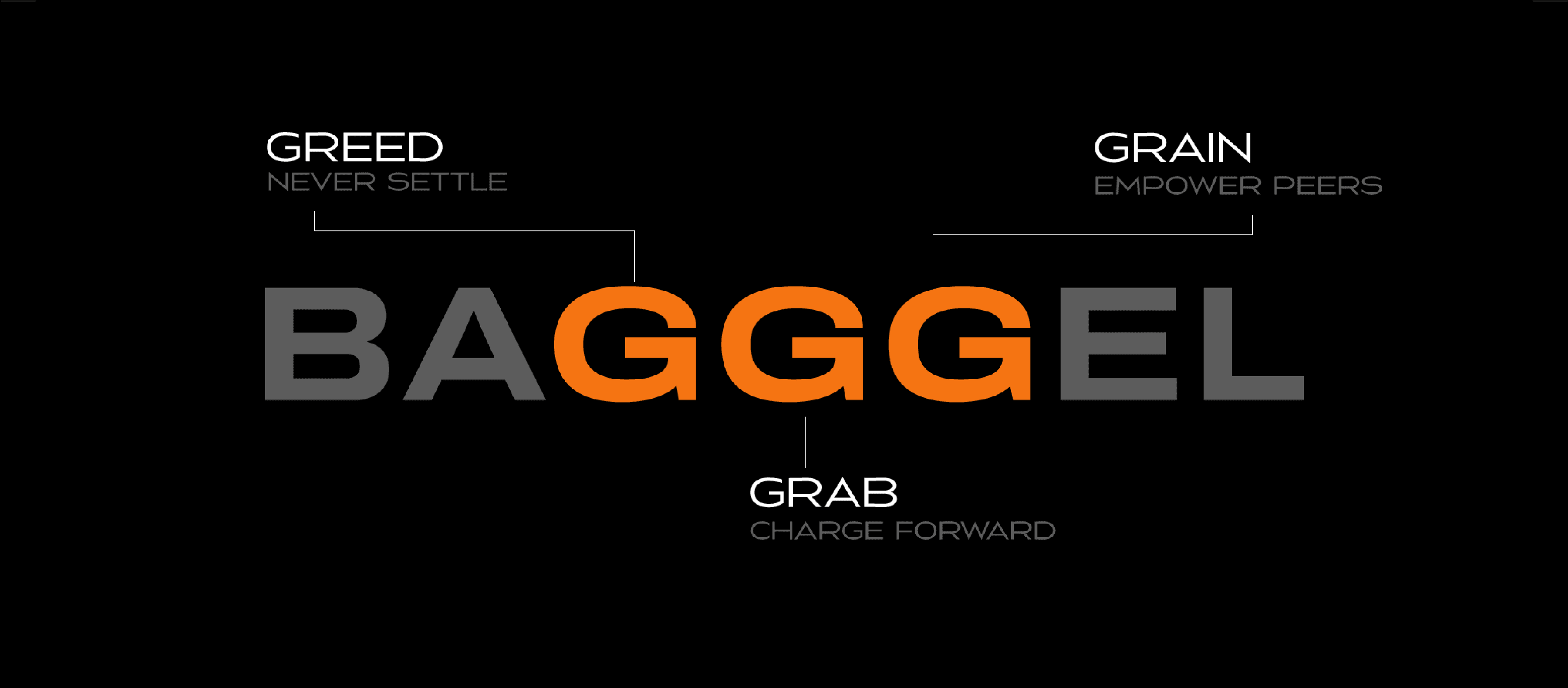
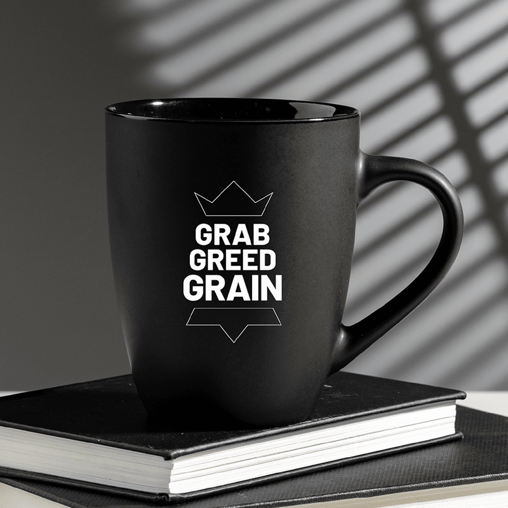
BAGGGEL had the drive, but needed the edge. The name felt irrelevant, disconnected from the world it wanted to build. The challenge was to redefine it into something that could command meaning and momentum. The strategy workshop led to the reimagination of its triple Gs as GREED, GRAB, and GRAIN. And this set the tone, personality, and direction BAGGGEL needed.
Incorporating a circle of unyielding, unflinching women, the logo emerges as the most formidable force in the game of chess, the Queen. On her toes, she balances life while battling norms. The square becomes her arena, her workspace, her community. The monochrome palette symbolises a unified effort between men and women to disrupt the corporate game.


A web of unapologetic women
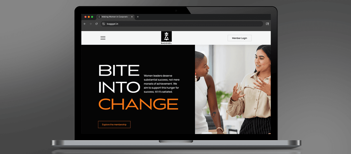
Designed a focused user journey for women in leadership and the CXO pipeline, ensuring clarity in who the platform is for and how they navigate it.
Built a minimal, clutter-free layout that keeps the focus on what matters, with clear sections and an intuitive reading flow.
Ensured a consistent and accessible experience across devices, allowing users to engage, connect, and learn on the go.

Like our work? Give us a little ting.
