














Crafting India’s presence at La Biennale di Venezia

Services
Brand Identity & Design System
Website Design & Development
Client
Ministry of Culture, Nita Mukesh Ambani Cultural Centre, Serendipity Arts
Sector
Arts, Culture & Community
Question
How do you translate a layered Pavilion vision and multiple artistic expressions into a cohesive, contemporary visual language with global resonance?
Answer
By weaving the curatorial themes into a restrained yet evocative design system rooted in abstraction and materiality rather than overt symbolism.
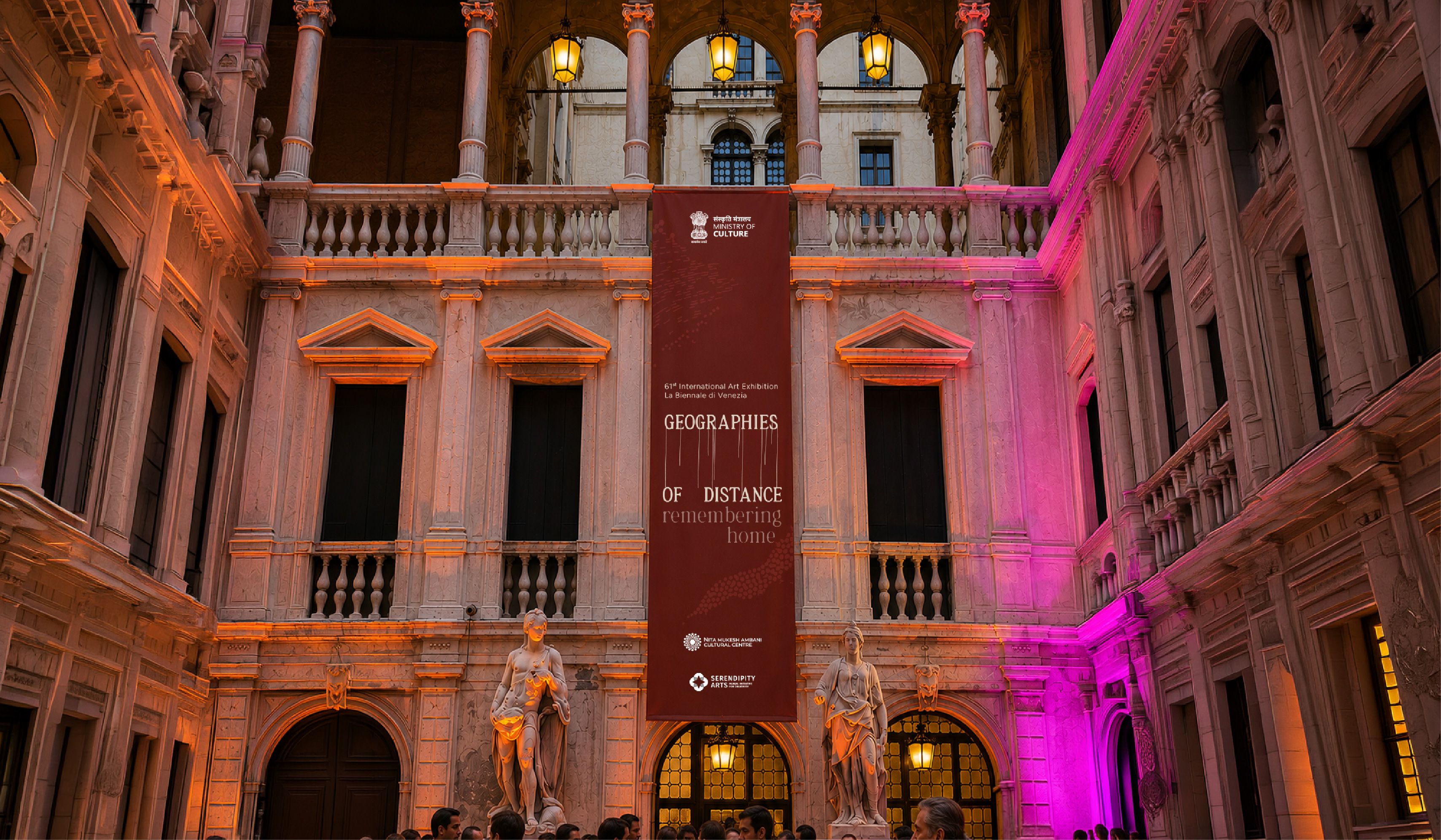
Across the canals, courtyards, and stone warehouses of Venice, India reappears at La Biennale di Venezia for the 3rd time, marking a significant moment on one of the world’s most prestigious stages for contemporary arts.
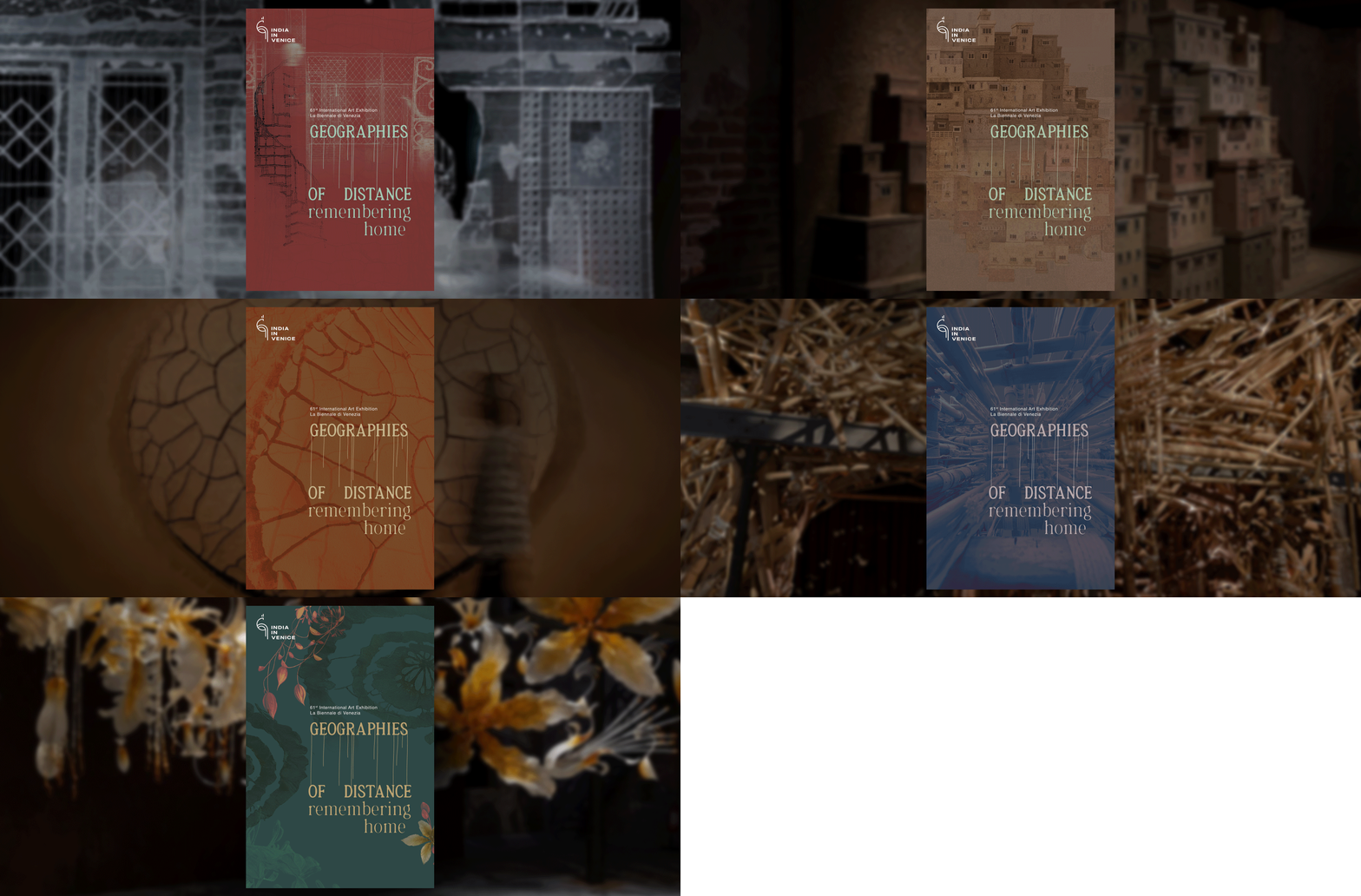
Curated by Dr. Amin Jaffer, the India Pavilion, themed “Geographies of Distance: remembering home”, brings together five artists - Alwar Balasubramaniam, Sumakshi Singh, Ranjani Shettar, Skarma Sonam Tashi and Asim Waqif - in a shared inquiry into home in the midst of India’s accelerated change.
At its core, “Geographies of Distance: remembering home” is based on the understanding that home is not always the place where we live today. Sometimes it is the place where we once lived, a place that we reconstruct through memory and feeling.
We were brought in as branding partners to translate this layered theme into a visual language that felt contemporary rather than nostalgic. The challenge lay in capturing diverse artistic expressions within a singular yet flexible identity system that reflected a more progressive image of India.
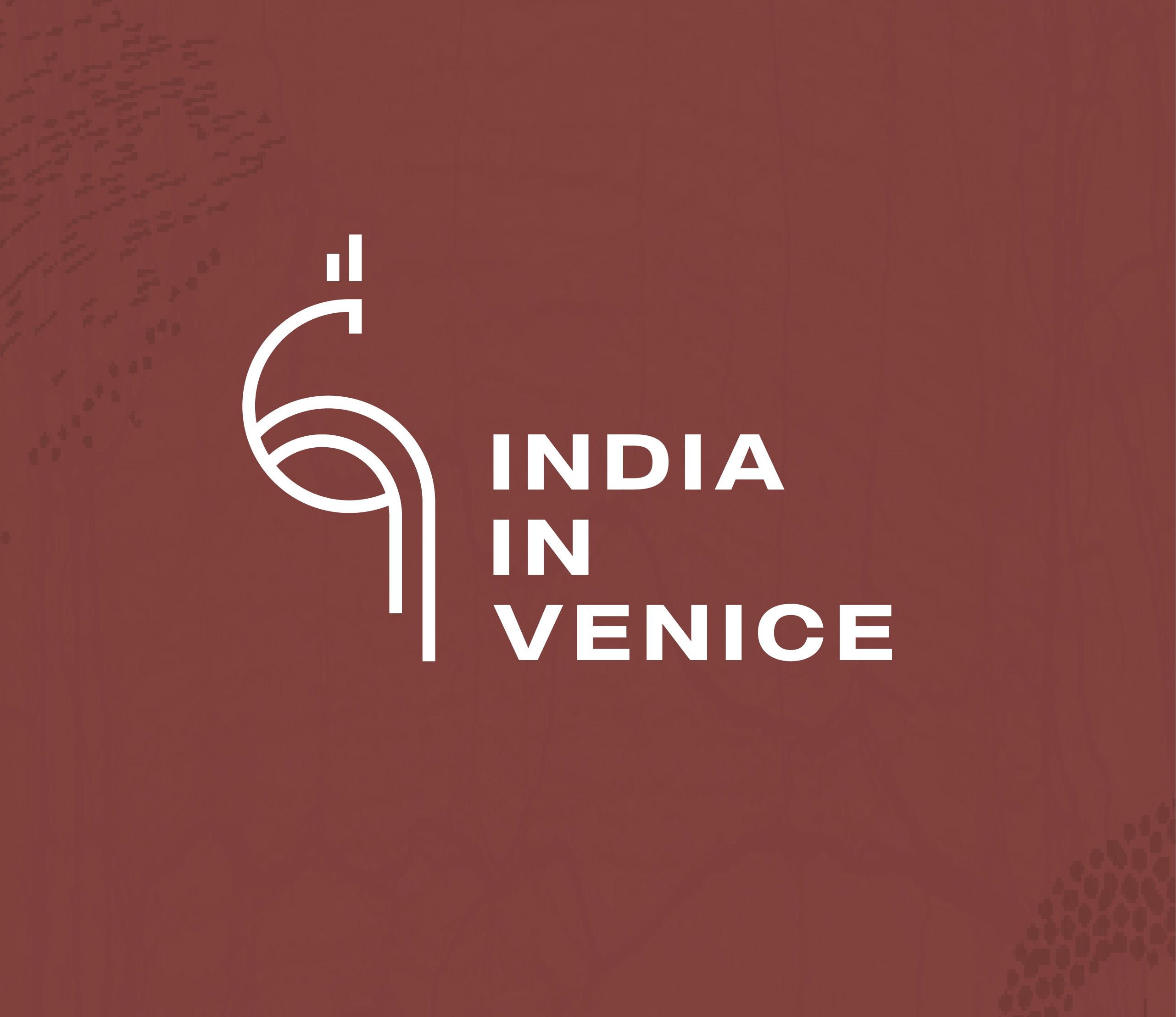
The emblem representing India in Venice
Reinterpreting the peacock through a minimal linear construct, transforming a familiar cultural symbol into a contemporary emblem. Rather than depicting the bird literally, the identity captures its posture, flow, and elegance.
An identity shaped by strands
The earthy red palette evokes warmth and belonging. Thread-like lines from “Geographies” stretch the word across space, expressing distance as tension and pull. The phrase “remembering home” is lighter and blurred, mirroring the way memories fade and lose clarity.
I am both a guest and an heir. Both a stranger and a child of the land. So, I trace back to the roots to ask, what it settled into the soil, and scattered into the wind.
Bringing the vision to life

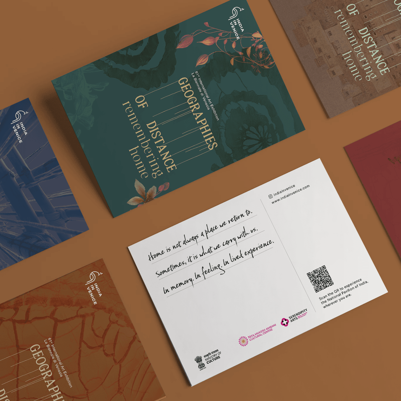
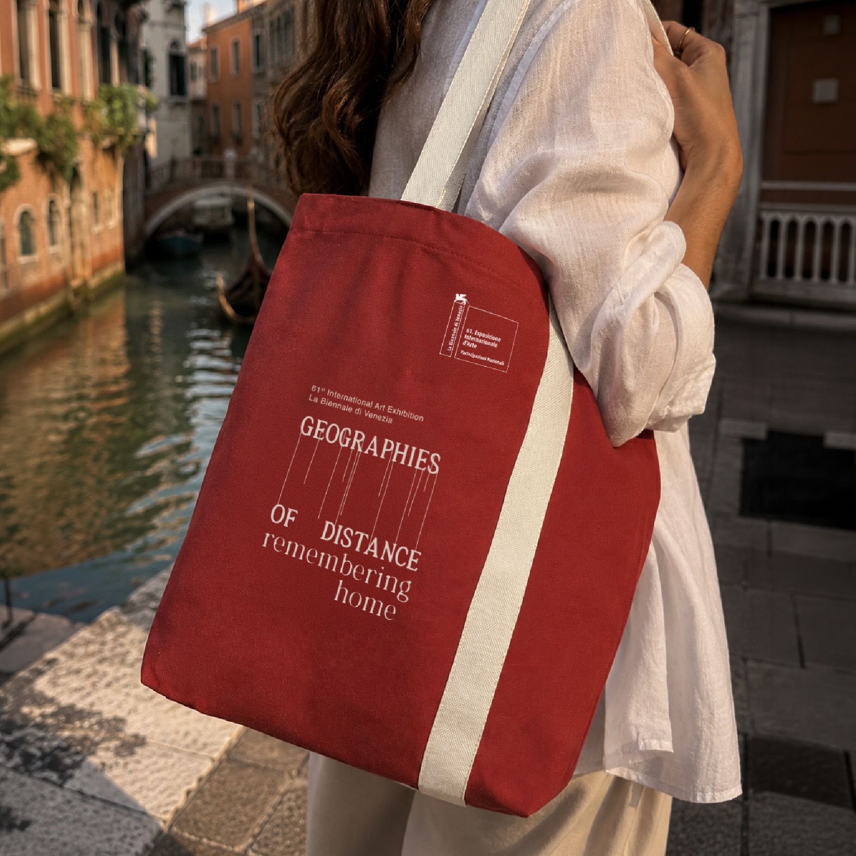
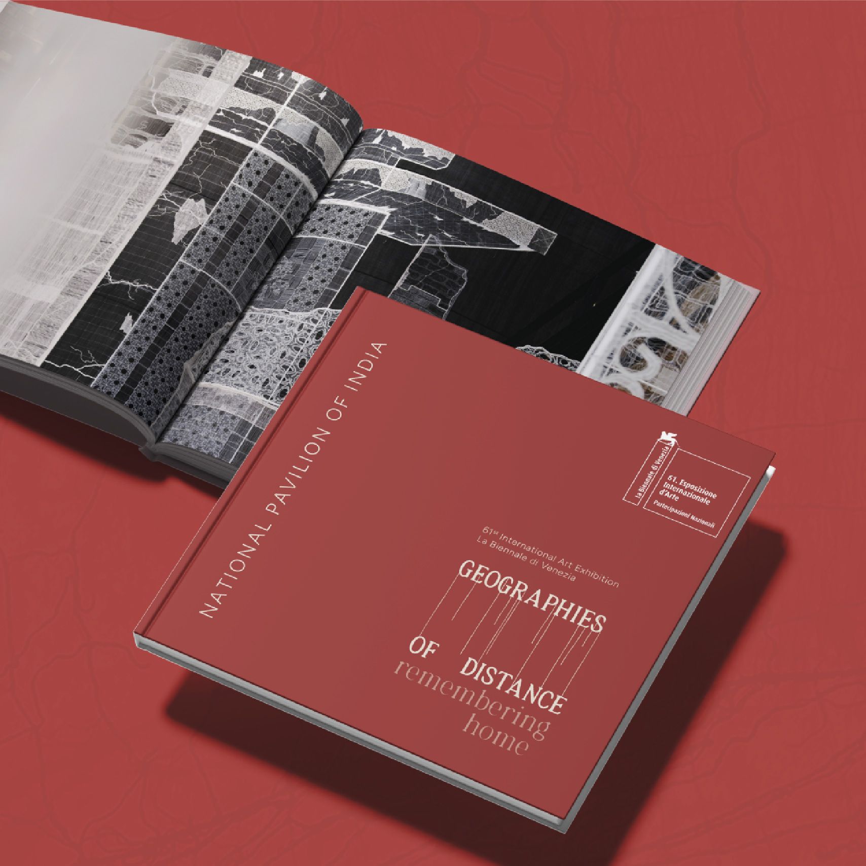

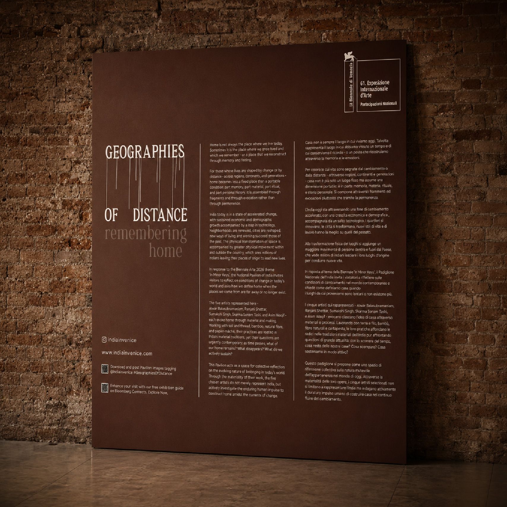
Home is not always a place we return to.
Sometimes, it is what we carry with us.
In memory. In feeling. In lived experiences.
Immersive storytelling, cinematic visuals, elegant typography, micro-animations, and generous whitespace transform the digital experience into an extension of the Pavilion itself.
Built on a modular Next.js framework, the site is fully responsive and performance-optimised, with scalable architecture, smooth interactions, and real-time integrations.
Layered layouts, motion transitions, lazy loading, media optimisation, and live Instagram feed integration ensure an engaging yet high-performance experience.


Like our work? Give us a little ting.