














Taking a banana chip from ZERO to HERO!
Services
Strategy
Packaging
Client
Beyond Snack
Sector
Consumer & Retail
Question
How do you make consumers notice what isn’t inside their snack pack?
Answer
By creating a memorable ZERO-first design system that strips away everything that distracts from it.
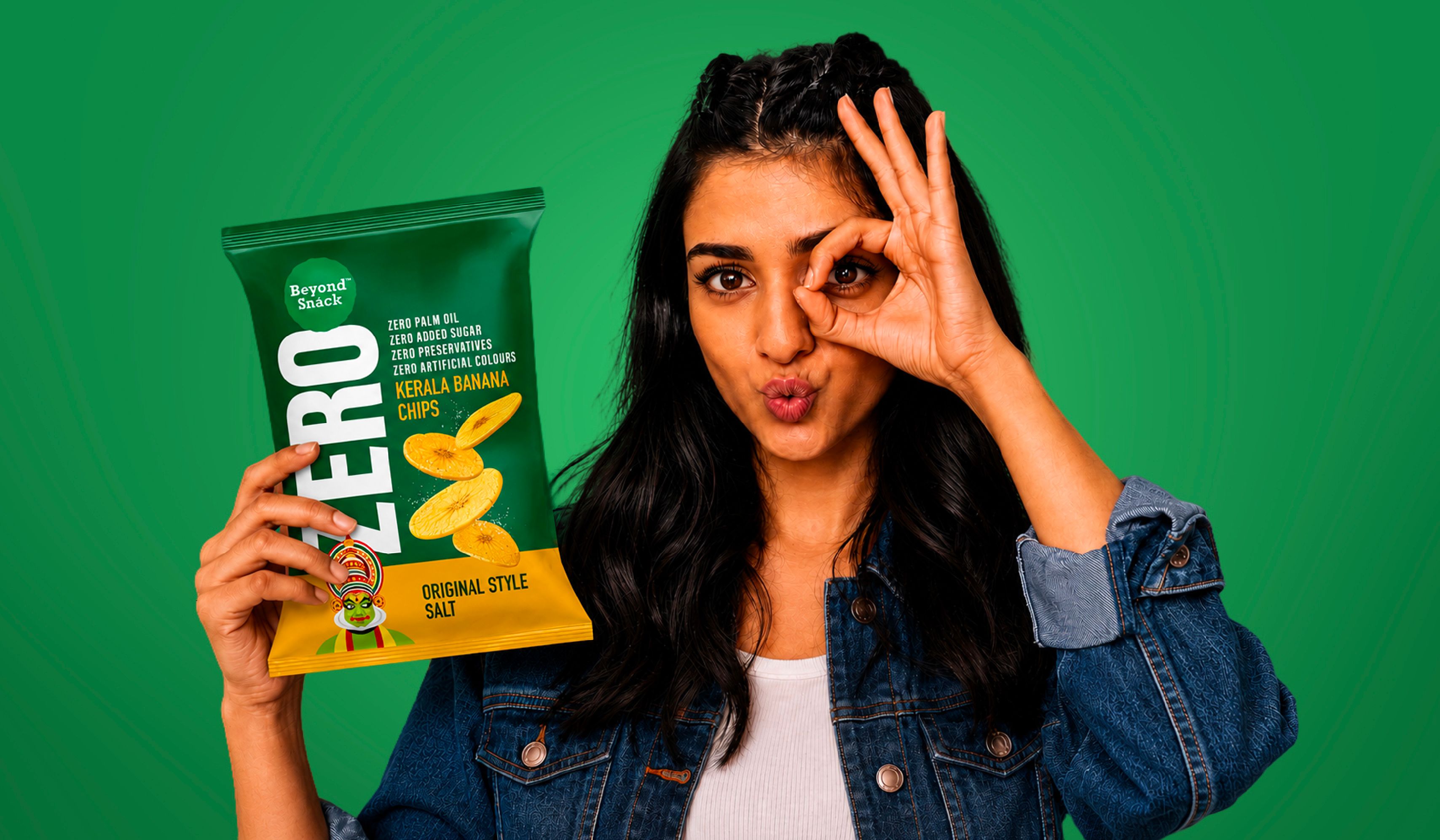
From the heart of Kerala comes Beyond Snack, bringing the region’s beloved Nendran banana chips into homes across India. After winning hearts on Shark Tank India, the brand set out to launch Beyond Snack Zero, a clean-label range with zero palm oil, zero preservatives, zero artificial colours, and zero added sugar, while maintaining the iconic crunch and flavour.
Our task was to make the Zero promise impossible to miss on the pack.
We began by exploring how the “Zero” proposition had been built across categories, conducting Q-commerce and in-store shelf audits to understand what shoppers are accustomed to, which cues command attention, and where the category left room for differentiation. Our study revealed that while “Zero” has become a dominant callout in beverages, it remains largely untapped in the snack aisle. Most snack brands scatter clean-label claims across the pack through multiple icons, badges and callouts. The result is visual clutter, familiar layouts and no single idea to own. Beverage brands, by contrast, let “Zero” take the spotlight, and nothing else.
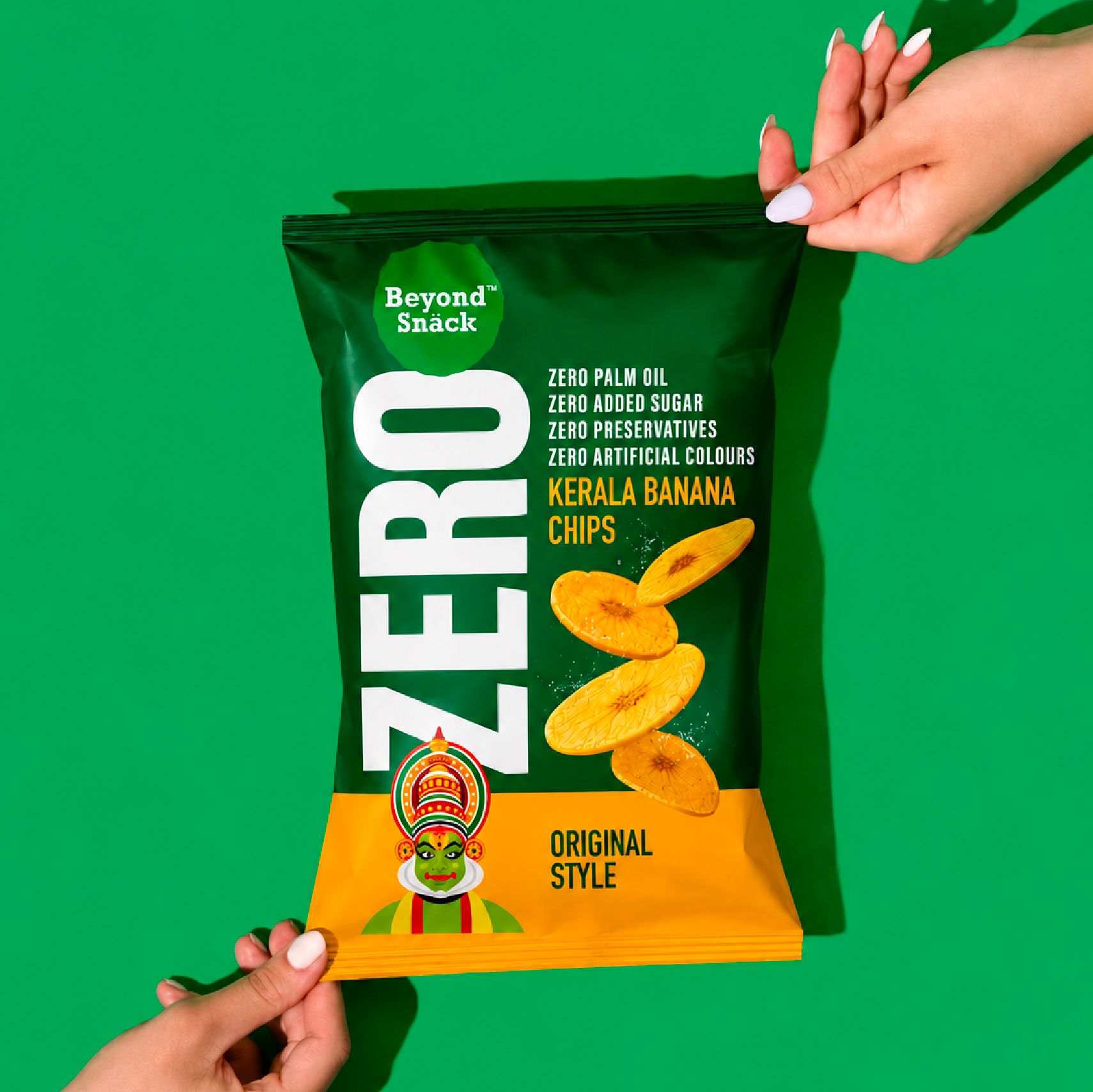
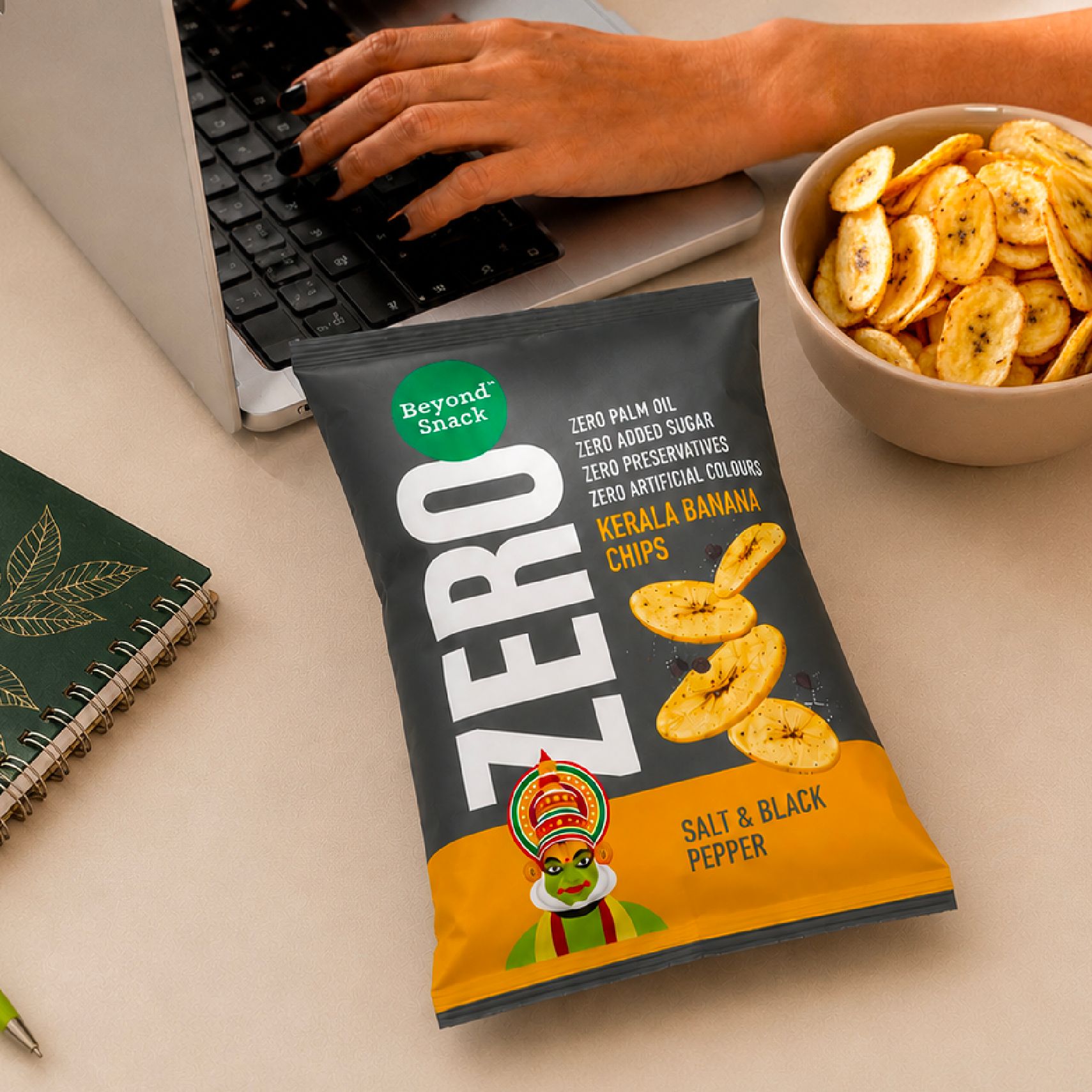
Our strategic move was to treat “Zero” as the organising principle of the packaging design. Instead of reducing the promise to a series of tiny icons, we stripped the design back and let typography do the talking. The result is a pack that cuts through the clutter and makes Beyond Snack Zero instantly recognisable, both on the shelf and online.
A new angle on Zero
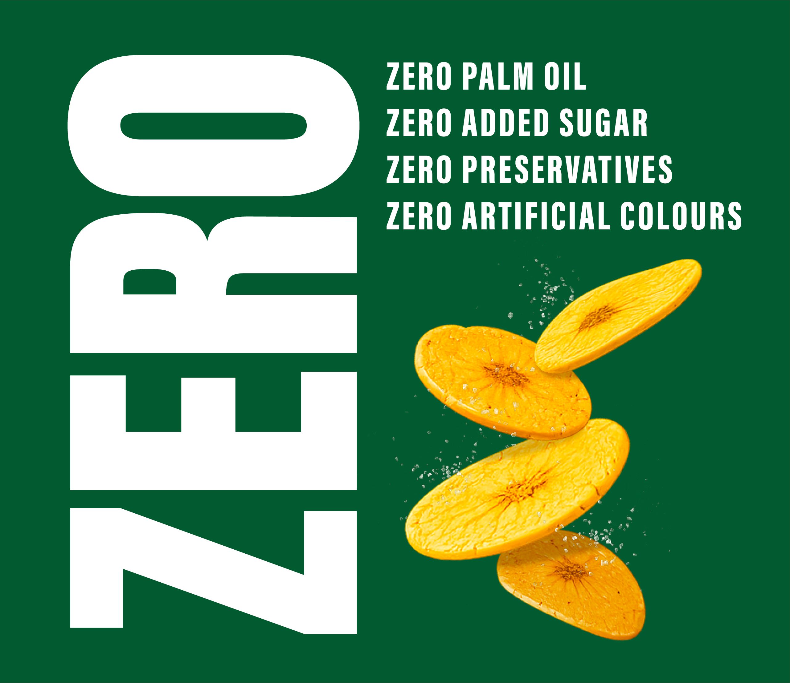
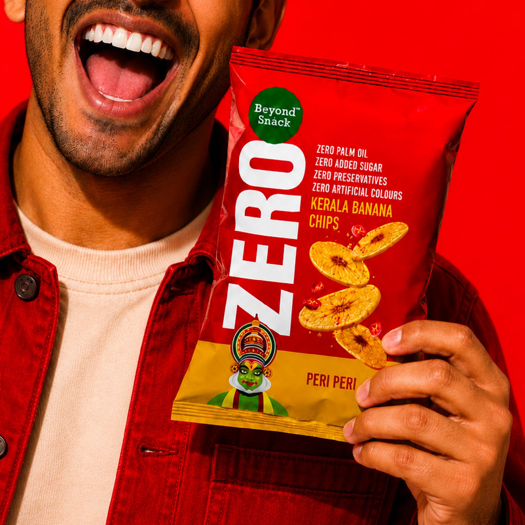
The vertical “Zero” became the anchor of the layout. An unconventional orientation for the category, it commands attention. The information hierarchy ensures every callout is clear at a glance. Everything else moved to the back, leaving the “Zero” promise front and centre.
Light on design. Big on craving.
The banana chips are arranged in an airy, layered composition that creates a sense of lightness while keeping the product irresistibly appetising.
Icon with a fresh look
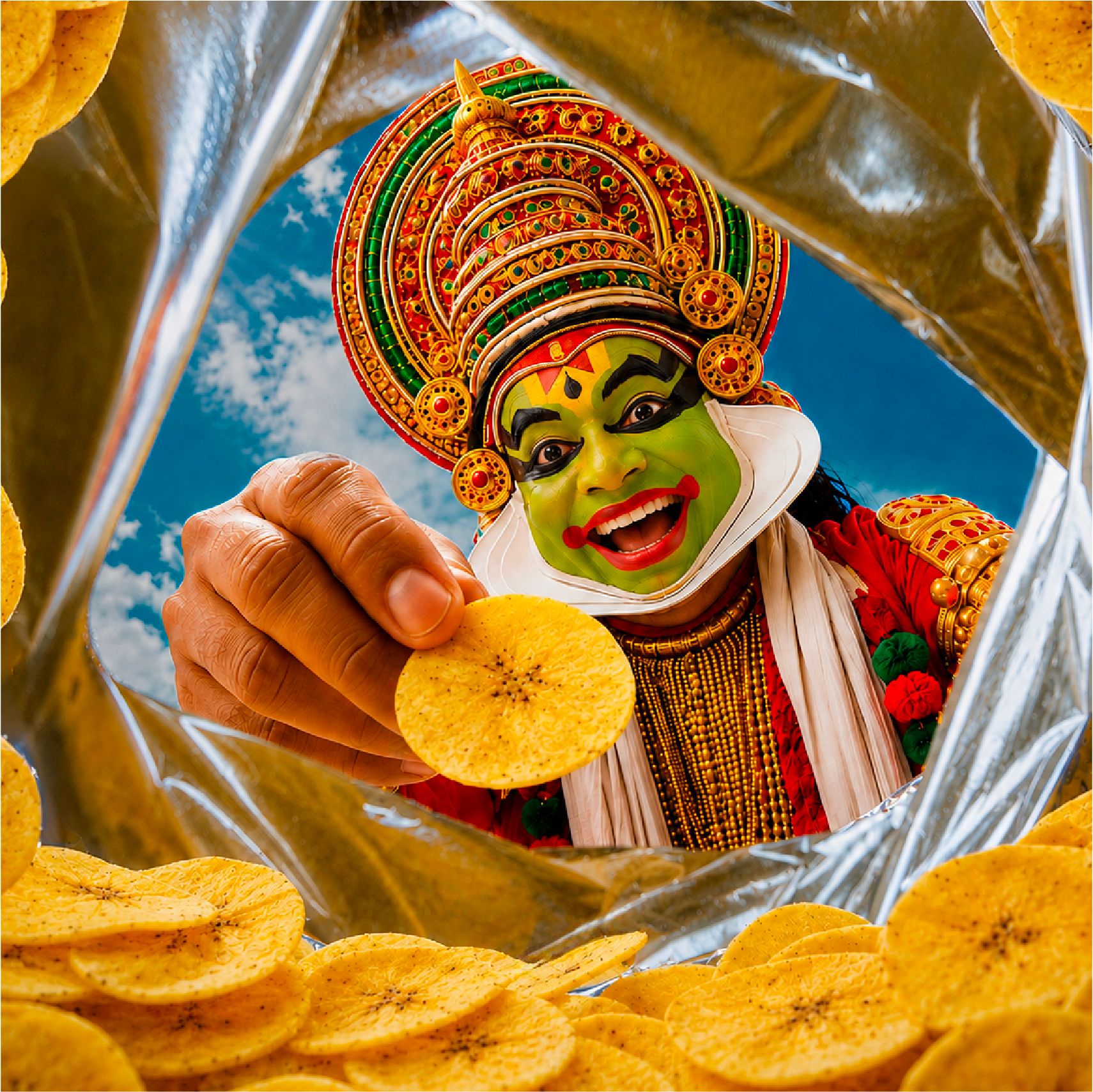
The iconic Kathakali character is reinterpreted in a contemporary illustration style, giving the pack a modern expression while honouring the brand’s heritage.
Colours true to flavours
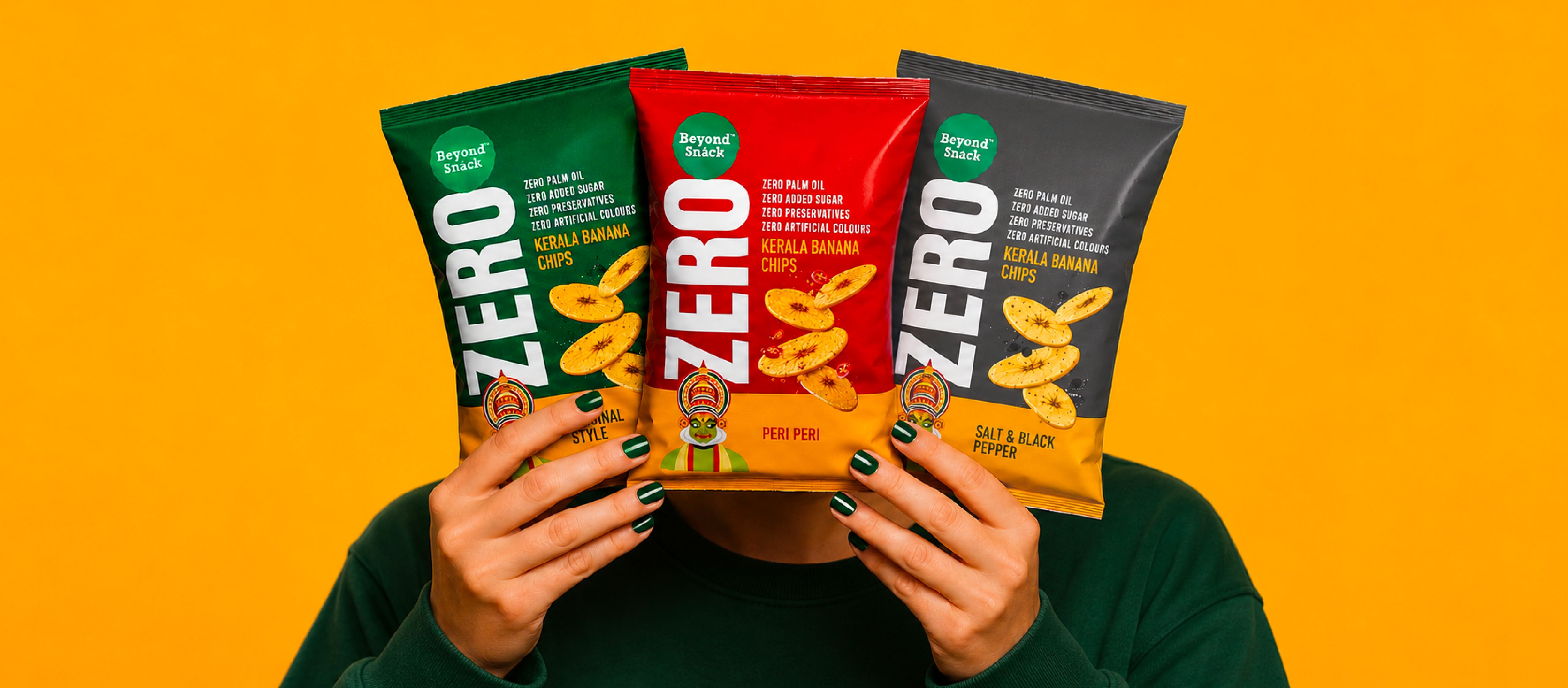
Each pack features a distinct colour inspired by its flavour. Grey represents Salt & Pepper, and Red reflects Peri Peri. The brand colour, Green, is used for the Original Style variant. Their signature Yellow forms a consistent band across every pack, unifying the range, adding vibrancy and reinforcing brand recall.
Full of nothing nasty
The Zero-first promise carries through every detail. Creating a mood that is bold enough to stand out and clear enough to be remembered.

Related case studies

Like our work? Give us a little ting.