


Turning a 100 year classic into a brand that serves comfort


Services
Strategy
Identity
Packaging
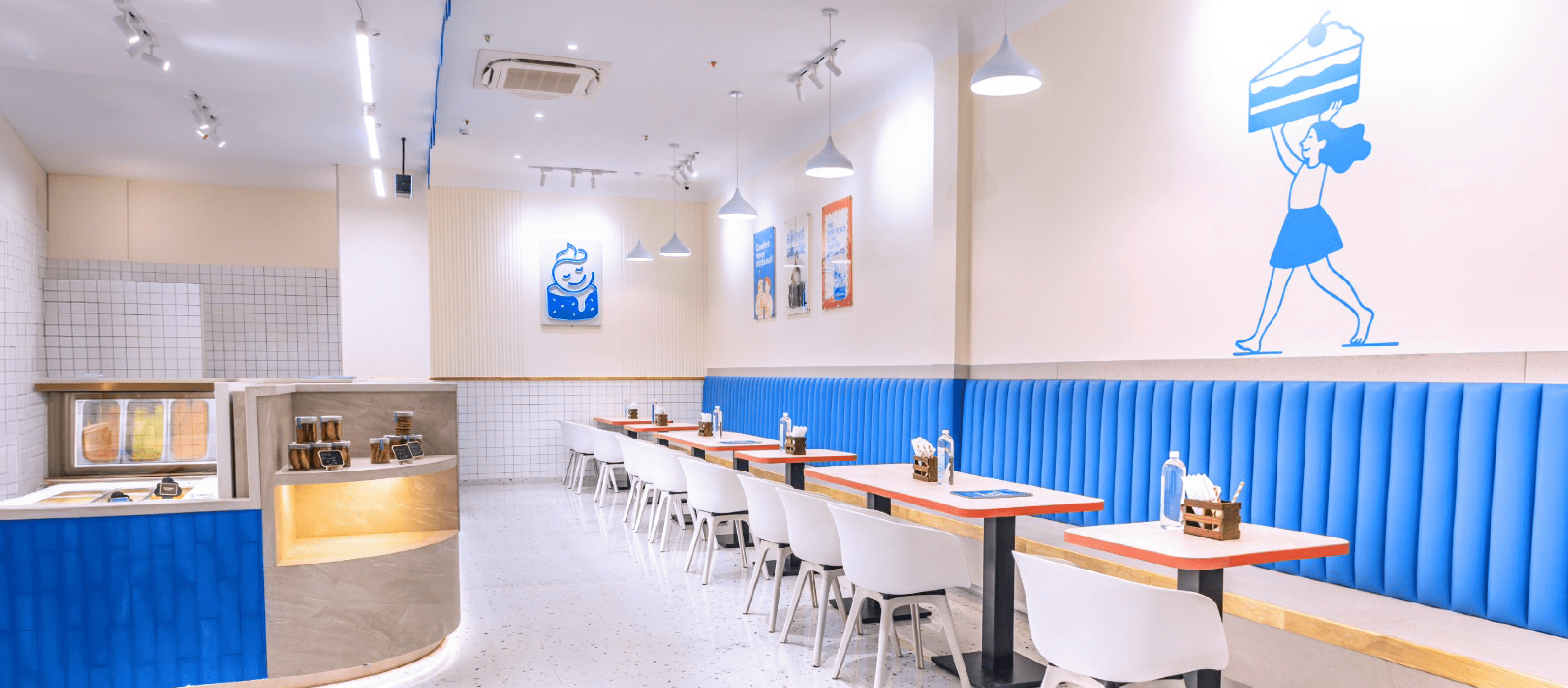
Space Branding
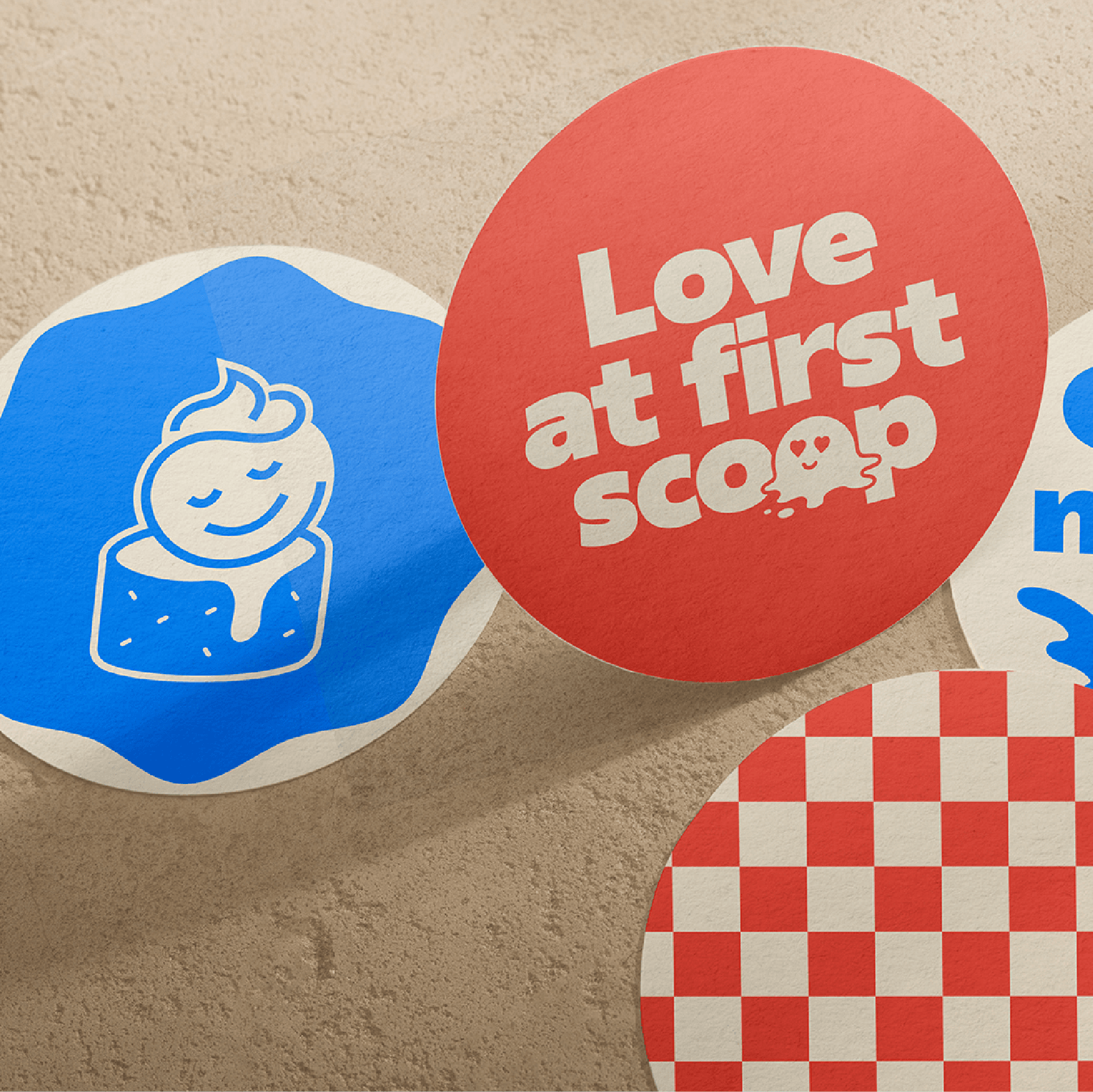
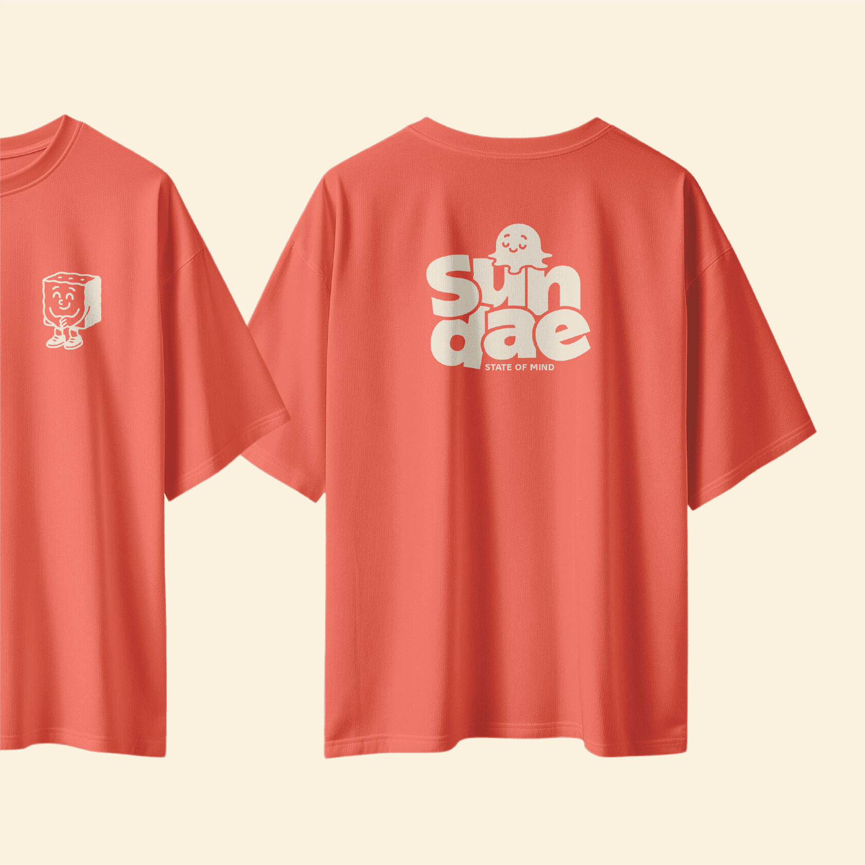
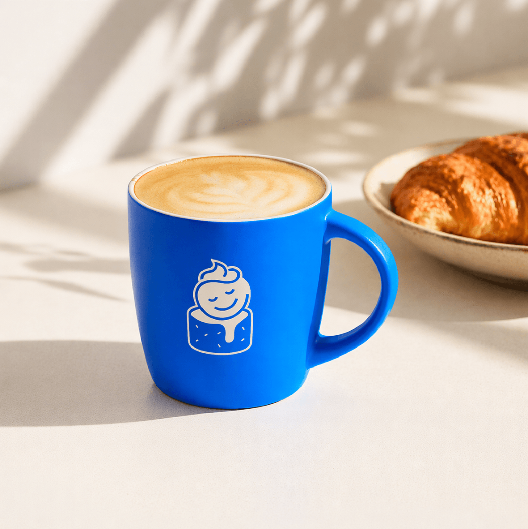
Merchandise
Collaterals
Client
Lakeview
Sector
Food & Beverages
Question
How do we transform Lakeview from a legacy dessert parlour into a culturally relevant brand in the neighbourhood?
Answer
Turning a familiar favourite into a distinct, modern, memorable and preferred destination.
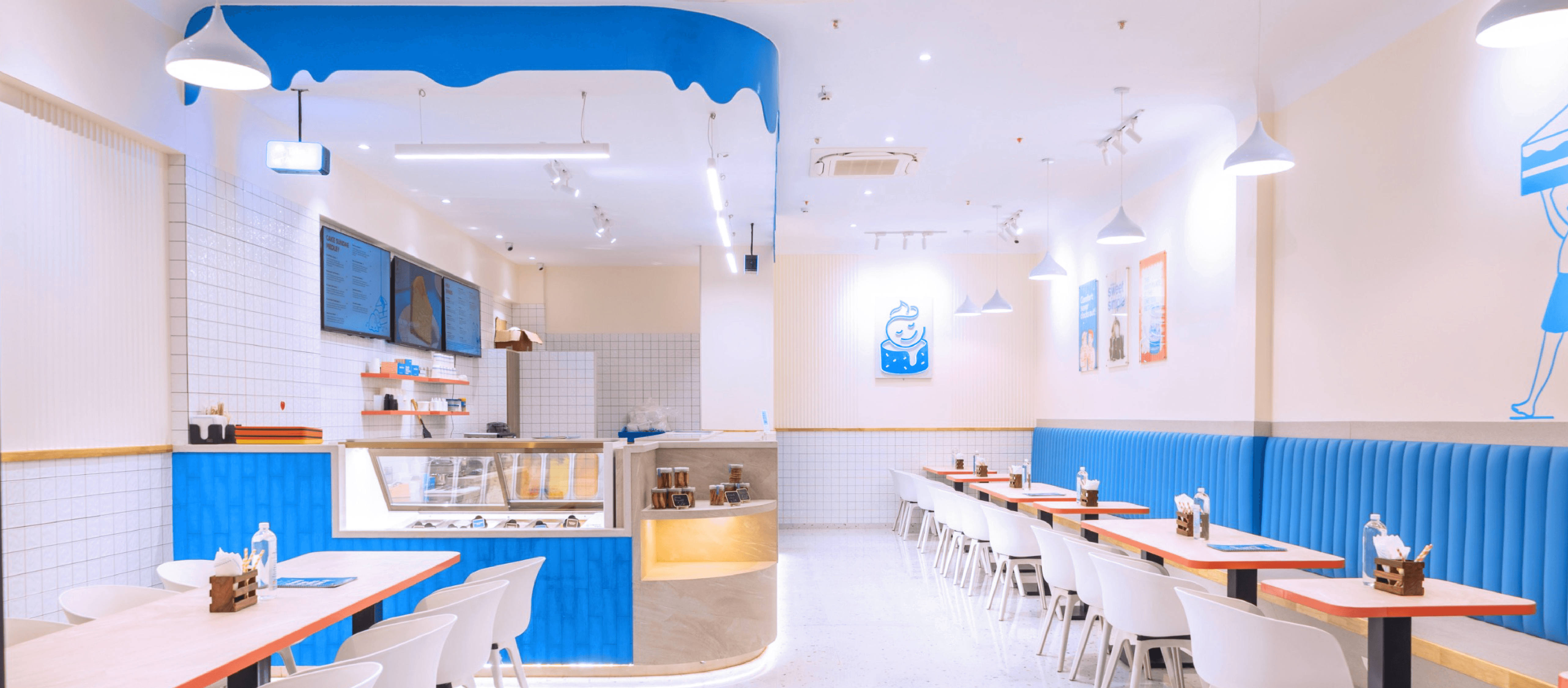
Before redefining Lakeview’s identity, we conducted an in-depth on-ground research across key locations, studying how the brand exists in real time. We mapped neighbourhood context, footfall, store visibility, perception and discovery through visual ethnography, anonymous buyer experience and in-depth staff interviews.
Across locations, Lakeview existed in high-potential environments, yet consistently blended into the background. Signage got lost in visual clutter, storefronts lacked distinctiveness, and interiors felt inconsistent. While it carried a 90+ year legacy, most consumers weren’t actively aware of it. Instead, what consistently surfaced across cohorts was familiarity, reliability, and ease.
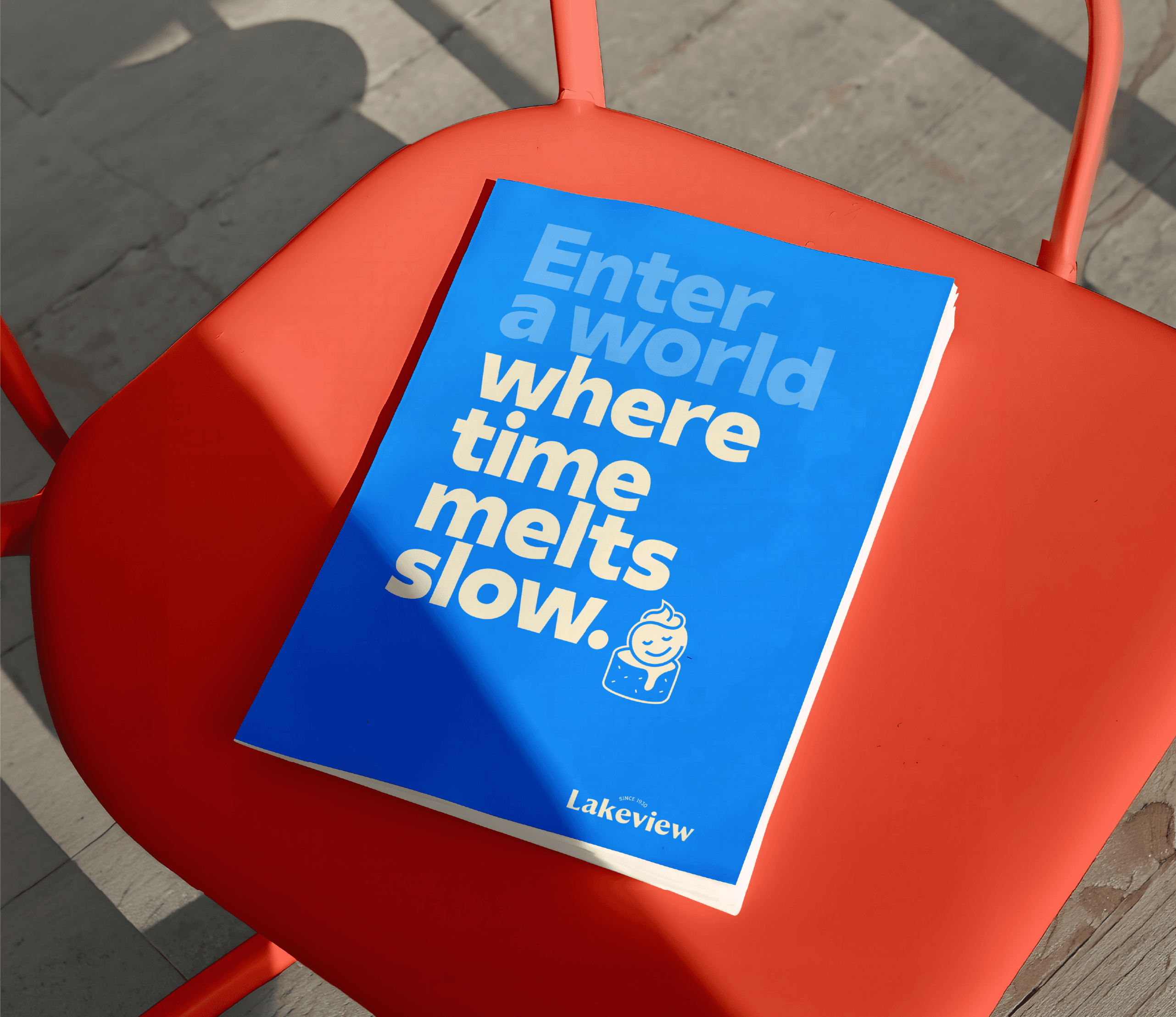
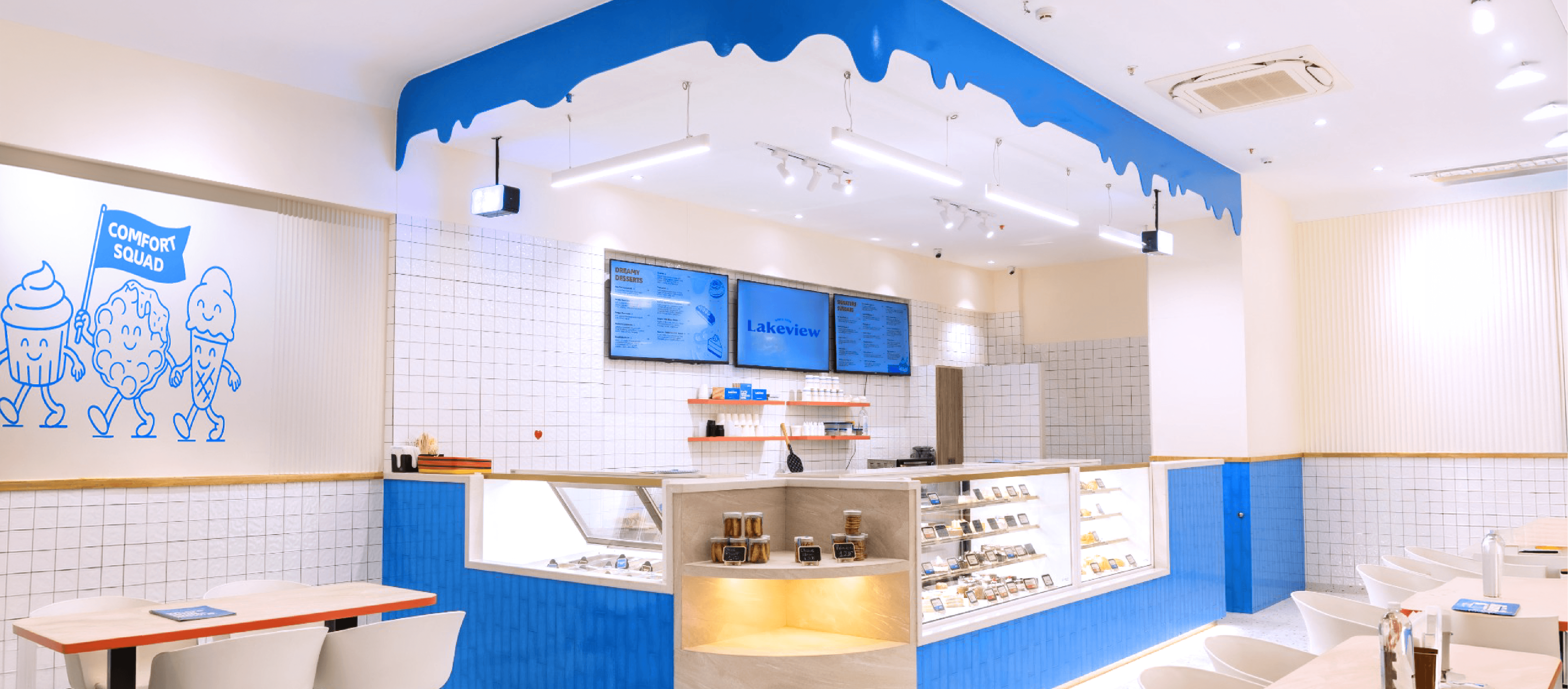
Instead of modernising the brand or preserving it as-is, we chose to codify comfort. Our strategy focused on one clear idea: Lakeview is the place people return for certainty, familiarity and small moments of joy. The identity was built as a system, not a style. Grounded in three principles: consistency, simplicity and warmth, each one directly solving a tension uncovered in the research. By translating its legacy into a symbol of comfort, we gave it a more current expression, one that feels approachable and recognisable, urban yet memorable.


A place where memories melt slow,
and comfort never clocks out.
A call to comfort
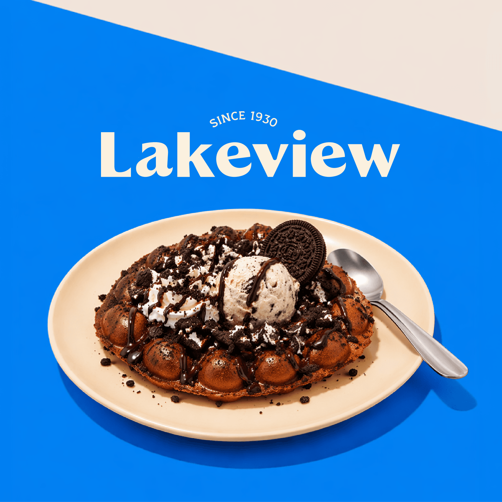
The new wordmark is rooted in familiarity, with a rounded, sans‑serif font chosen for its friendly, approachable character. The arched “Since 1930” detail adds a quiet nod to the brand’s legacy.

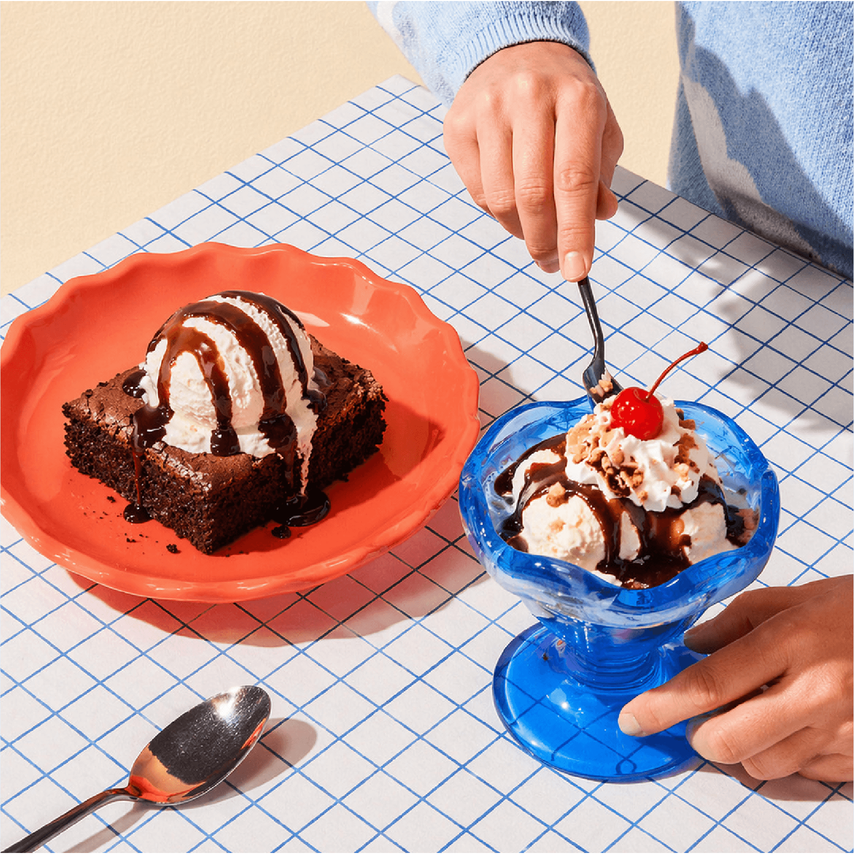
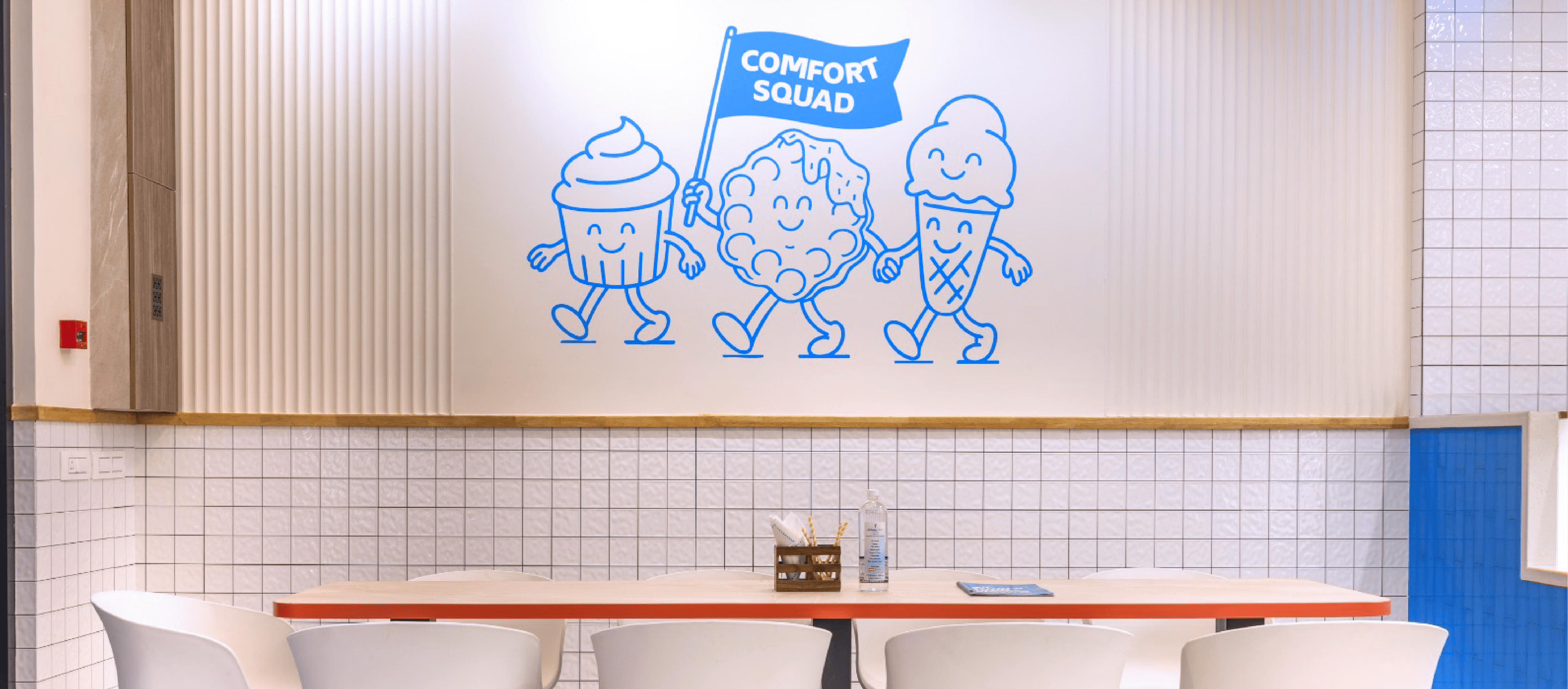
A cosy moment in time
The brandmark captures the essence of comfort, pause, and indulgence in a single, expressive icon. The relaxed, contented face nestled in a swirl of cream suggests a peaceful moment; a moment of comfort frozen in time. The drip of cream evokes deliciousness that oozes joy. Its form is deliberately open to interpretation, evoking cake, ice cream, and fudge alike, making it a warm, versatile symbol of Lakeview’s entire sweet universe. The soft blue colour palette builds immediate trust and comfort in our craft.
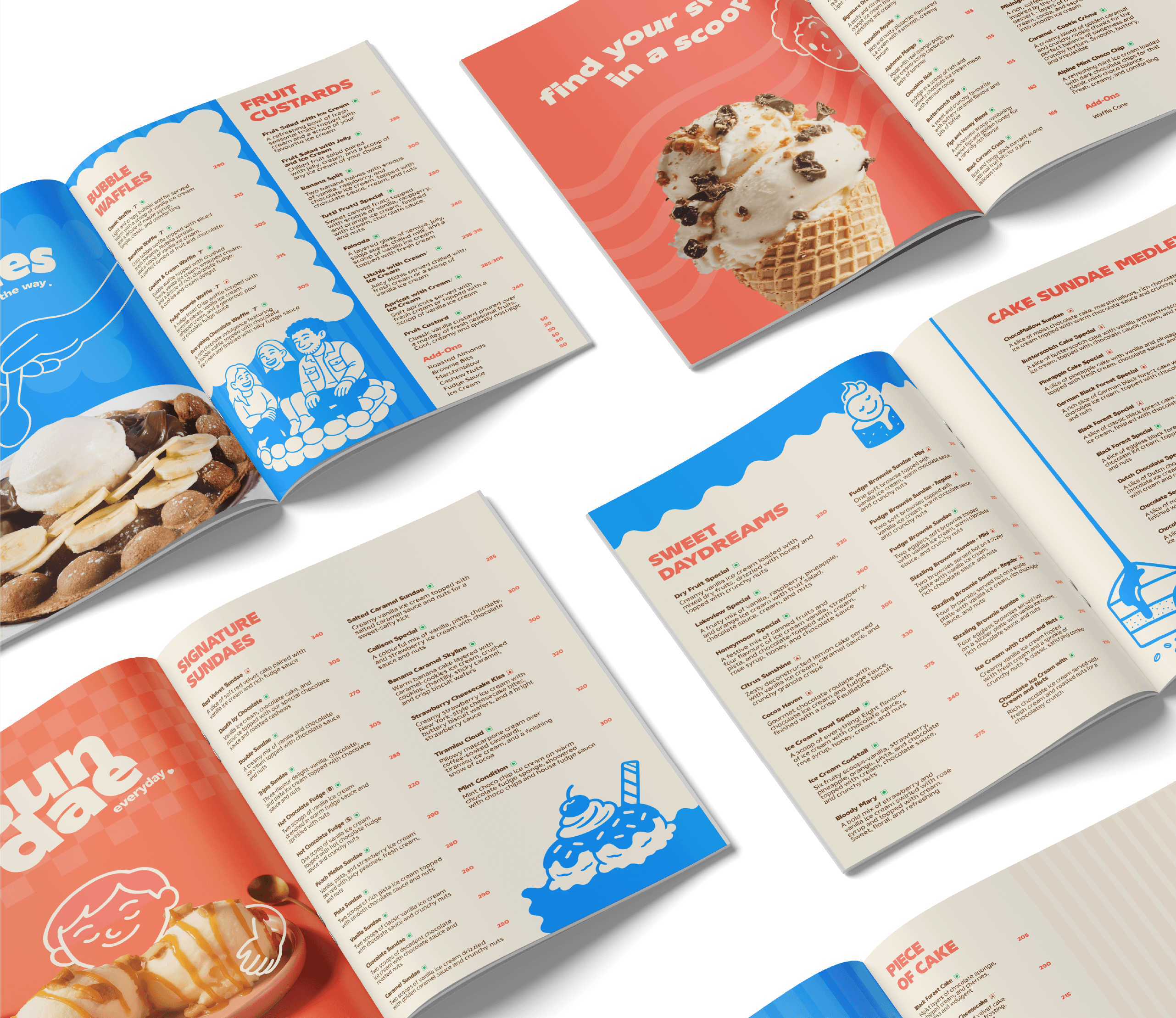
Serving decades of decadence
The menu was designed to simplify choice without losing the charm of variety. Clear hierarchy, intuitive grouping and concise descriptions guide customers effortlessly, while section breakers and thoughtful copy add warmth to the experience.
Your quiet place, with lots of sprinkles
Take away a bag full of joy
Churning out the perfect look


Related case studies
Like our work? Give us a little ting.
