














From I can to ‘I AM’, bringing a belief to life

Services
Website Design & Development
Client
I AM Group
Sector
Consumer & Retail
Question
How do you bring a belief to life through a beverage brand that transforms purity, balance, and hydration into an experience?
Answer
By creating a calm, minimal digital experience that uses fluid movement and intentional pacing to make hydration feel balanced, immersive, and elevated.
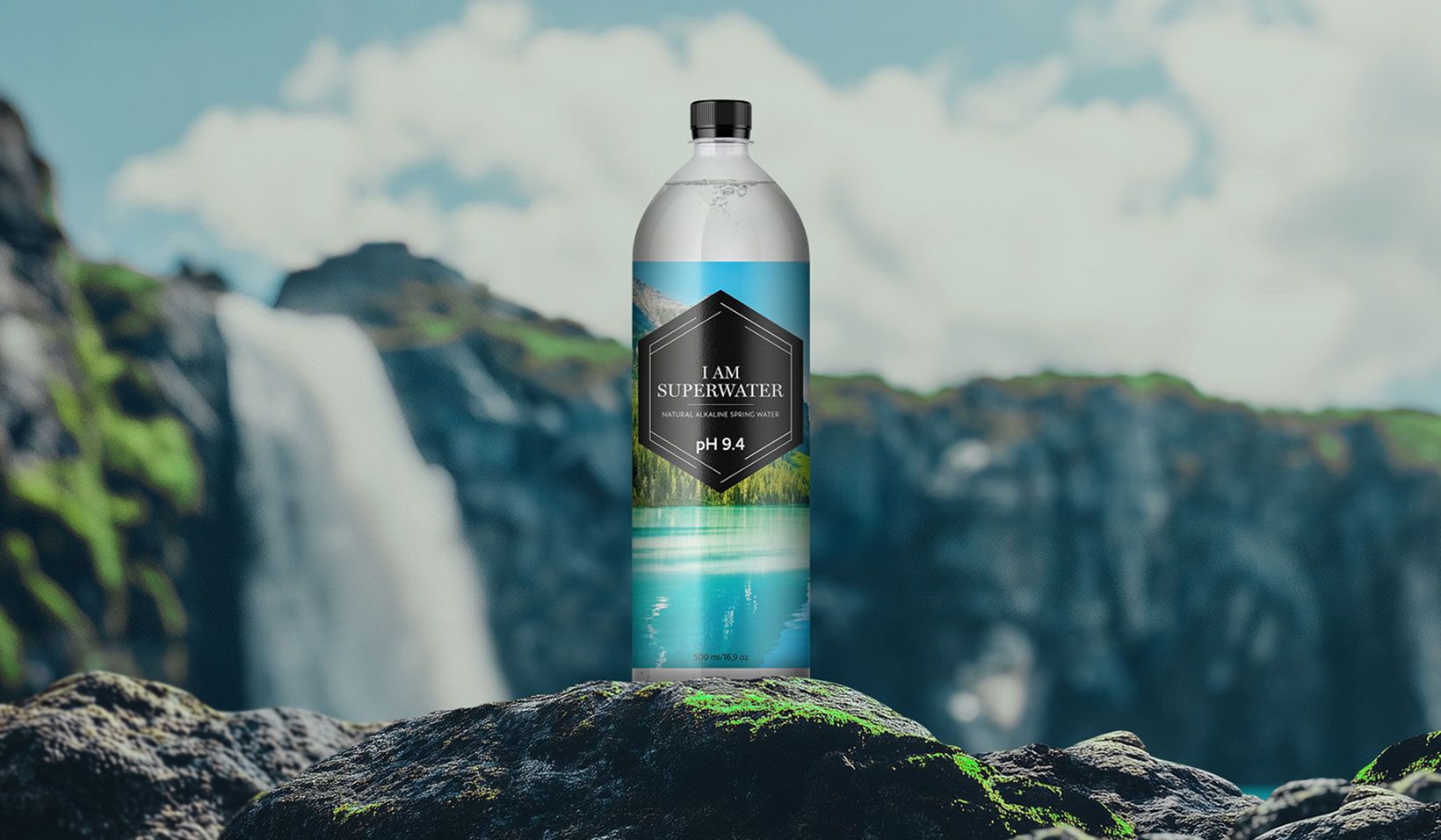
Built on the belief that every word you place after “I AM” shapes your reality, I AM Superwater transforms purity and hydration into a calm and elevated experience. Designed with restraint and clarity at its core, the website reflects the brand’s minimal and balanced approach through clean layouts, fluid transitions, and intentional pacing.
Soft movement, spacious compositions, and subtle interactions create a sense of ease throughout the journey, allowing the experience to feel immersive without excess. Every element was carefully considered to reflect the purity of the product itself, resulting in a digital experience that feels refreshing, balanced, and quietly confident.
Straight from the tropics
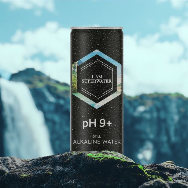
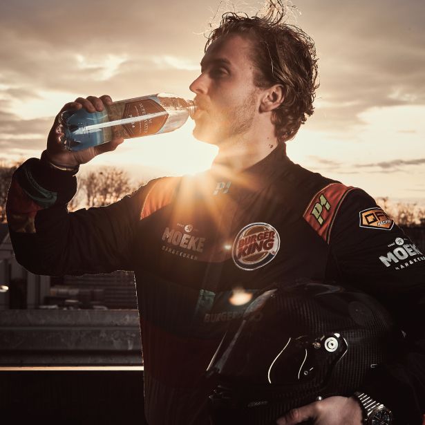
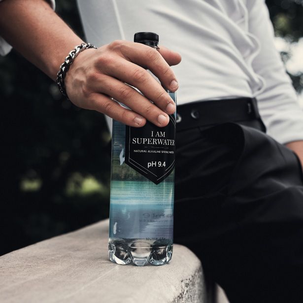
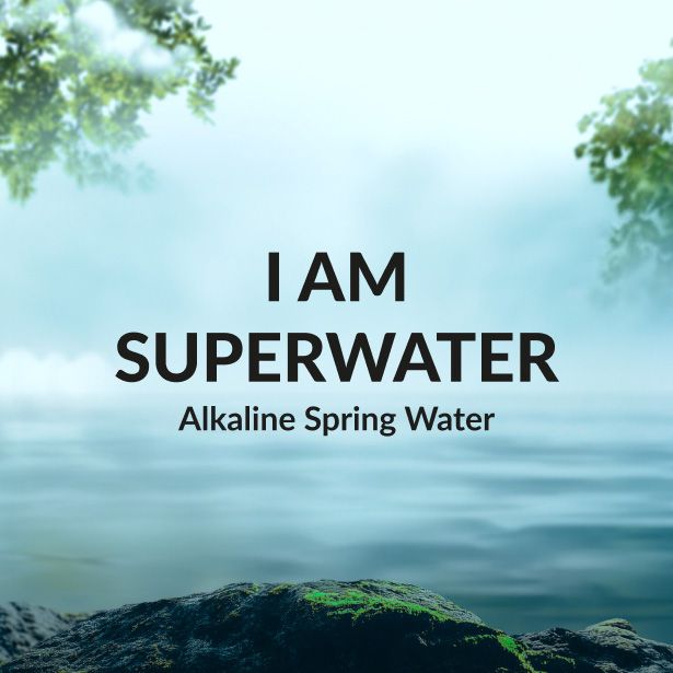
The moodboard for I AM Superwater took a minimal and refined approach to the tropical aesthetic. Soft tones, clean compositions, fluid forms, and airy visual references were used to create a sense of purity, balance, and calm.
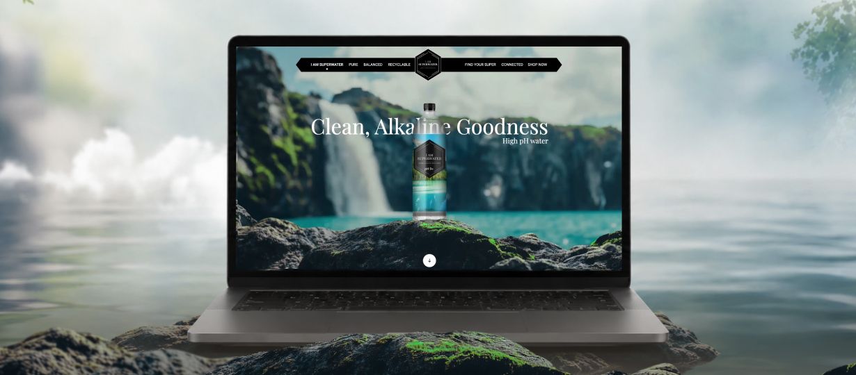
The visual language was built around simplicity, allowing clean layouts and minimal compositions to reflect the purity and honesty of the brand.
Soft gradients, flowing forms, and uninterrupted visual rhythm were used to mirror the fluid and effortless nature of the product.
Every detail was carefully considered to create a digital experience that feels light, fluid, and quietly confident, staying true to the essence of the brand.
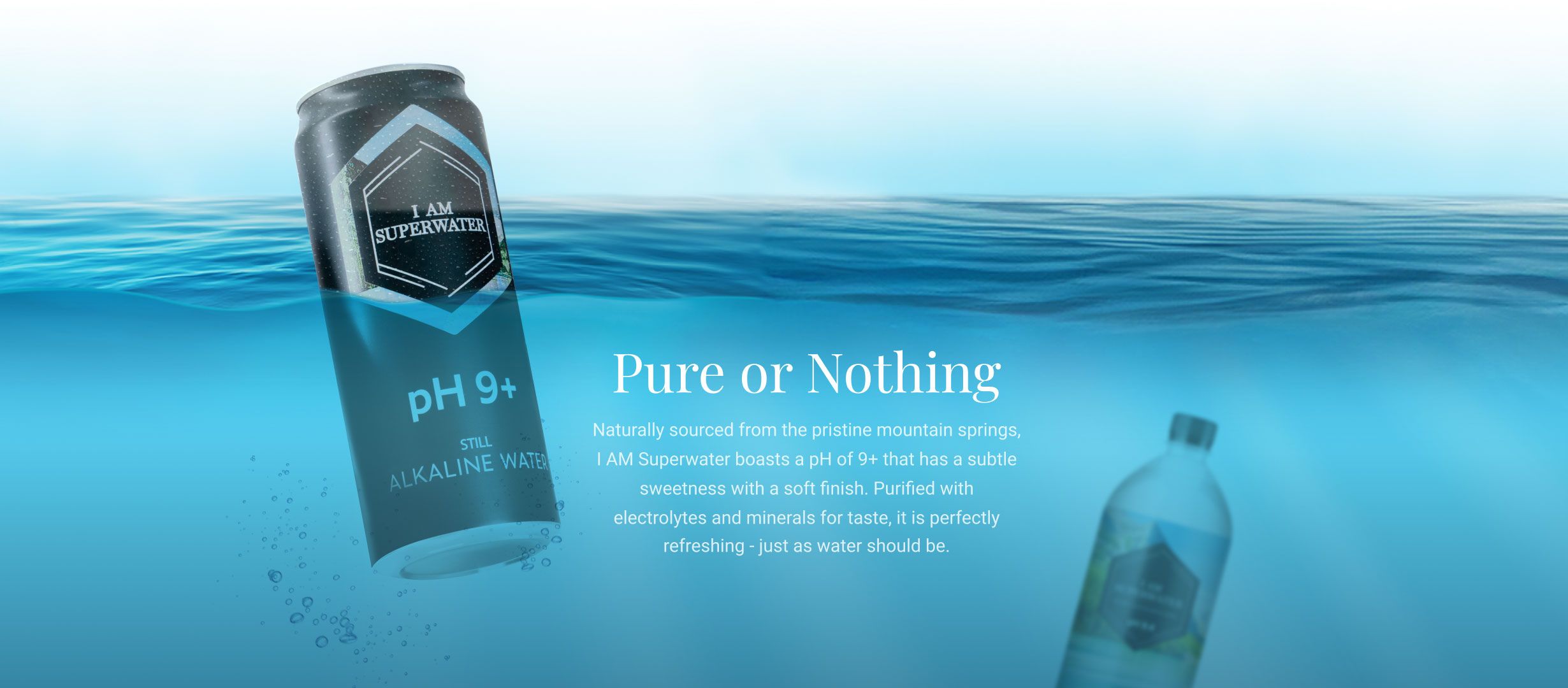
A refreshing take on web design

Related case studies




Like our work? Give us a little ting.