


Personal branding that makes hope meet action

Services
Strategy
Identity
Website Design & Development
Client
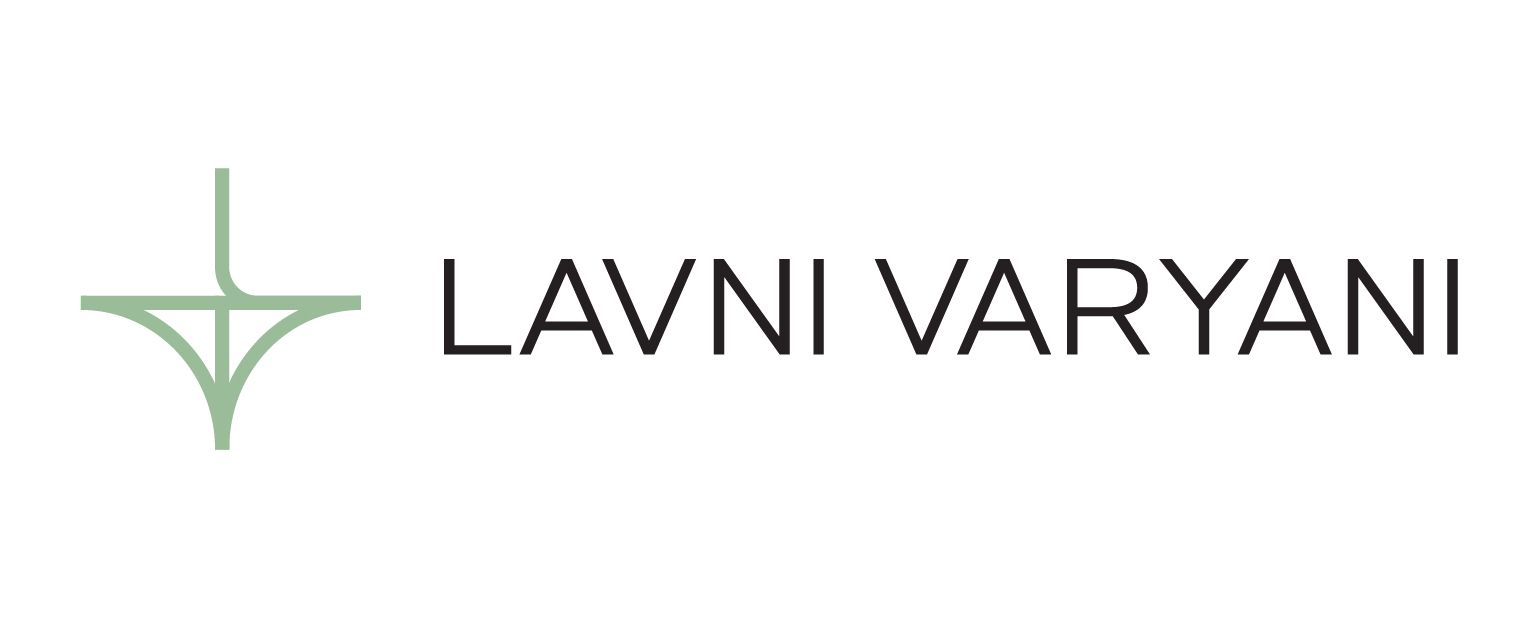
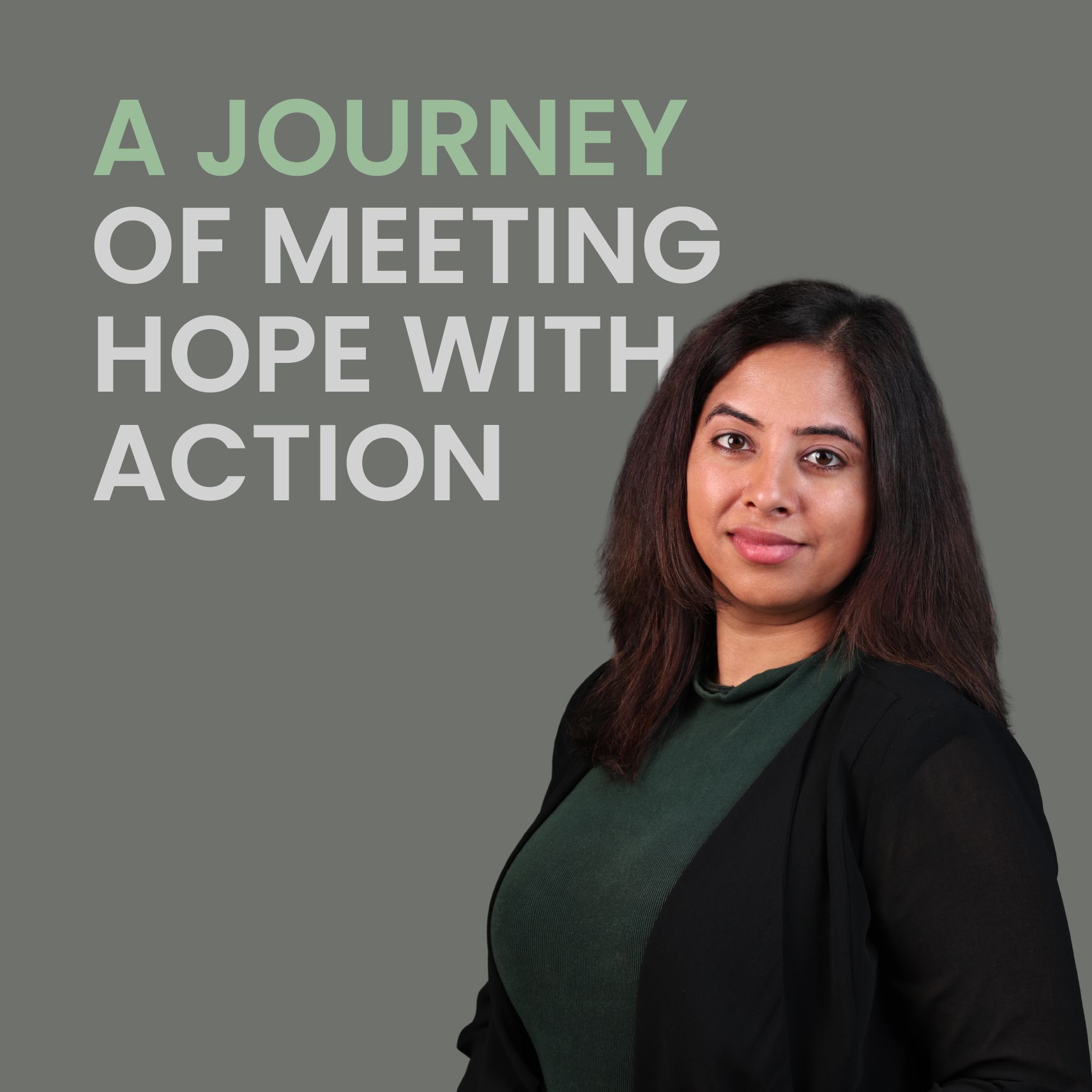
Lavni Varyani
Sector
Personal Branding
Question
How do you build a personal brand around a mission that is as human as it is strategic?
Answer
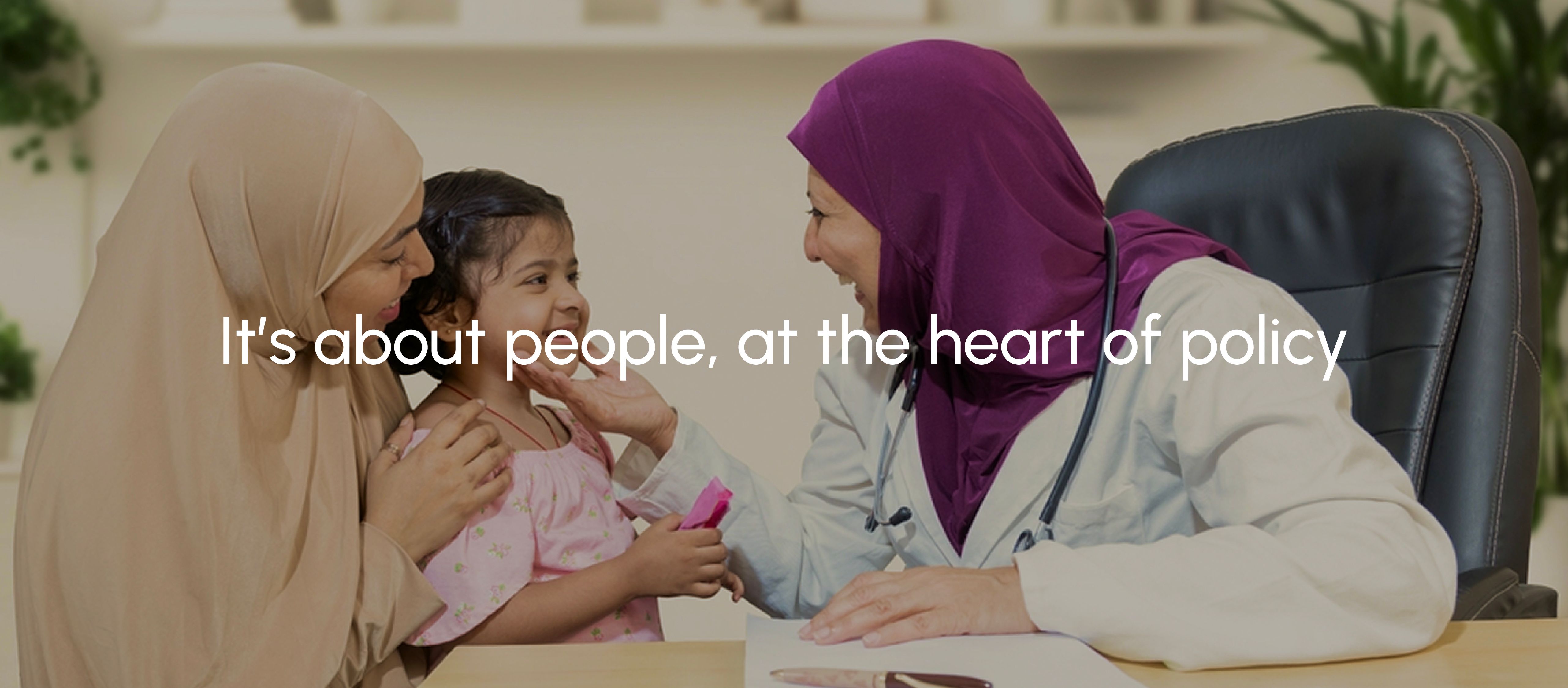
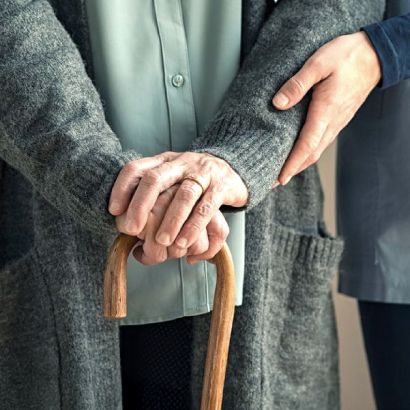
By building a patient first brand that reflects her substance, expertise and purpose.
Lavni Varyani works at the intersection of policy, science, and human need. Through Pharma BP, now called Becoya, she has spent years making essential therapies accessible across the Middle East. Her goal has always been about bringing access to a region evolving faster than the global healthcare industry has cared to keep pace with.
A practice built on this kind of conviction needed a brand with the same depth. We began with the Ikigai framework, mapping what she loves, where she excels, and where the world needs her most. That centre became the strategic foundation.
From there, we defined her purpose, identified her five distinct audience segments, and built the architecture for how she shows up for each of them. Her identity brings that to life through a mark that represents the connection between innovation and access. Her website carries it forward, giving full expression to the breadth of her work and everyone she serves.
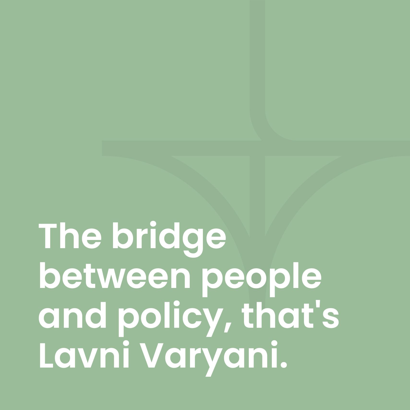
A bridge of intent. A spark of transformation.
This mark unites the initials L and V into a symbolic bridge - representing Lavni’s role in connecting therapeutic innovation to the systems and people that need it most.
The L acts as a vertical anchor - signalling leadership, clarity, and grounded strategy. The V forms the supporting arch - conveying reach, support, and inclusivity. The primary palette of sage green draws from the language of care and healing, warm enough to invite trust, restrained enough to hold authority.
The overall silhouette resembles a spark - capturing the idea of catalysing change reflecting Lavni’s ability to drive access, and inspire systemic progress.
Warmth with a purpose behind it.


Bridging the gap between innovation and access
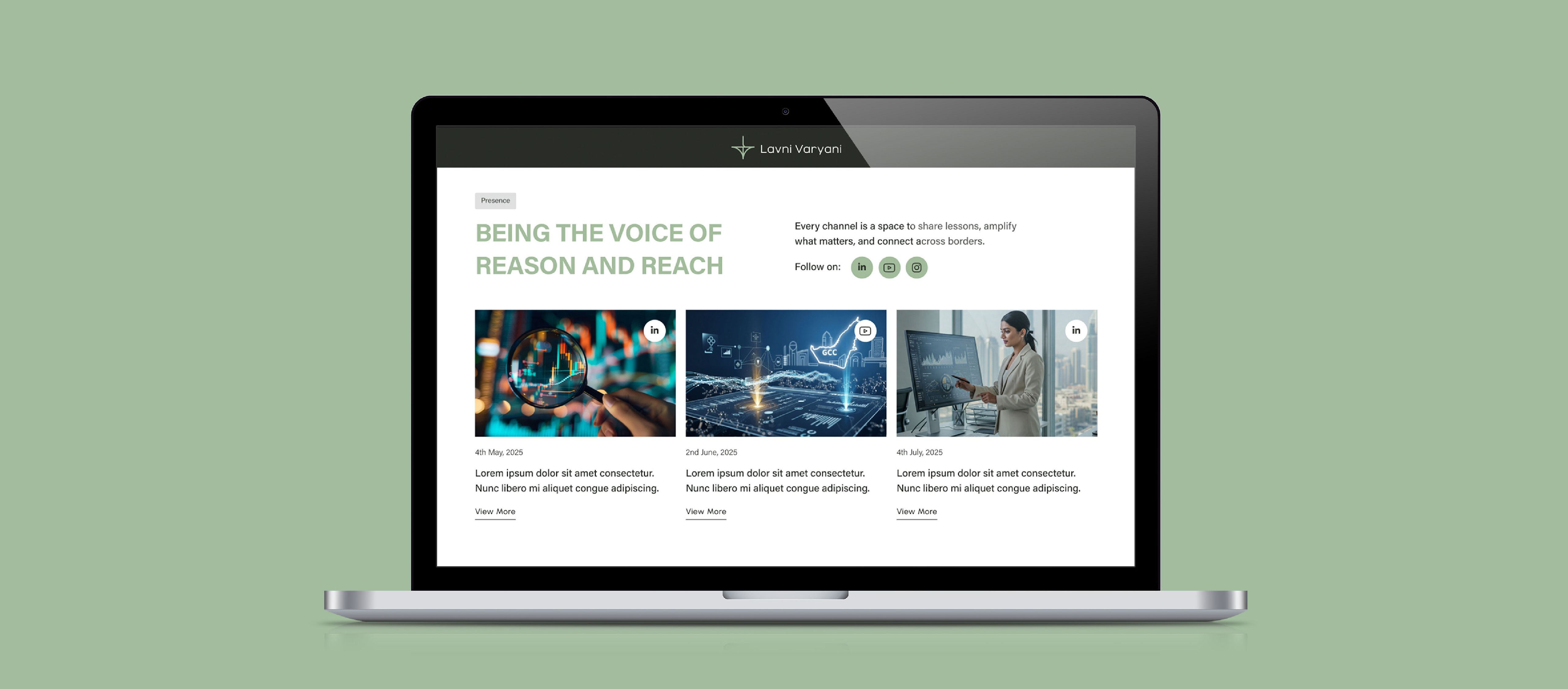
Structured as a single flowing page, each section leading naturally into the next. From who Lavni is, to what she offers, to who she serves, to proof of the work. Every visitor leaves with a reason to reach out.
Each section speaks directly to a different audience, shifting from strategic to human, from advisory to advocacy. Lavni's voice stays consistent across every conversation the website holds.
A structured interface using sage green and generous white space keeps the focus on Lavni's work. Clear sections, intuitive flow, and a visual timeline ensure every visitor understands her journey.


Like our work? Give us a little ting.
