














Capturing the vibrant contradictions of India for OPI
Services
Brand Campaign
Naming
Packaging
Creative Direction
Influencer Marketing
Content Creation & Production
Client
OPI India
Sector
Consumer & Retail
Question
How do you localise a global beauty icon without losing its signature voice?
Answer
By embracing India’s contrasts while retaining the brand’s bold and dynamic expression.
OPI is a leading international nail color brand from US-based parent company Coty. It offers salon-quality nail lacquers and nail care products across Asia, America and Europe. As the brand set out to launch its first fully localised campaign in India, the challenge was to capture the essence of India in a way that feels authentic, modern and relevant to its young audience.
In a market dominated by both global players and strong local alternatives, we aimed to carve a distinct voice that celebrates India not as a singular narrative, but as a vibrant, layered experience, representing its colourful chaos. We articulated this with ‘The Colorful Chaos of India’ and then translated it across product naming, packaging, photo-shoot and visual storytelling. We created dynamic and conversational names for each category that spoke directly to the TG, with an illustrated style to complete the visual language.
Finally, we entered the campaign stage, ensuring every touchpoint carried the same spirit. Supported by a strong digital and influencer push, we turned the products into conversations, making India not just the inspiration, but the experience.
Reimagining the beauty of chaos
Crafting a magnificent melange
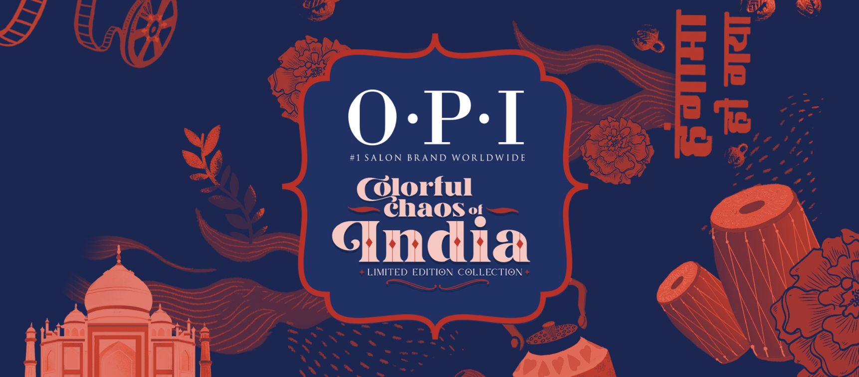
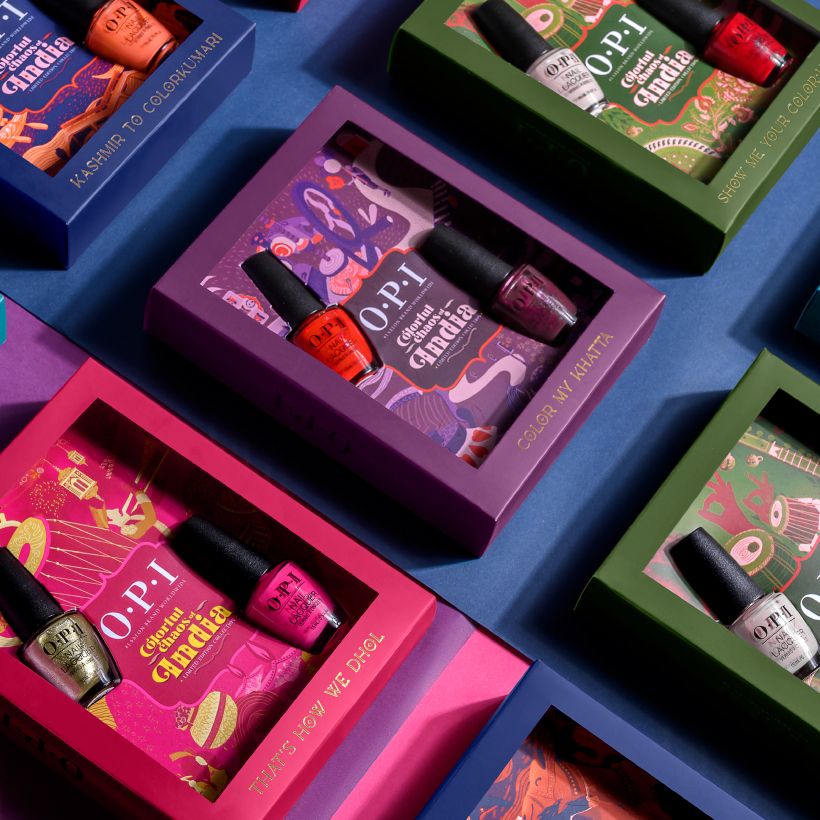
Designed to stand out both on shelves and on screens, the packaging balances vibrancy with sophistication. Taking the spirit of OPI forward, every product was presented as not just a purchase, but a piece of the story.
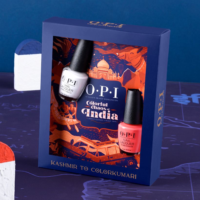
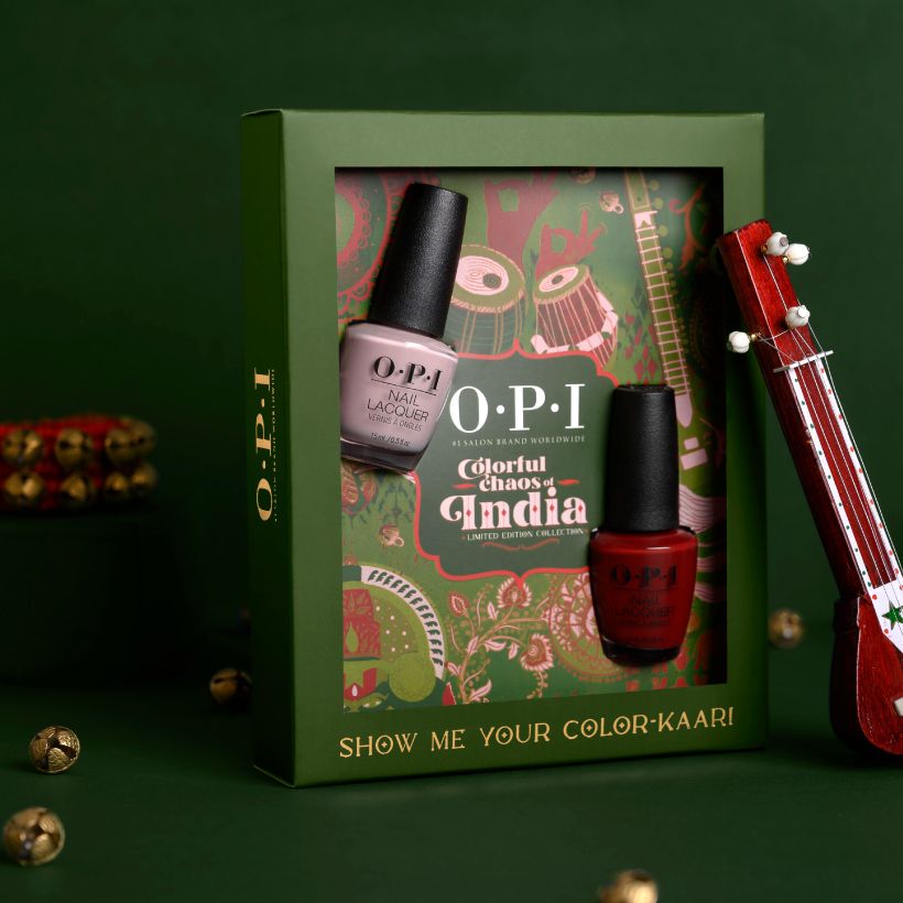
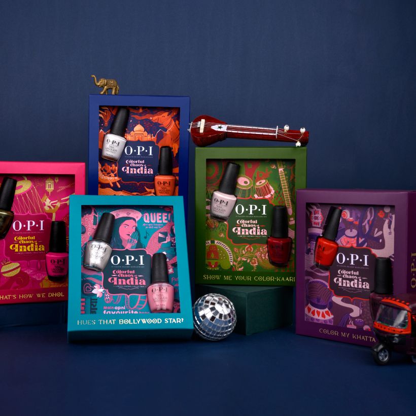
Each pack was designed as a tribute to one of these 5 categories: Travel, food, folk art, entertainment and weddings. The colour palette for each pack was based on the 2 nail lacquer variants in the respective box.
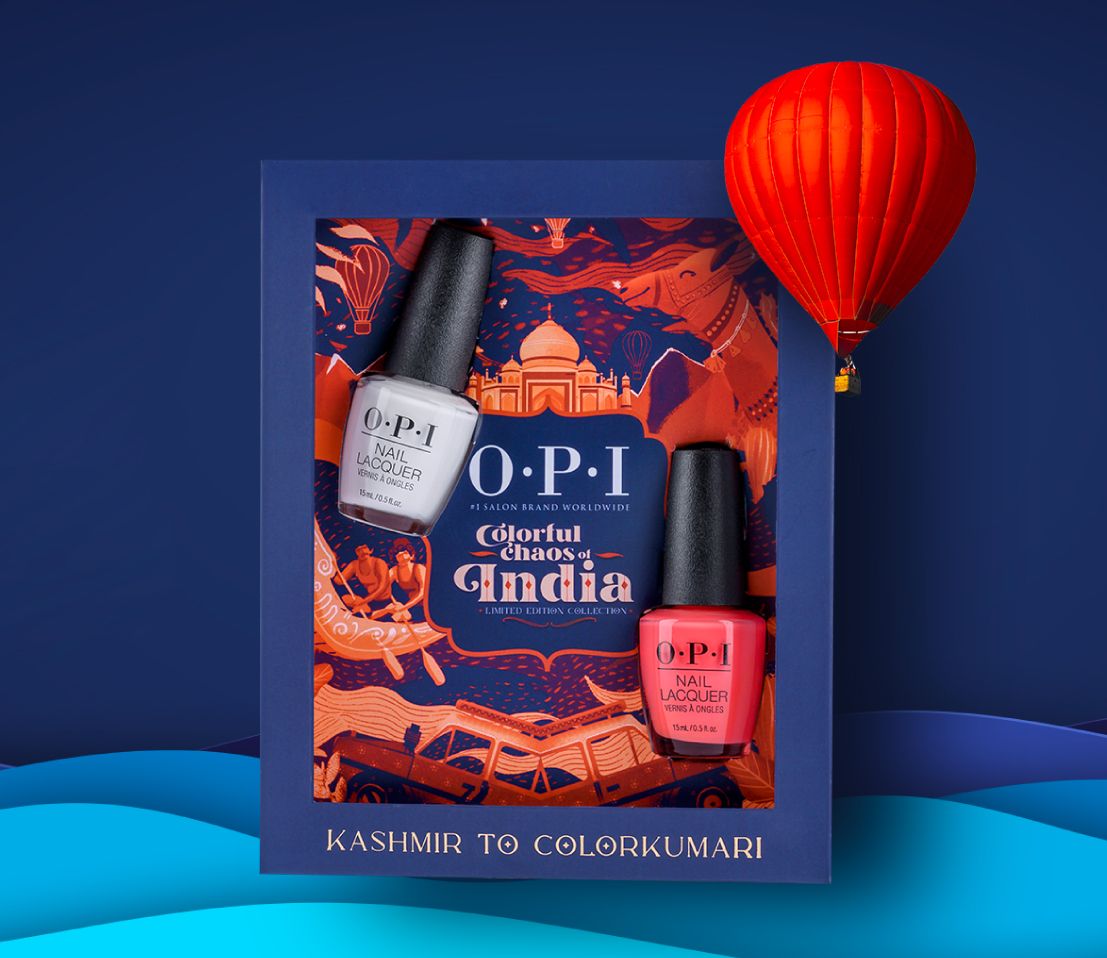
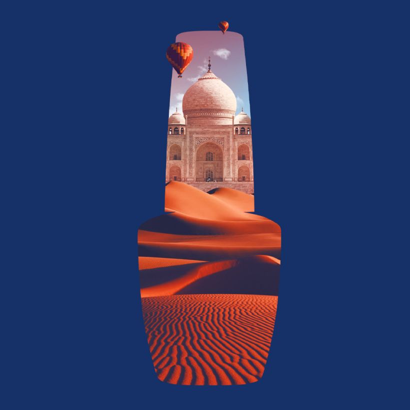
Kashmir to Colorkumari
Portrays wanderlust, featuring illustrations of Taj Mahal and the iconic fishing boats of Kerala
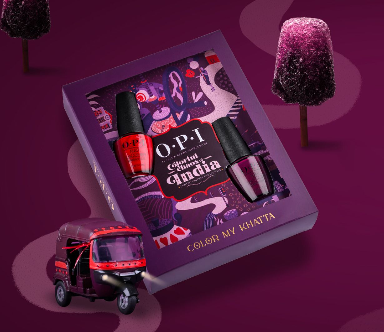
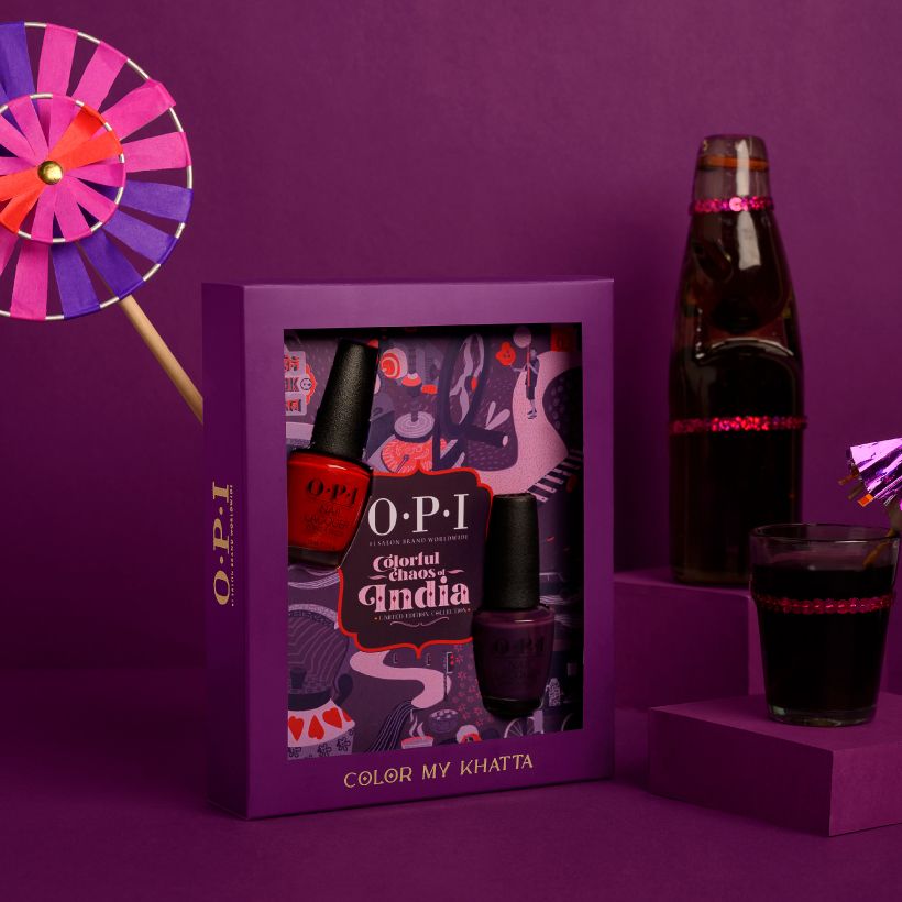
Color My Khatta
Represents the vibrant essence of Indian street foods, inspired by but not limited to kaala khatta.
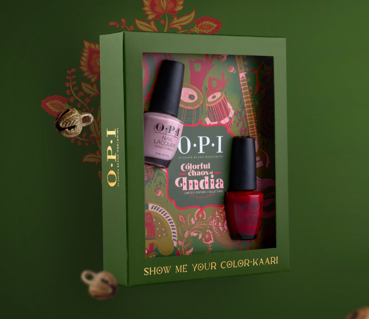
Show Me Your Colorkaari
Showcases folk dance, music and art through motifs highlighting Indian karigari, mudras and instruments

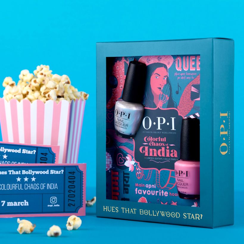
Hues That Bollywood Star
Denotes entertainment through illustration on Bollywood inspired dialogues and iconic characters.
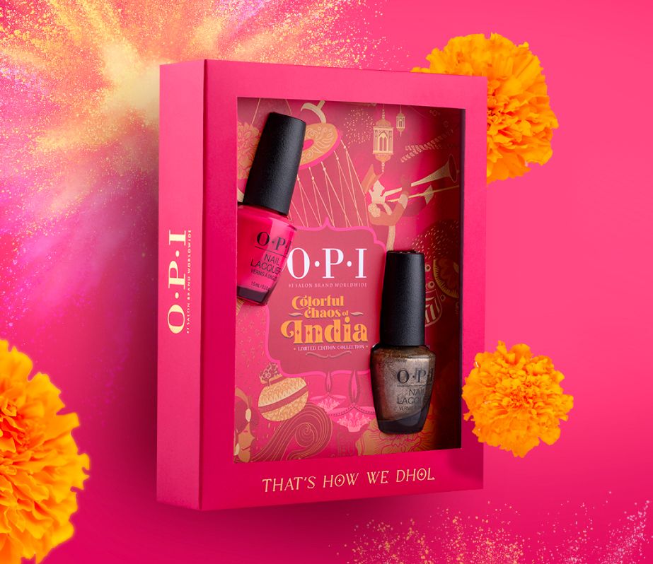
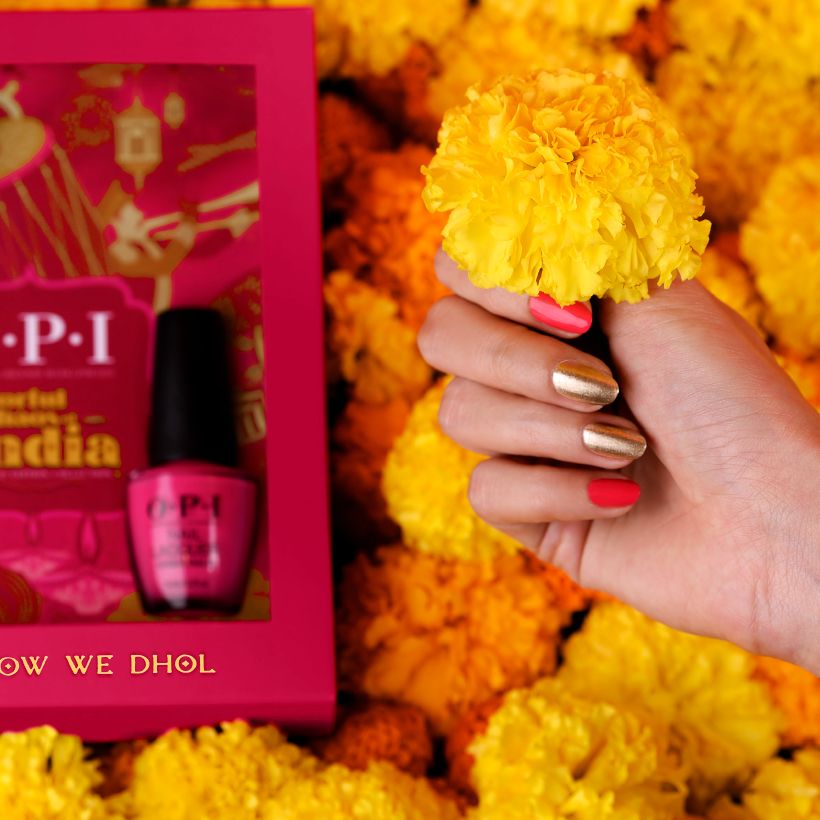
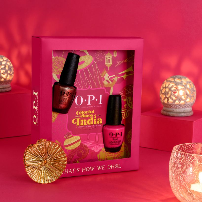
That’s How We Dhol
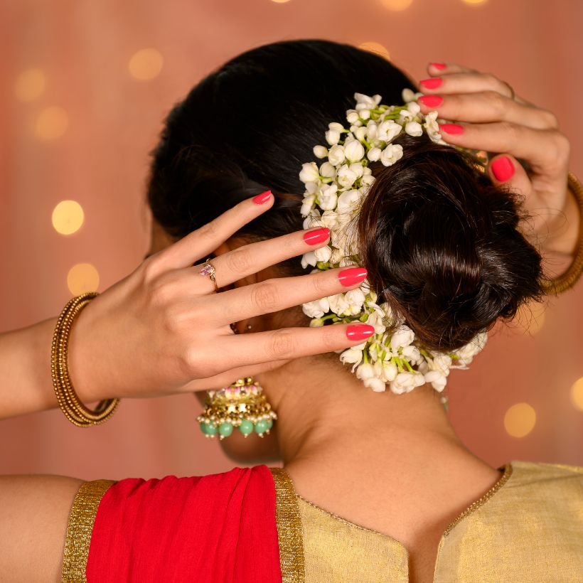
Encapsulates the spirit of an Indian wedding with vibrant elements of celebration and music around it.
Translating India, one shade at a time
We collaborated with a carefully curated set of women influencers, each chosen for their unique voice, audience appeal and content style. From Daizy Batra's travel, beauty and fashion storytelling, Aashna Shroff's contemporary wedding aesthetic, Alicia Souza's charming illustration style, Tanya Khanijow's vibrant travel narratives and Nicole Conessao's dance-led celebration of Bollywood culture, each creator authentically brought a distinct facet of India's colour, creativity and culture to life.
A palette of possibilities
Related case studies

Like our work? Give us a little ting.