


The art of witnessing, rendering, holding

Services
Strategy
Identity
Website Design & Development
Client
Rachel Parker
Sector
Arts and Culture
Question
How do you give a painter's inner world a meaningful digital presence beyond the canvas?
Answer
We found the stillness at the centre of Rachel’s work and built a world that moves the same way.
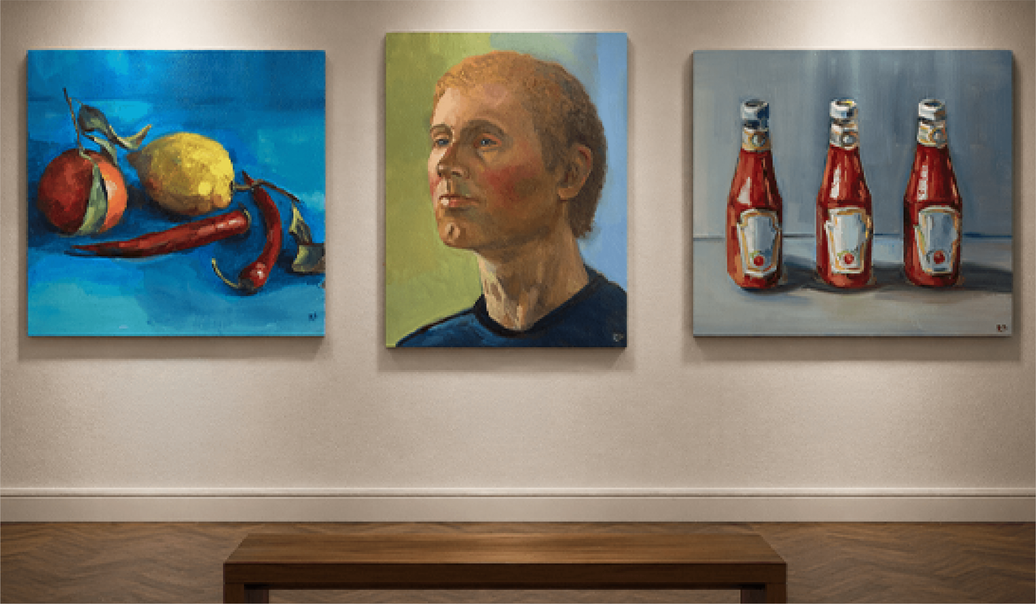
Rachel Parker paints what most of us move through without stopping to feel. Her work doesn't announce itself, it waits, until you're still enough to receive it. For a generation that is always online but rarely seen, her paintings offer something the world has stopped making room for. For her identity, we interpreted her work as a companion for the moments when the noise finally drops, and you witness the world in stillness.
The ‘Ikigai framework’ offered a way to sit with this more intimately. An exercise to understand the threads running through her process of creation. Taking a closer look at what she returns to, what she does with care, what she brings into the world and why it seems to meet something in others. It helped bring these elements into relation, revealing a centre that had always been there.
This brought us to a purpose, of what the Rachel Parker brand goes on to stand for. It is about art that feels personal, honest, and quietly powerful. Art that's made to stay with you. While her work remains gentle, intuitive and open, her brand now carries a deeper sense of intent.
The identity for Rachel Parker was designed as a reflection of her way of seeing the ordinary. At its centre is a mirrored “L”, forming the corner of a canvas and nod to her craft. This framing is paired with a clean, modern typeface making the logo feel understated and approachable, mirroring Rachel’s grounded and sincere artistic voice.
The primary colour of deep brown evokes warmth, earthiness, and groundedness, qualities that mirror Rachel’s sincere, intimate approach to painting. Drawn from the natural tones often present in her work, it brings a sense of calm and strength to the identity.
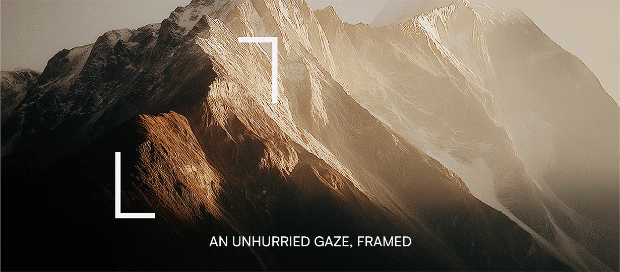
A slower way into art
Built for a generation that feels too much and too little at once, this is an art practice designed to be experienced, not consumed. From first scroll to final purchase, every touchpoint is shaped to slow you down, build emotional connection, and let the work reveal itself over time.
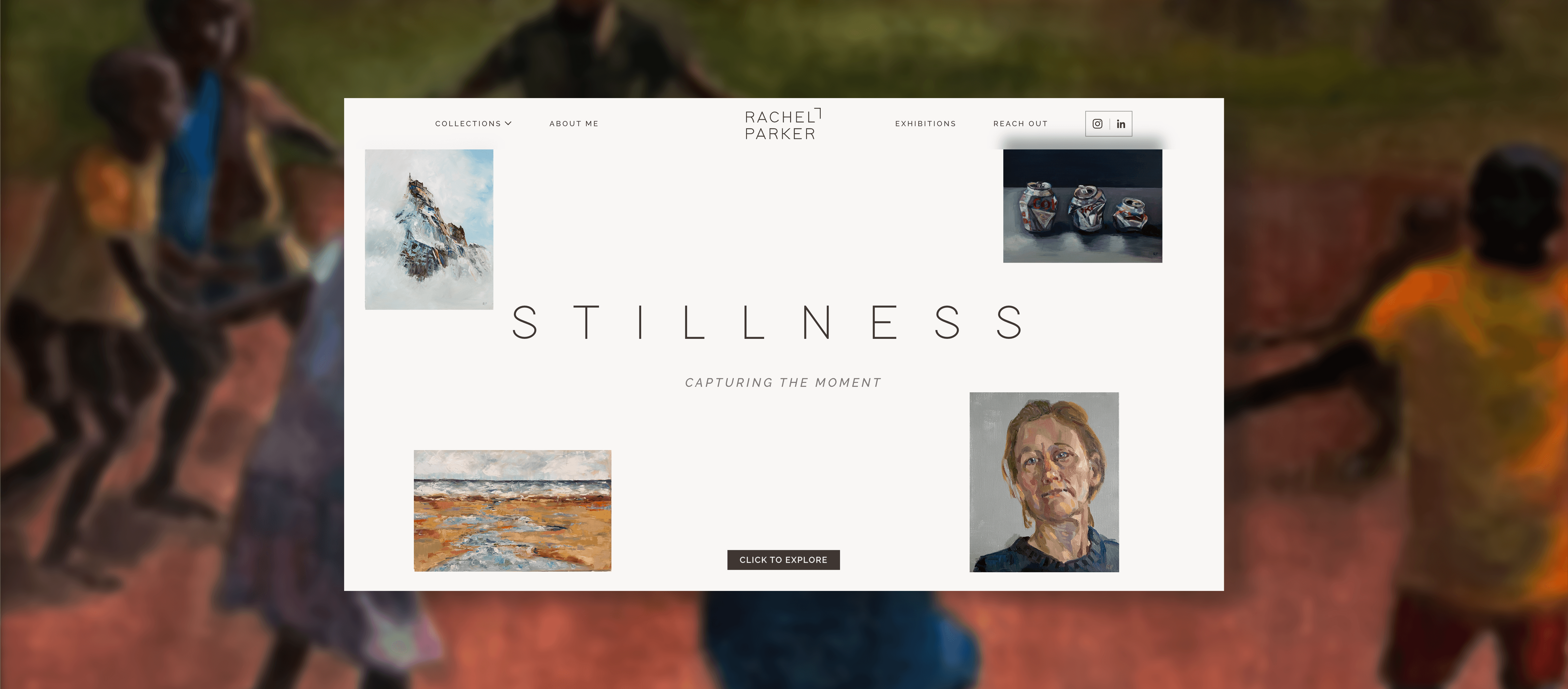
The experience was built to move the way she paints, horizontally, unhurriedly, with room for each work to breathe. You don't browse here. You arrive and linger.
Subtle, elegant typography and restrained interactions create a calm, contemplative browsing journey that aligns well with the artist’s tone and aesthetic.
Generous whitespace and large, high-quality visuals establish a refined visual hierarchy, allowing each piece to breathe, elevating the perceived value of the work.


Like our work? Give us a little ting.
