











Social Media Design
October 2026
The Death of the Perfect Feed
WRITTEN BY

Sarvesh Bramhe
Associate Creative Director – Design

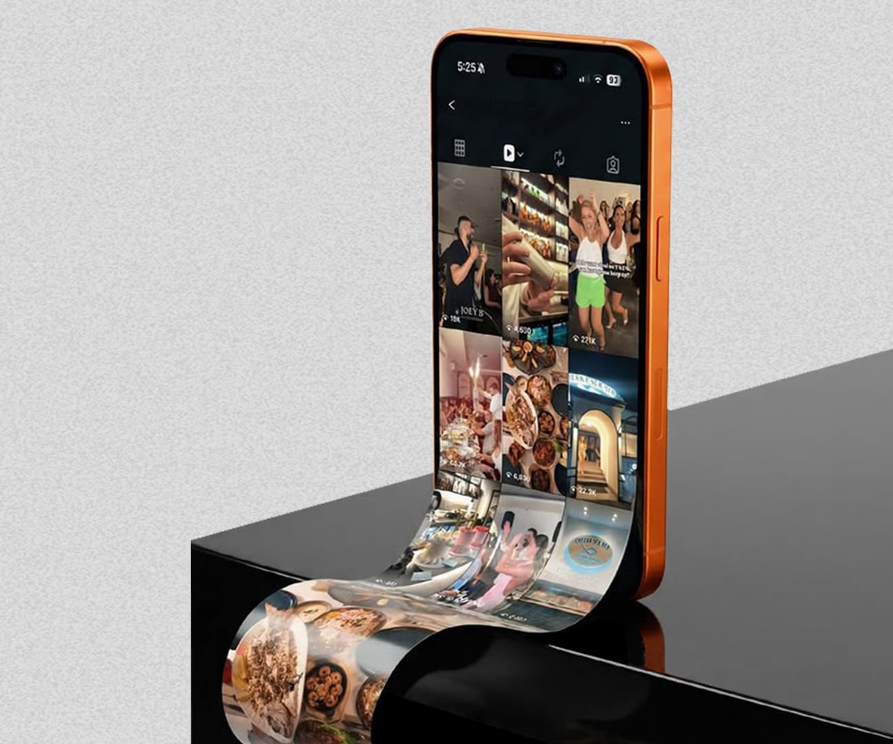
For years we designed social media around the feed. Nine posts had to sit well together, the colours had to match and every piece followed the same visual system. That made sense when people visited a brand's profile. Most don't anymore. They meet a brand through a single Reel, Story, carousel or meme while scrolling past everything else. So the job has changed. A post no longer has to look like the last one. It has to stop someone and still feel like the brand when it does. For designers, that means working from principles instead of templates, thinking about the first second before the colour palette, and knowing which parts of an identity are essential and which are just habits.
There was a time when we spent a surprising number of hours worrying about how a brand's feed looked. The colours had to be right, the typography consistent, and the image treatment on system. And those nine posts had to look good together because the feed was the brand's digital showroom.
Somewhere along the way, people stopped visiting the showroom. Most of them now meet a brand mid-scroll: a Reel between two creator videos, a Story that's gone in 24 hours, a meme a friend forwarded. The feed isn't where they come to see us anymore. It's the environment our work has to survive in.
When Consistency Becomes a Trap
When brands first took social seriously, consistency was the priority, and rightly so. They were setting up in a new space. Templates, colours and type built recognition, and a well-designed feed could tell you who a brand was before you read a word of copy.
The trouble is that social media isn't read like a brochure. It consumes one thumb swipe at a time. If every post follows the same visual formula, people will recognise the brand and then scroll straight past it, because they feel they've already seen it.
The audience doesn't see your content system. They see one post competing with everything else on their screen.
So the question I ask of a layout has changed. It used to be "does this look like our last post?" Now it's "would this make someone stop?" and, right behind it, "does it still feel like us?"
Designing for the Scroll
This is the part I find most interesting as a designer. We still think about colour, type and composition, but the first second now comes before all of it. What does someone notice first? Can they get the idea without sound? Does the type hold up on a phone? Does the first frame make them want the second?
These are design questions too. They just come from how people behave, not from how the layout looks. A beautifully composed post can still fail if the idea takes too long to land, and on social media the most effective design is often the one that gets out of the way and lets the idea do the work. The prettiest thing on the screen rarely wins. What wins is whatever earns one more second of attention.
Consistent Doesn't Mean Identical
Brands aren't only competing with other brands now. They're up against creators, memes, news and whatever else is on that screen, and you can't always walk into that conversation looking like you just stepped out of a brand guideline document. Some days the work needs polish. Other days it should be playful, or plain, or so native to the platform that it barely reads as an ad.
None of this means abandoning the identity. It means knowing which parts of it are essential and which are just visual habits. The logo doesn't always need to be prominent. The brand colour doesn't have to own every frame.
I think we often say "consistency" when we mean "sameness". Think of a person. You don't dress the same way for a client meeting, a friend's birthday and a Sunday morning, but you're still recognisably you. Brands can work the same way.
A strong identity should flex with the culture around it without losing the personality that makes the brand recognisable.
That's where design systems need to grow up a little: fewer rigid rules, more principles a designer can apply to whatever format comes next.
Then Came AI
Just as social content was moving faster than ever, AI arrived. Making a visual has never been easier. We can try styles, worlds, characters and treatments in minutes, and for anyone in creative that's exciting.
The catch is that when everyone has the same tools, the tools stop being the advantage. If anyone can make a beautiful image, a beautiful image isn't enough, and neither is a perfectly polished feed. The questions that matter are why this image, why this idea and why now. AI makes our execution faster. It doesn't tell what is the best course of action.
What This Asks of a Social Designer
The brief used to be simple: here's the idea, here are the brand guidelines, make the post. Today a social designer has to understand a lot more: the audience and how they behave, the platform and format, the cultural context, how fast the conversation is moving and, increasingly, the technology that can bring an idea to life.
That doesn't mean designers have to become strategists, copywriters or technologists overnight. It means design can't happen in isolation anymore. The best social work usually starts with design asking questions before it opens a file. What's the idea? Who are we talking to? Where will they see it, and what else will they be seeing?
The question I keep coming back to: does this look like advertising, or like something people would actually want to see?
So, Is the Perfect Feed Really Dead?
Maybe. But I don't think the perfect feed was ever really the goal. The goal was recognition and relevance, making a brand matter to someone. We just used to measure it by how well nine posts sat next to each other.
Today the job is harder. A brand has to be recognisable without repeating itself and relevant without chasing every trend, and it has to do that one post at a time. That, I believe, is where social media design goes next: less effort on building a perfect feed, more on building a brand that can survive an imperfect one.
about the author
Sarvesh Bramhe
Associate Creative Director – Design