












Making cheese look different for Adya Dairy
Services
Brand Identity & Design System
Packaging
Client
Adya Dairy
Sector
Consumer & Retail
Question
How do you help a new cheese brand belong on the shelf and still stand out?
Answer
By balancing familiar category cues with a bold, distinctive identity designed to be noticed and remembered.
With a growing portfolio across the dairy category, Adya Dairy was ready to enter the cheese segment. But instead of launching another product under its existing brand, the ambition was to create a distinct cheese brand of its own.
In a category filled with similar packaging, visual cues and brand language, the challenge was to build an identity that could stand apart, earn attention quickly and create recognition from the very first encounter.
A fresh take on cheese
We set out to create a name and identity that felt unlike anything the cheese category was used to. The name needed to be easy on the ears, while the visual identity had to be instantly appealing and distinctive enough to draw attention on its own.
From Moo to Moozee
We began by exploring sounds that felt naturally connected to the world of dairy, while still carrying enough personality to appeal to younger audiences. The name had to be simple, playful and instantly memorable as something that could feel familiar without sounding predictable.
That led us to one of the most recognisable sounds in the category: the cow’s “moo”. We gave it a lively twist, turning a familiar dairy cue into a name that felt fresh, fun and distinctly its own. And that is how Moozee came to be
Making Moozee unmistakable
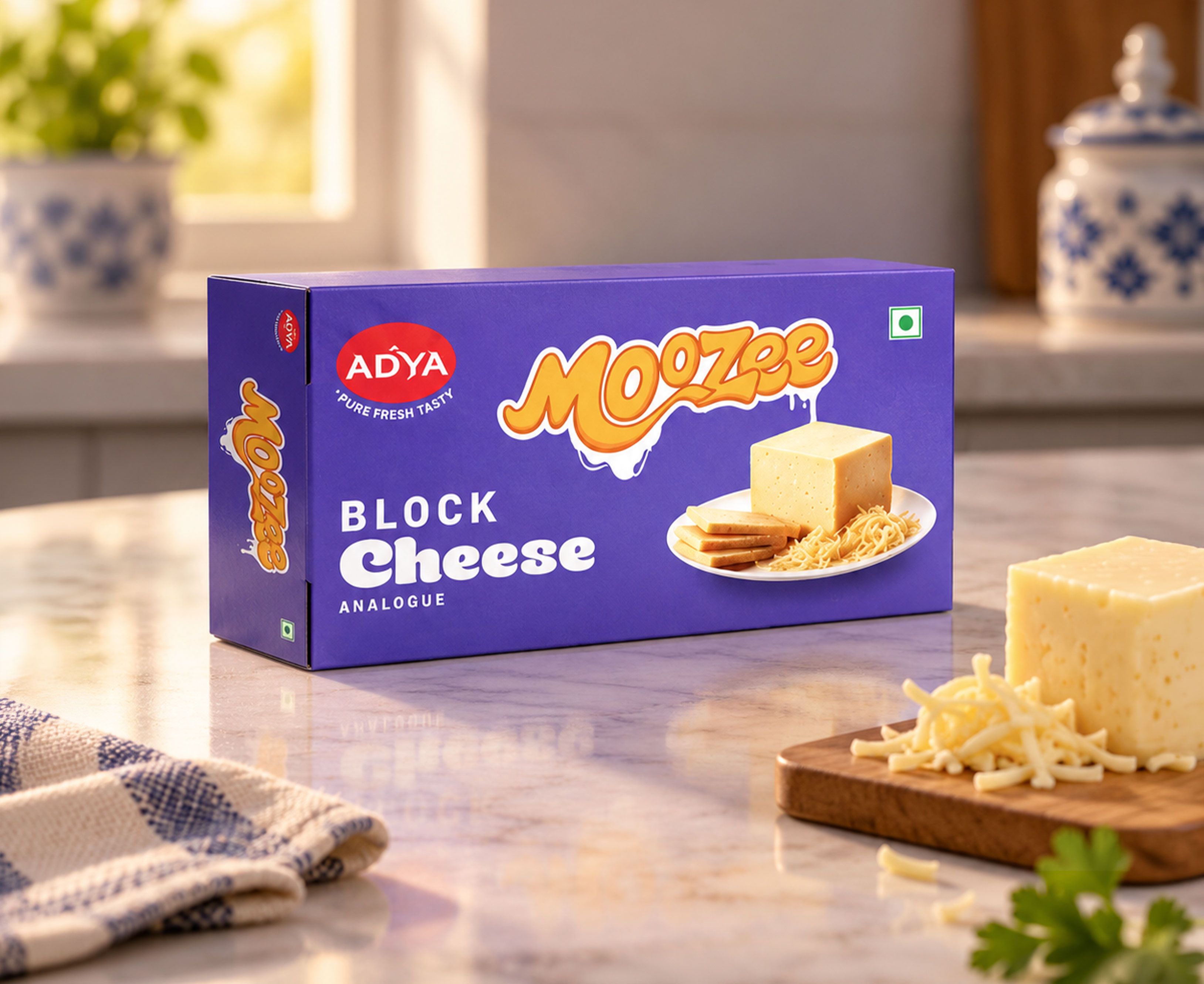
To make Moozee recognisable, we needed to build a visual identity that felt every bit as playful and distinctive as the name itself.
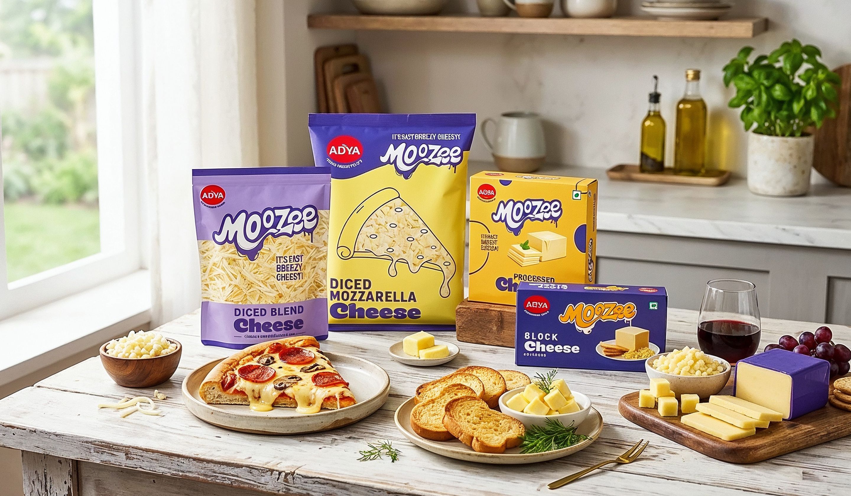
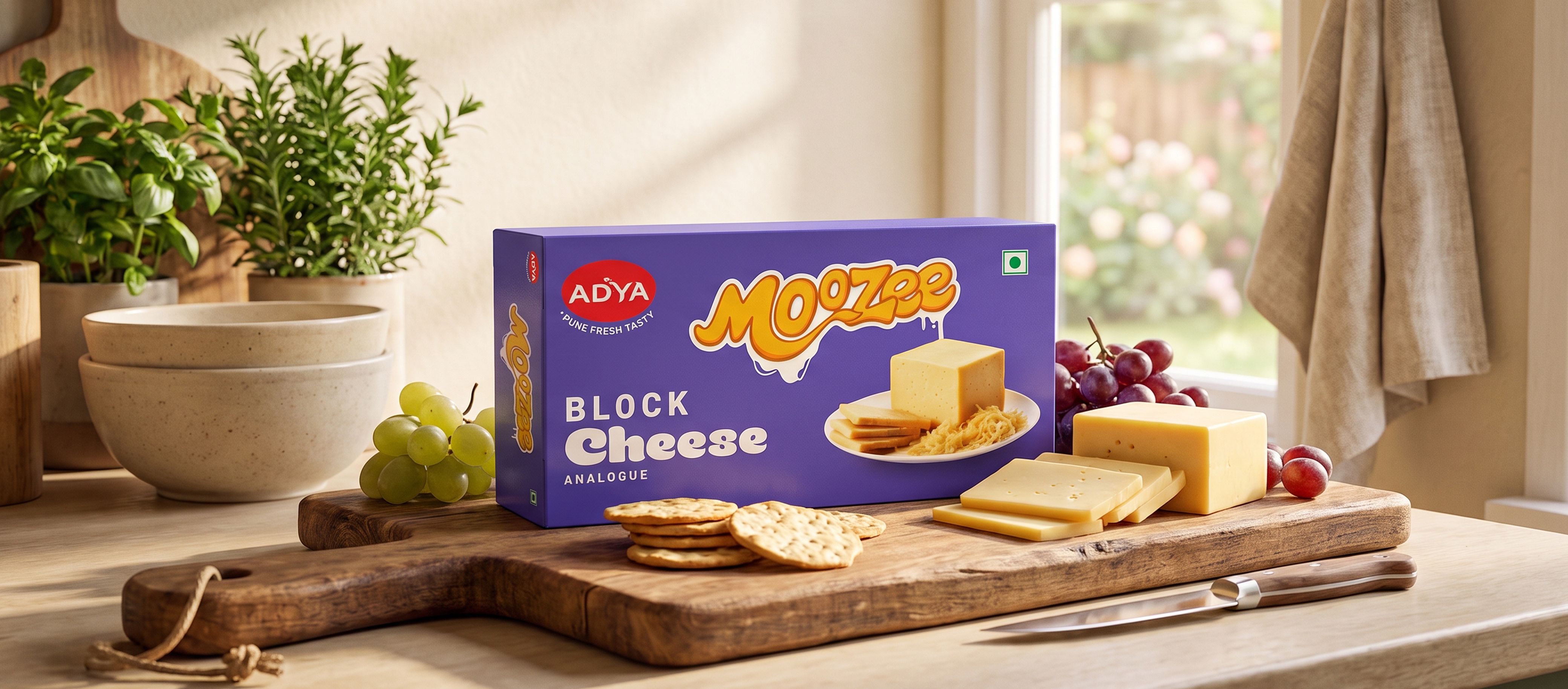
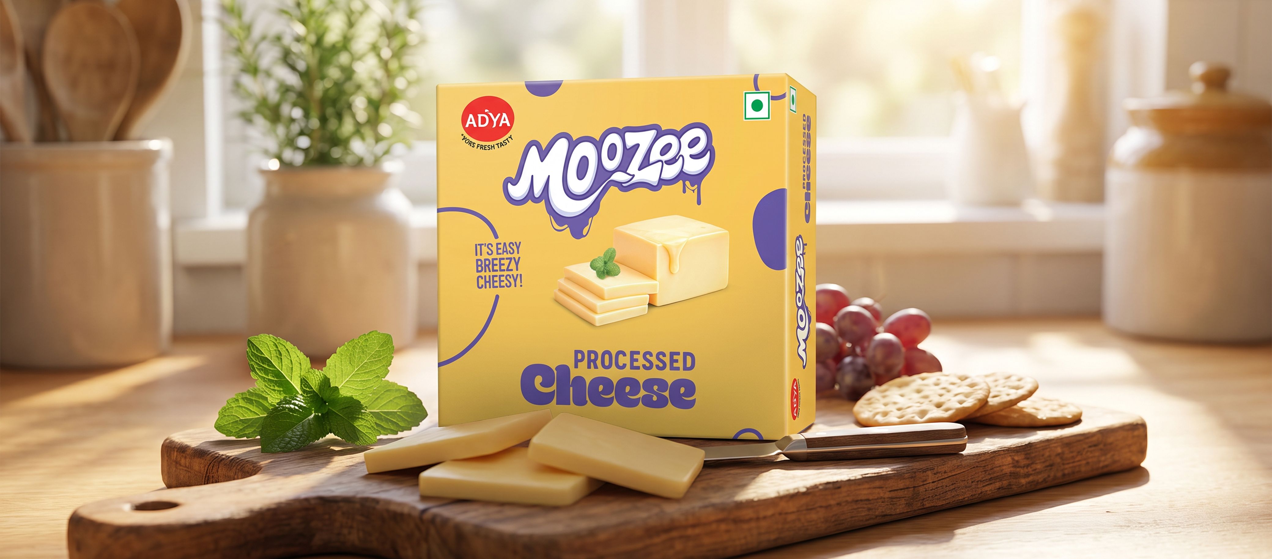
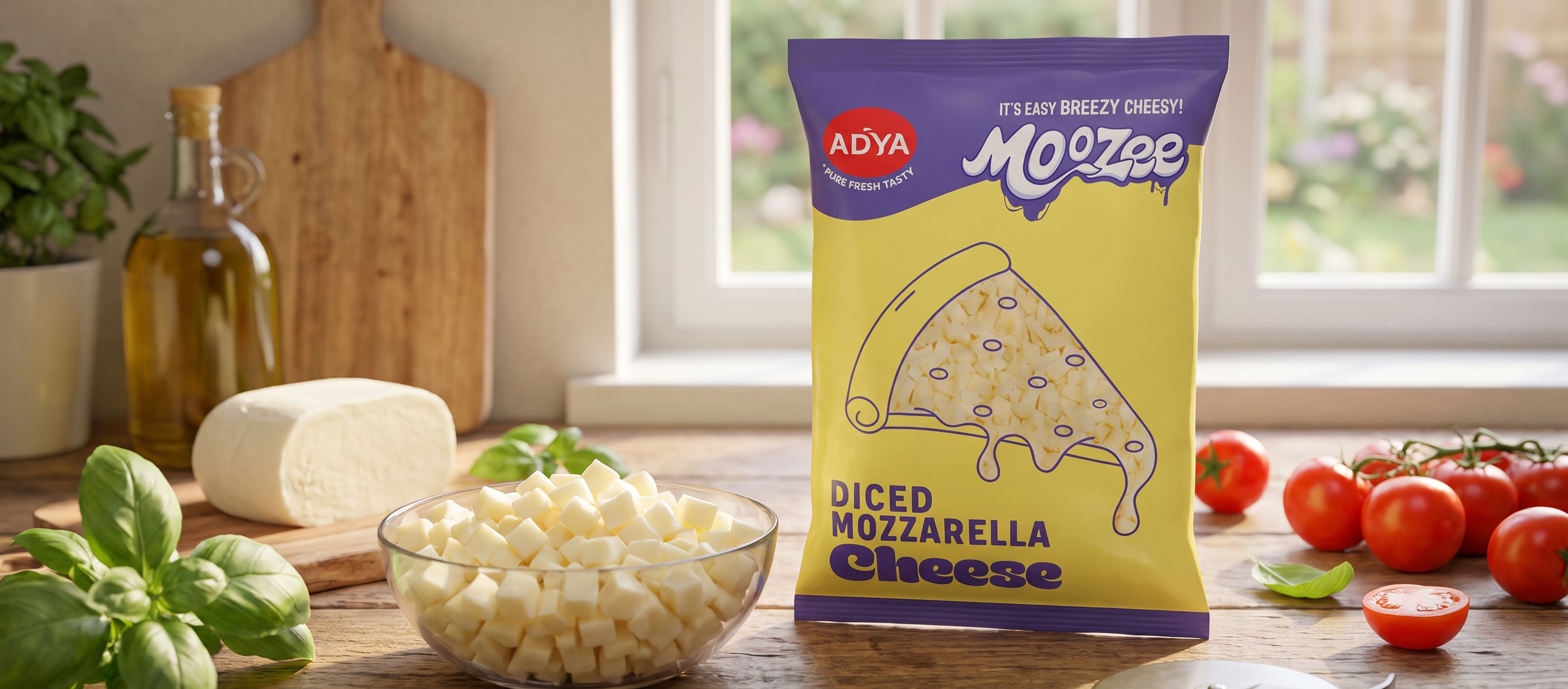
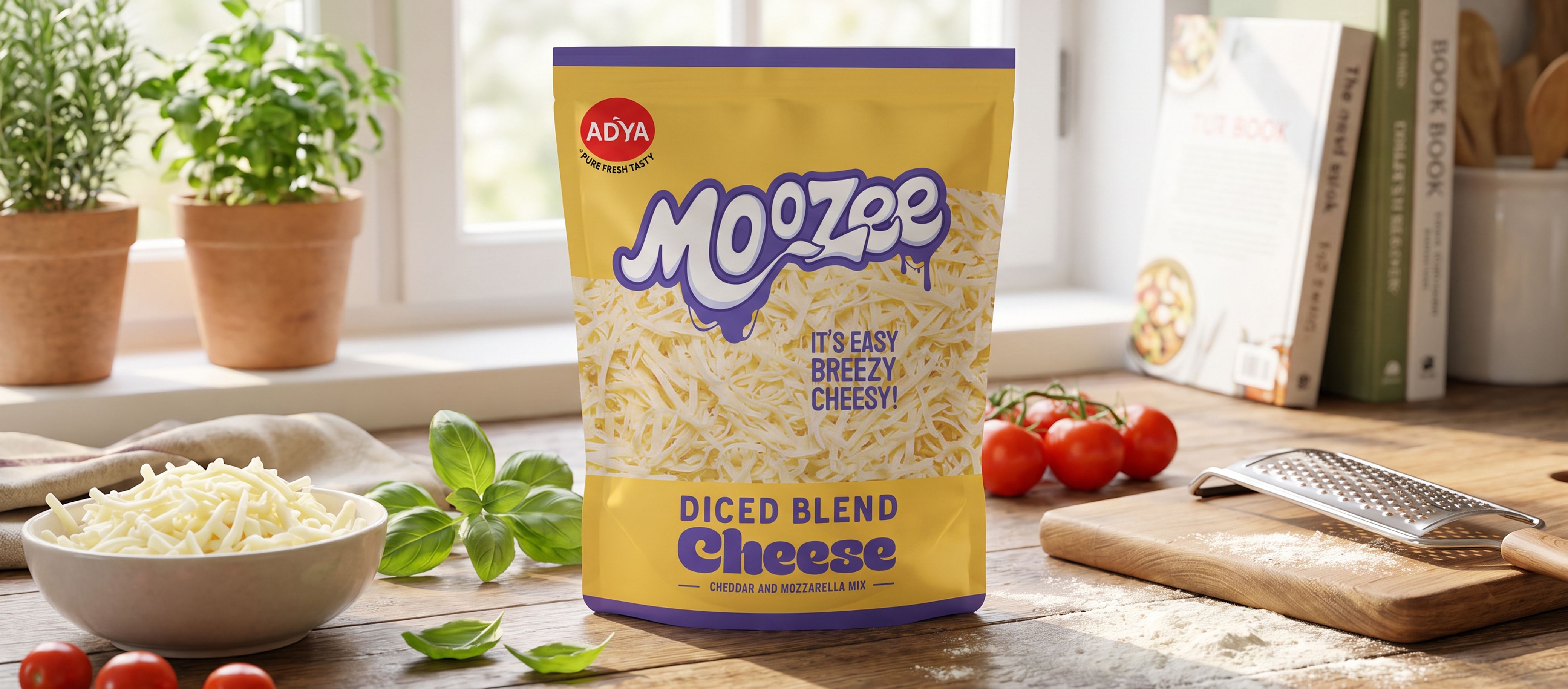
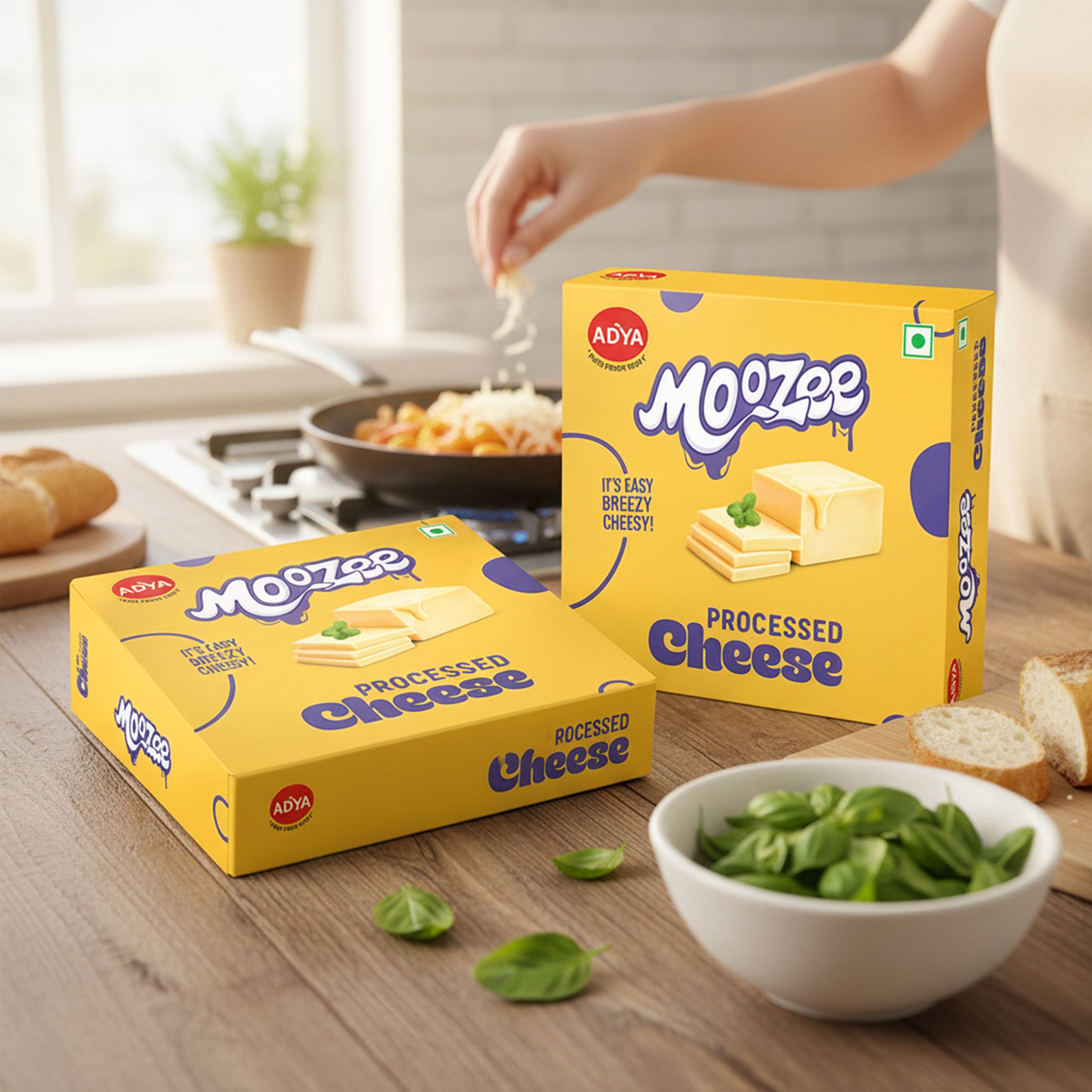
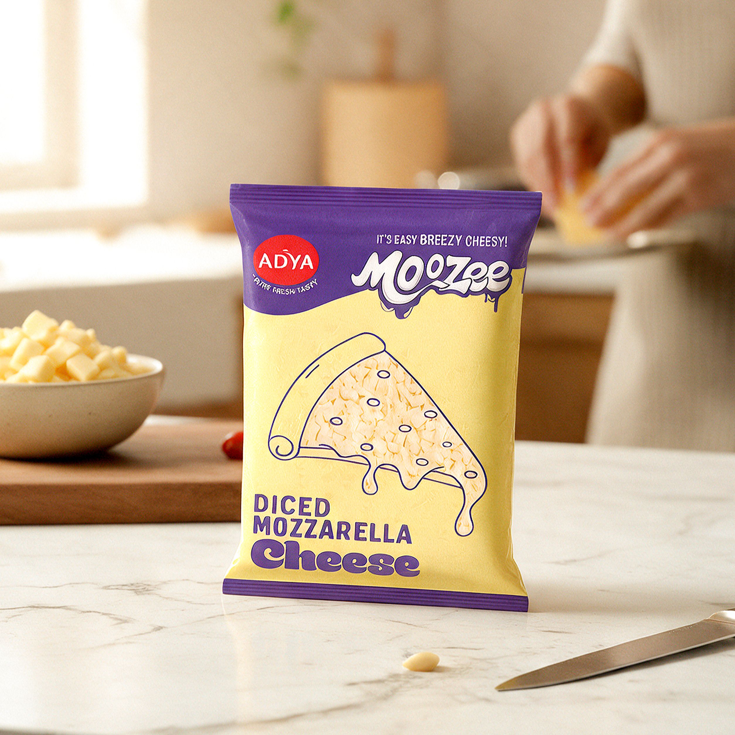
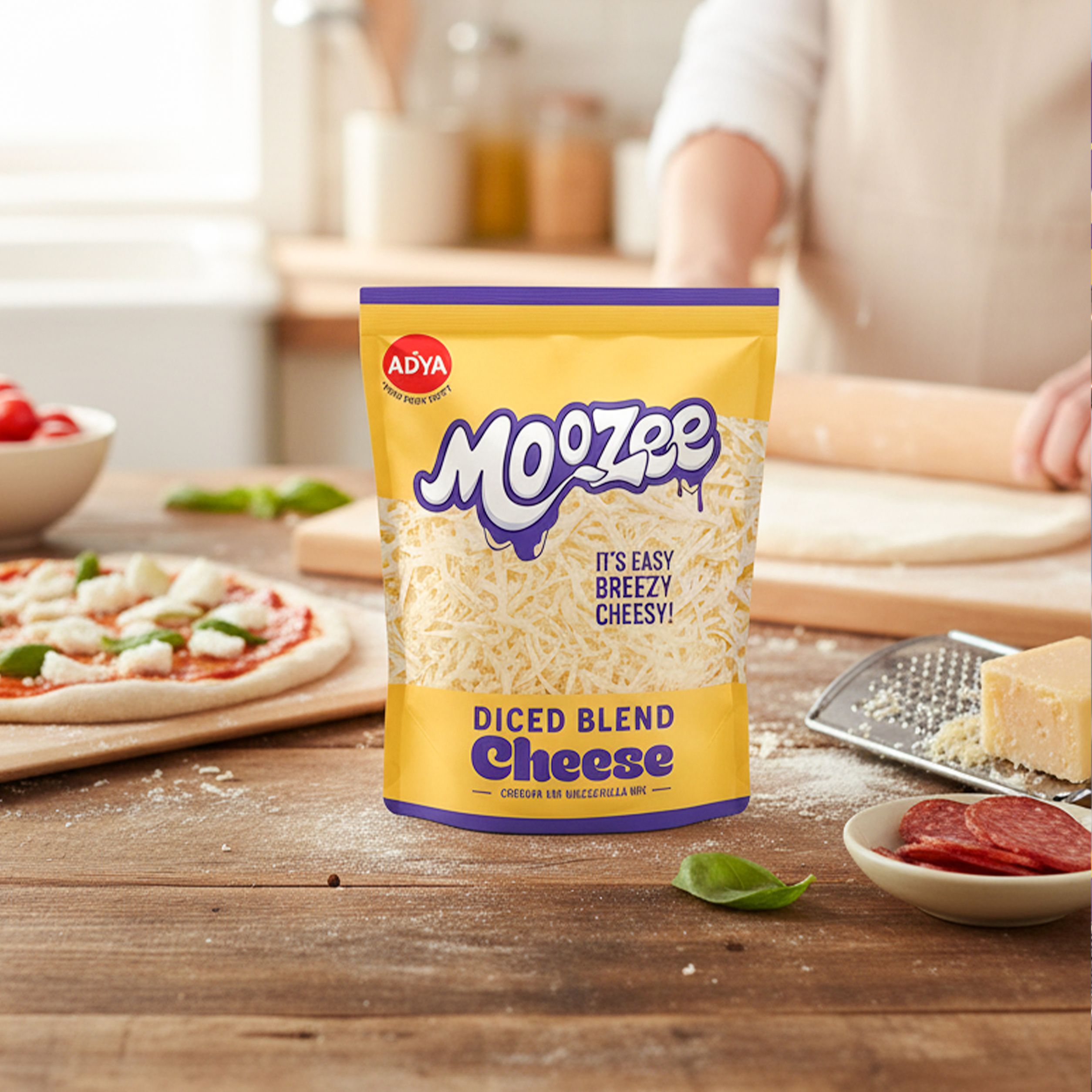
We moved away from the colours typically seen in the category, choosing a bold purple and soft cheese-yellow palette that gave the brand an unexpected presence.
At the same time, familiar cues such as cheese melts and drips were woven into the typography, helping the identity stay rooted in the product while still feeling fresh, fun and unmistakably Moozee.
Designed to be picked up
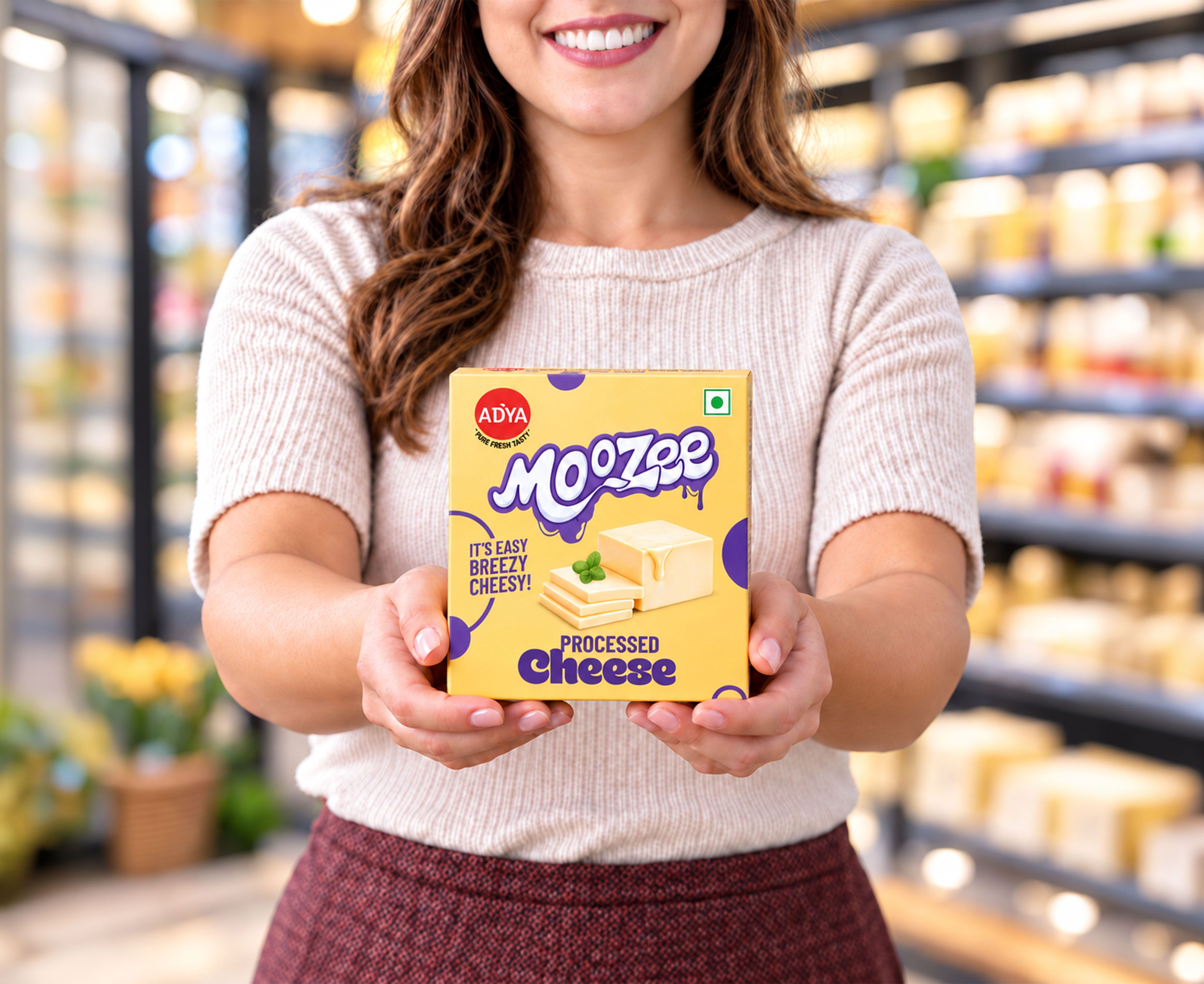
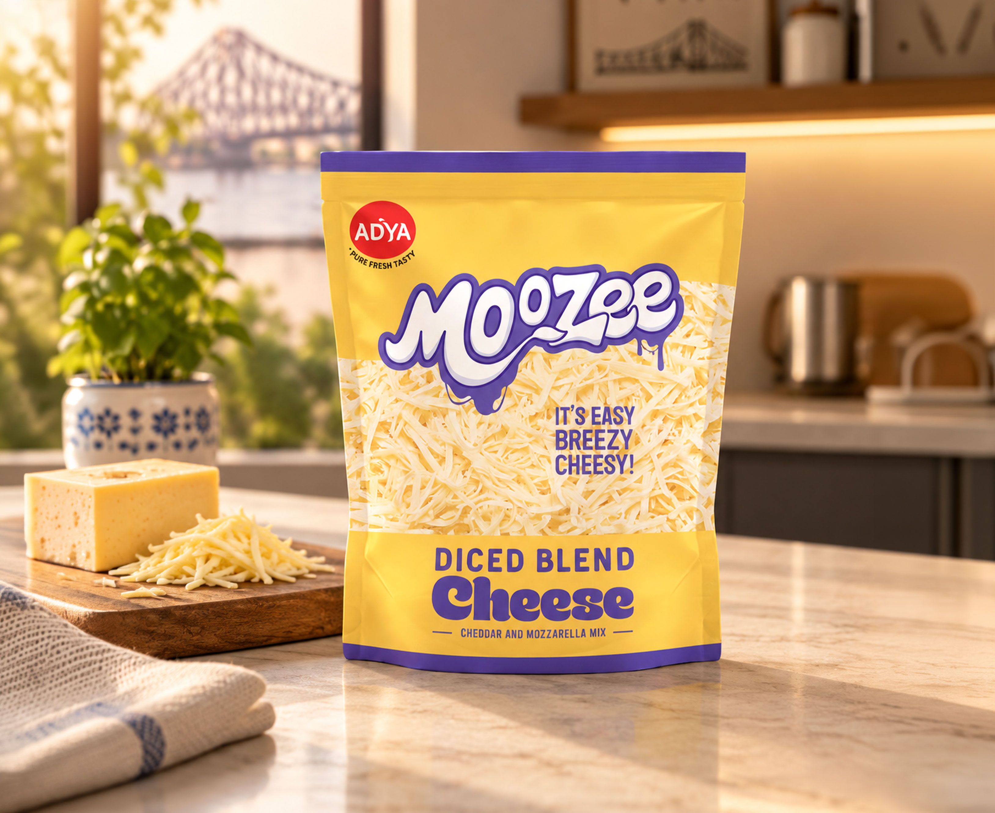
With the pack format and dimensions largely defined by the category, the real opportunity lay in how the packaging showed up on the shelf.
We used Moozee’s bold colour palette, distinctive typography and clear visual hierarchy to turn a familiar pack into something far more noticeable. Every element was designed to create contrast in a crowded aisle, helping the product command attention even before it was picked up.
Easy. Breezy. Cheesy. Moozee.
Related case studies


Like our work? Give us a little ting.