


A fresh look for a family-favourite snack
Services
Website Design & Development
Photography
Client
Balaji Wafers
Sector
Food & Beverages
Question
How do you make a legacy brand feel relevant without losing the authenticity that made it iconic in the first place?
Answer
By shaping a contemporary, vibrant look and voice that reflects the brand’s growth and its strong presence in Indian households
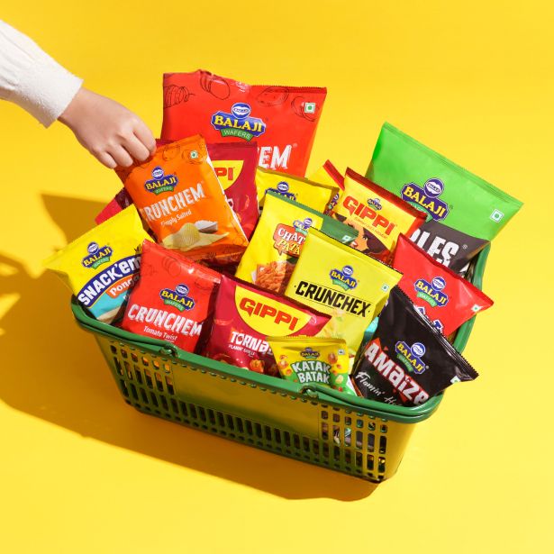
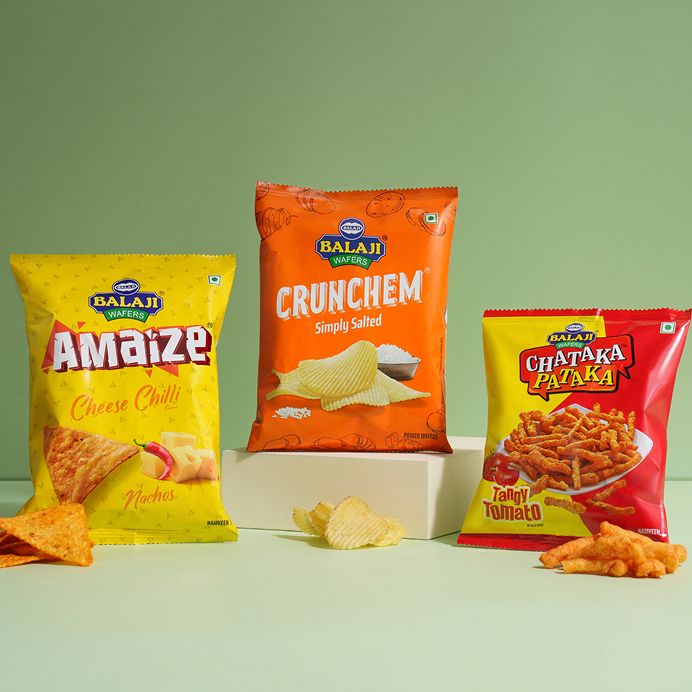
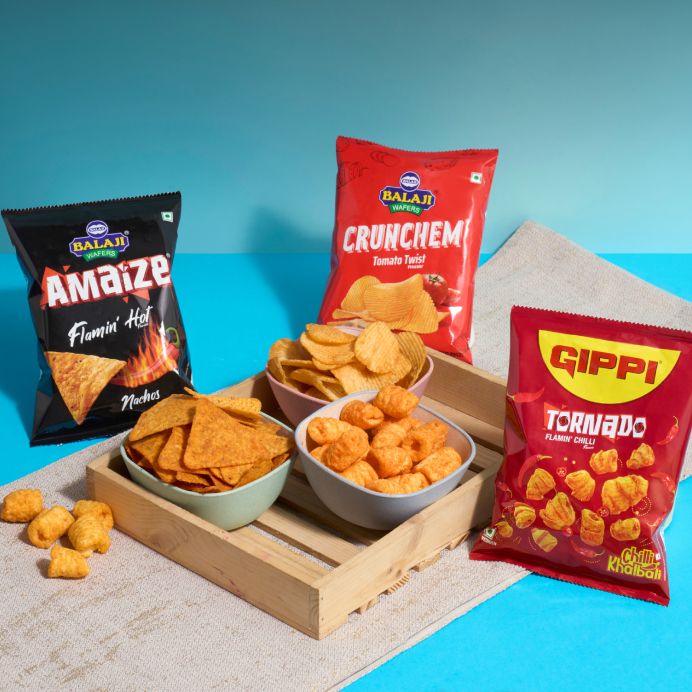
Balaji Wafers is a household snacking staple that has earned its place across generations. Built on an inspiring rags-to-riches journey by the Virani brothers, the brand has grown from humble beginnings into one of India’s most trusted and widely loved names in the category. Over the years, it has expanded its product portfolio, and today it’s rivalling even global giants like Lay’s.
However, while the brand continued to evolve, its digital presence lagged behind. The website no longer reflected the energy, scale, or contemporary appeal of the brand. The task was to reimagine this experience, bringing in a fresh, youthful perspective while preserving the credibility, warmth, and legacy that define Balaji Wafers.
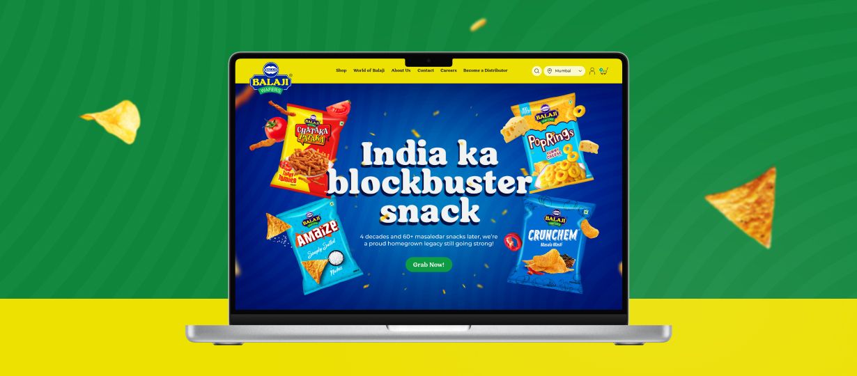
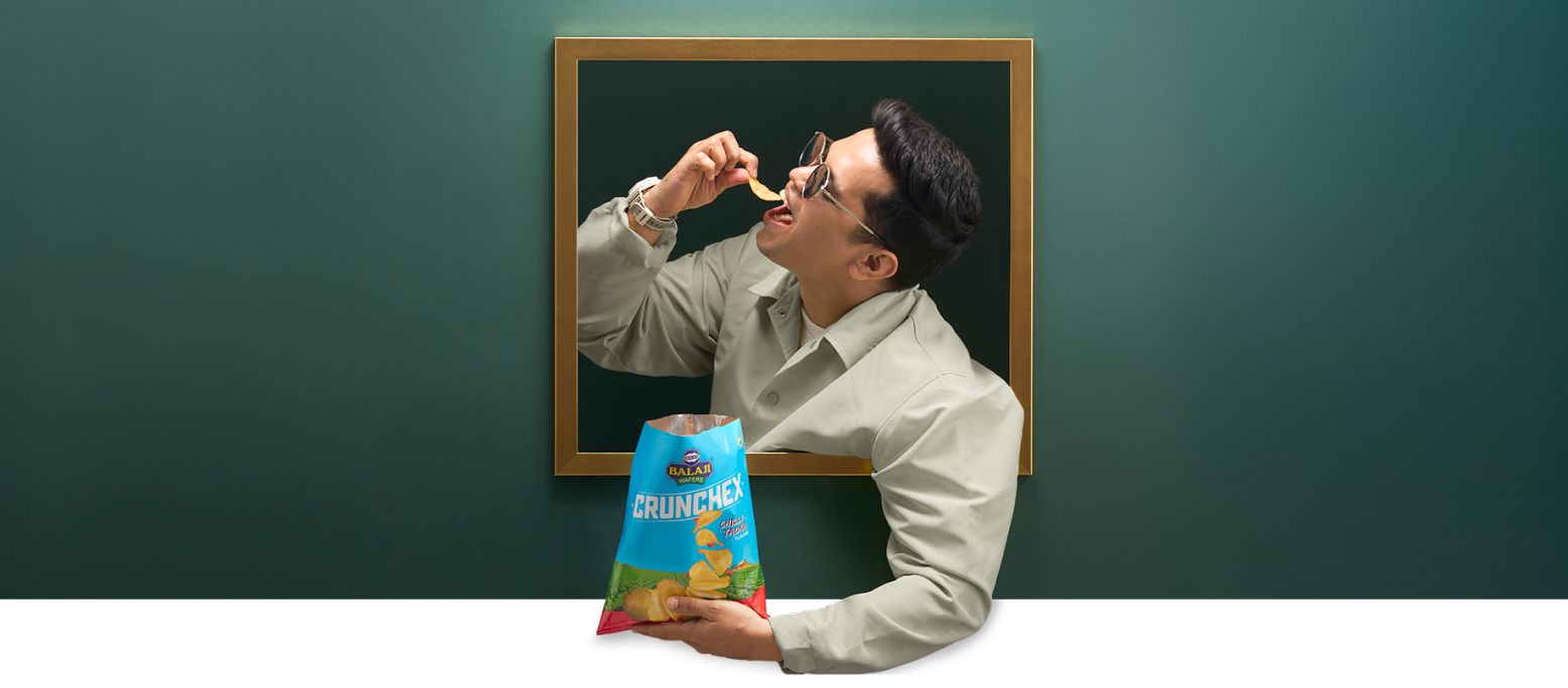
India ka blockbuster snack
Legacy, retold in a new language
The website traces the lesser-known journey of the Virani brothers, linking it to their value-for-consumers philosophy and reinforcing their promise of greater quality and quantity, in a dynamic tone rooted in Indian sentiment.
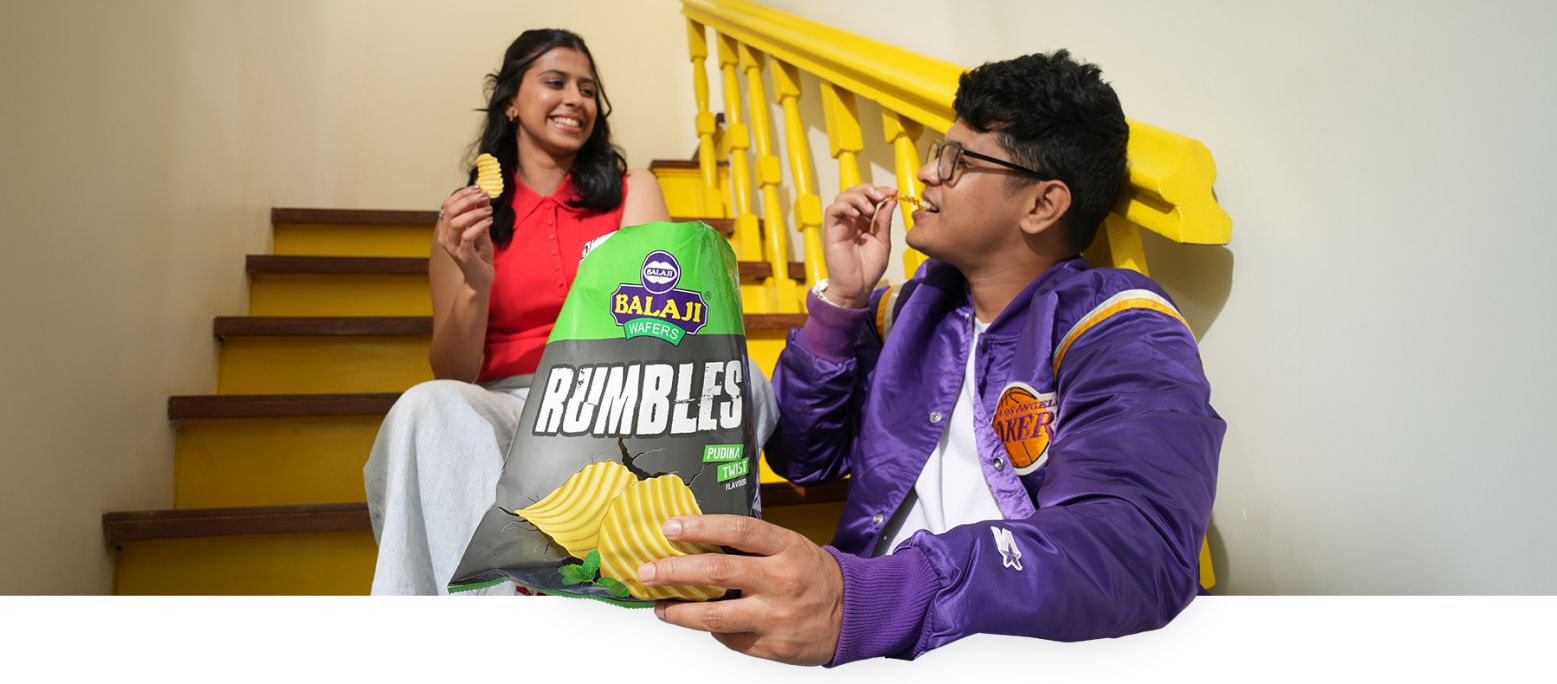
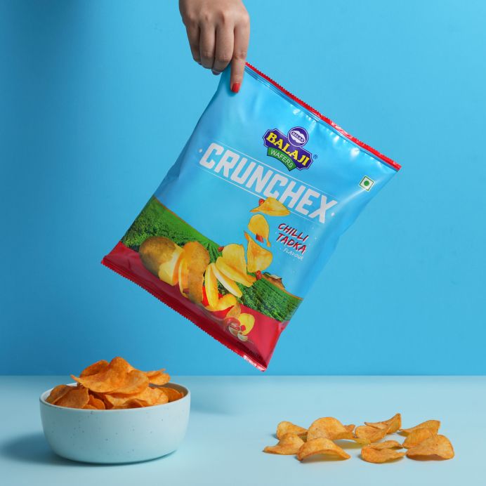
From pack to pixel
Design cues from packaging translate into a cohesive digital system, creating a familiar yet refreshed experience across pages. It also differentiates the brand from stiff, "corporate" competitors.
Snackable, now scrollable
Playful micro-interactions, such as the “crunch” effect triggered by hovering over buttons, bring in a sense of fun while keeping the interface clean, making the experience both intuitive and engaging.
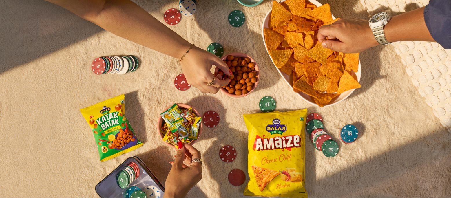
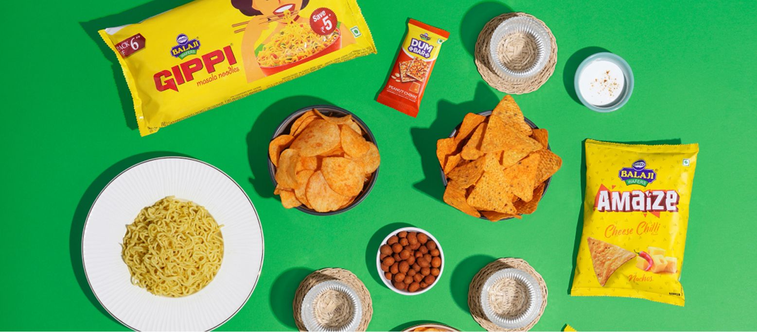
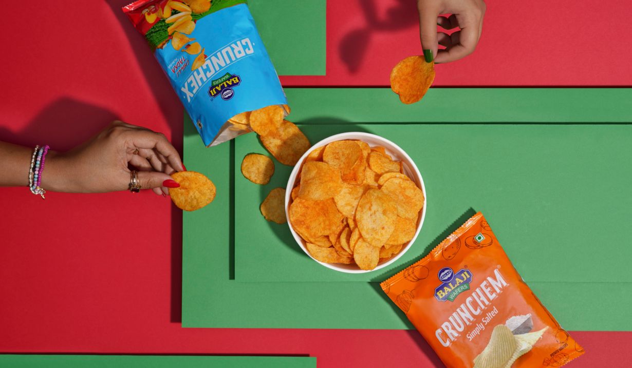
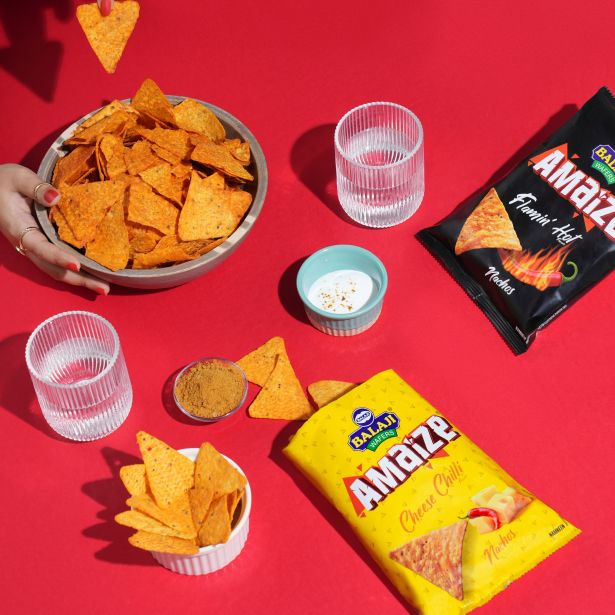
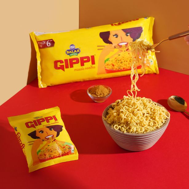
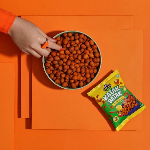
Cravings, captured

Related case studies

Like our work? Give us a little ting.
