


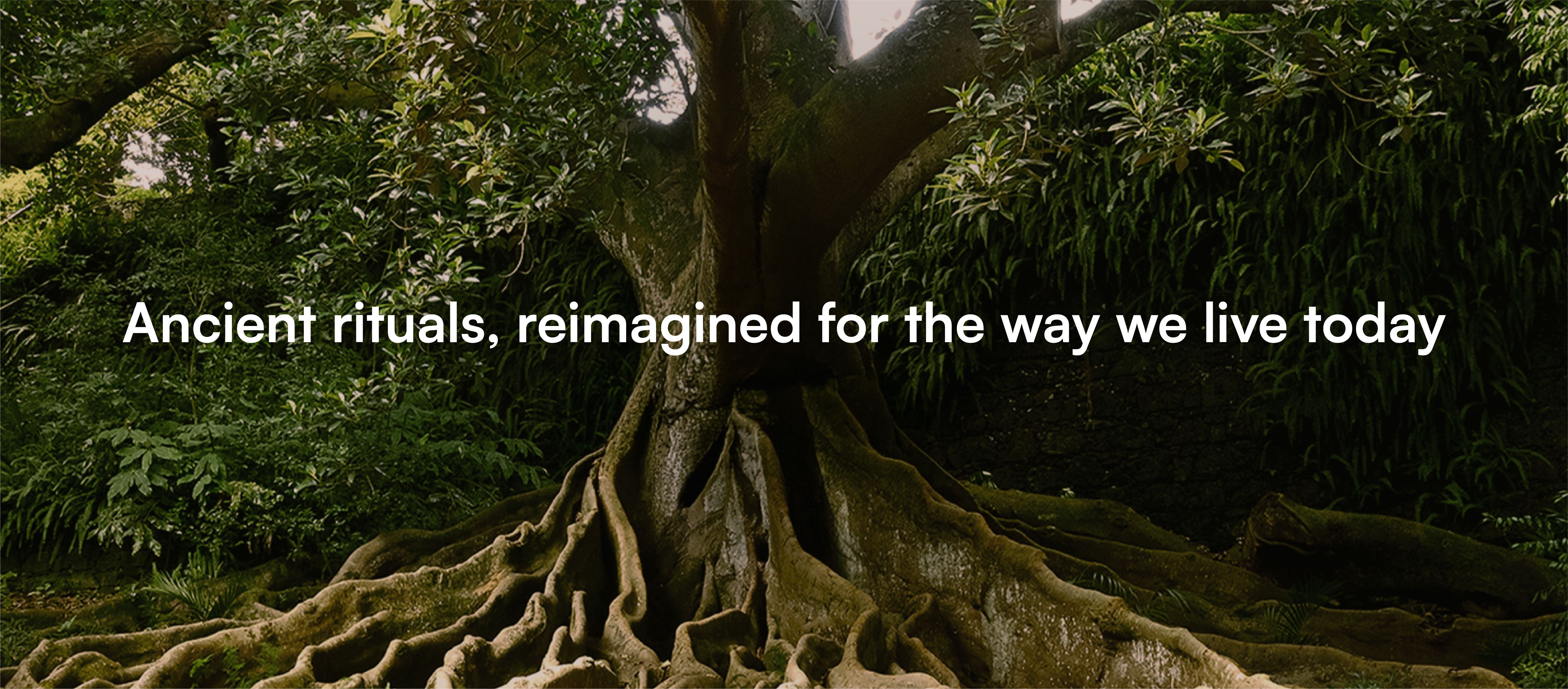
Reimagining ancient rituals for modern living
Services
Strategy
Identity
Packaging
Website Design & Development
Client
Nytarra
Sector
Healthcare & Wellness
Question
How do we position a brand that brings traditional aromatherapy back into a fast-paced world that has grown distant from its roots?
Answer
By building a brand rooted in tradition and clean aromatherapy, and bringing it to life through two distinct packaging styles for traditional and modern ranges, connected by a shared philosophy.
The brief was to build a brand that could stand apart in a category dominated by synthetic aromatherapy, where many products compromise both health and the environment. We saw an opportunity to bring traditional practices back into everyday use, in a way that feels relevant to how people live today, while building trust with cleaner, more responsible alternatives.
We defined the brand’s core philosophy as ‘in me, on me, around me’, a simple way to look at wellbeing more holistically. The idea was to treat what we surround ourselves with, like aromatherapy, with the same level of awareness as what we consume or apply to our skin. This naturally led us to position Nytarra around intentional living.
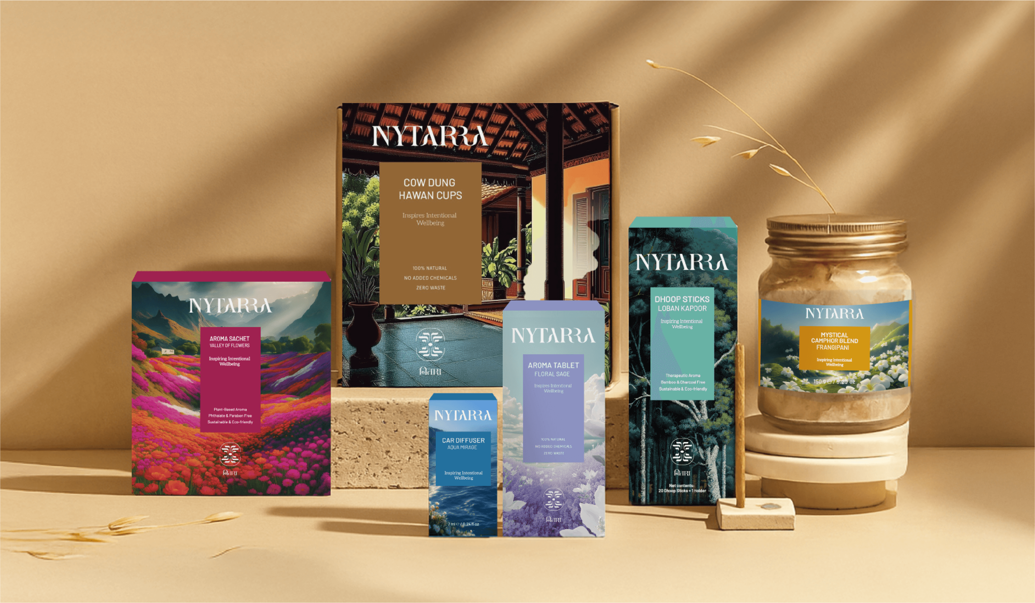
From there, we built a brand system that feels rooted in tradition, but not dated. Clean aromatherapy shaped the way the brand communicates, keeping things honest and easy to understand. The identity follows the same approach. The tone stays consistent across touchpoints, while the packaging explores two distinct directions for traditional and modern ranges. They look different, but are connected by the same underlying thinking.
The result is a brand that brings traditional aromatherapy back into the present in a way that feels simple, relevant, and easy to adopt.
The name Nytarra, meaning ‘having deep roots,’ informed the identity direction from the outset. The identity draws from the idea of connection. To self, to nature, and to the rituals we carry forward. The symbol is inspired by roots, representing stability, grounding, and a return to what is essential. At the same time, it suggests growth and renewal. The wordmark is kept clean and understated, allowing the brand to feel approachable and calm. Together, they create a system that feels both timeless and relevant.
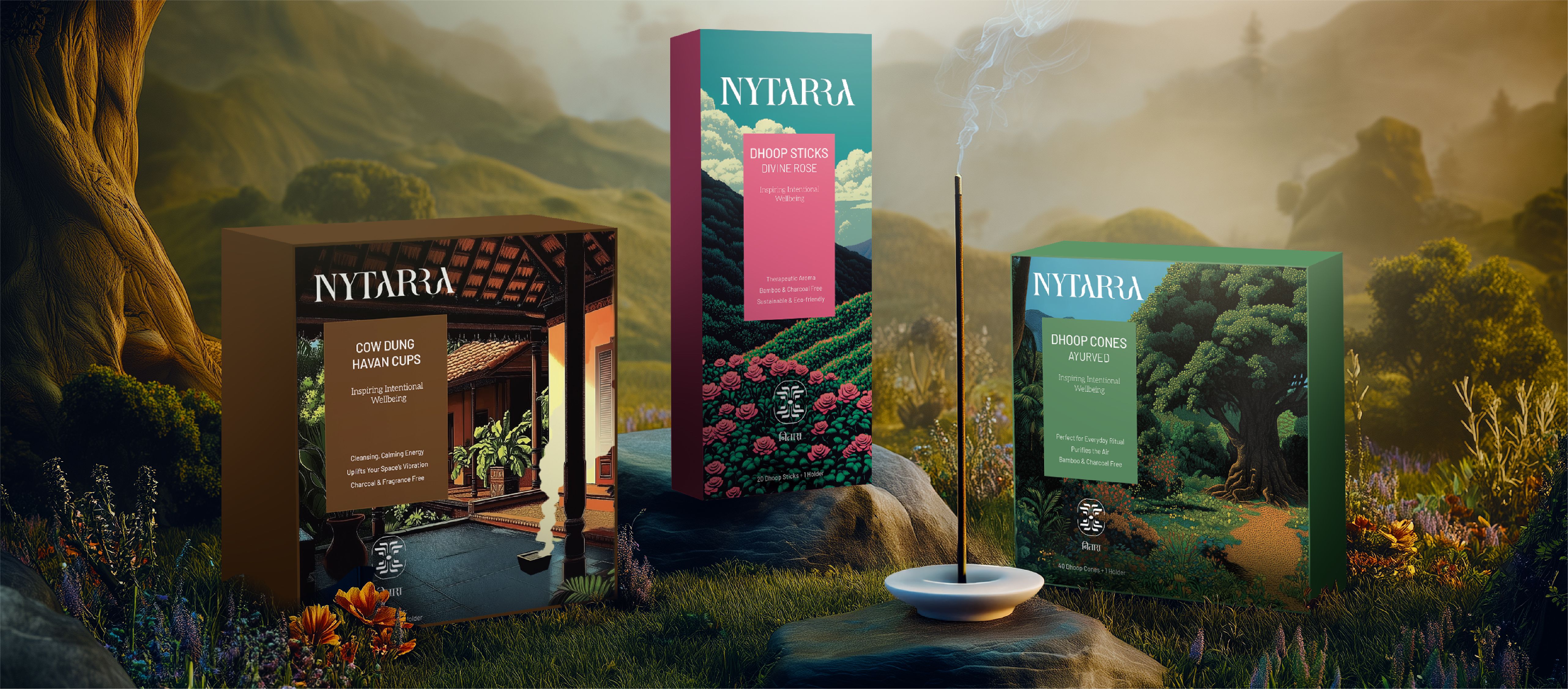
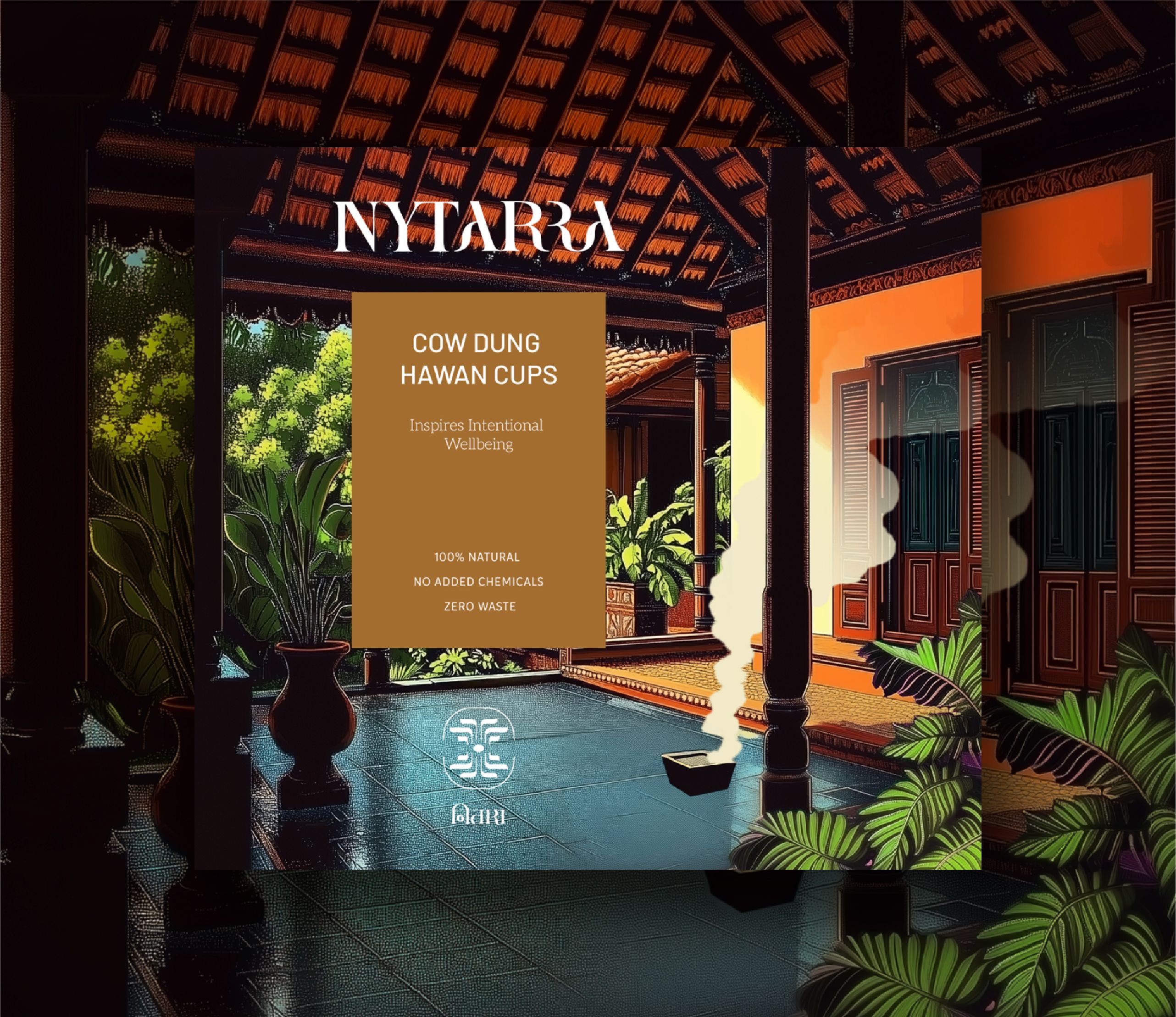
The traditional range
The traditional range feels familiar and rooted, drawing from rituals, heritage, and cultural memory.
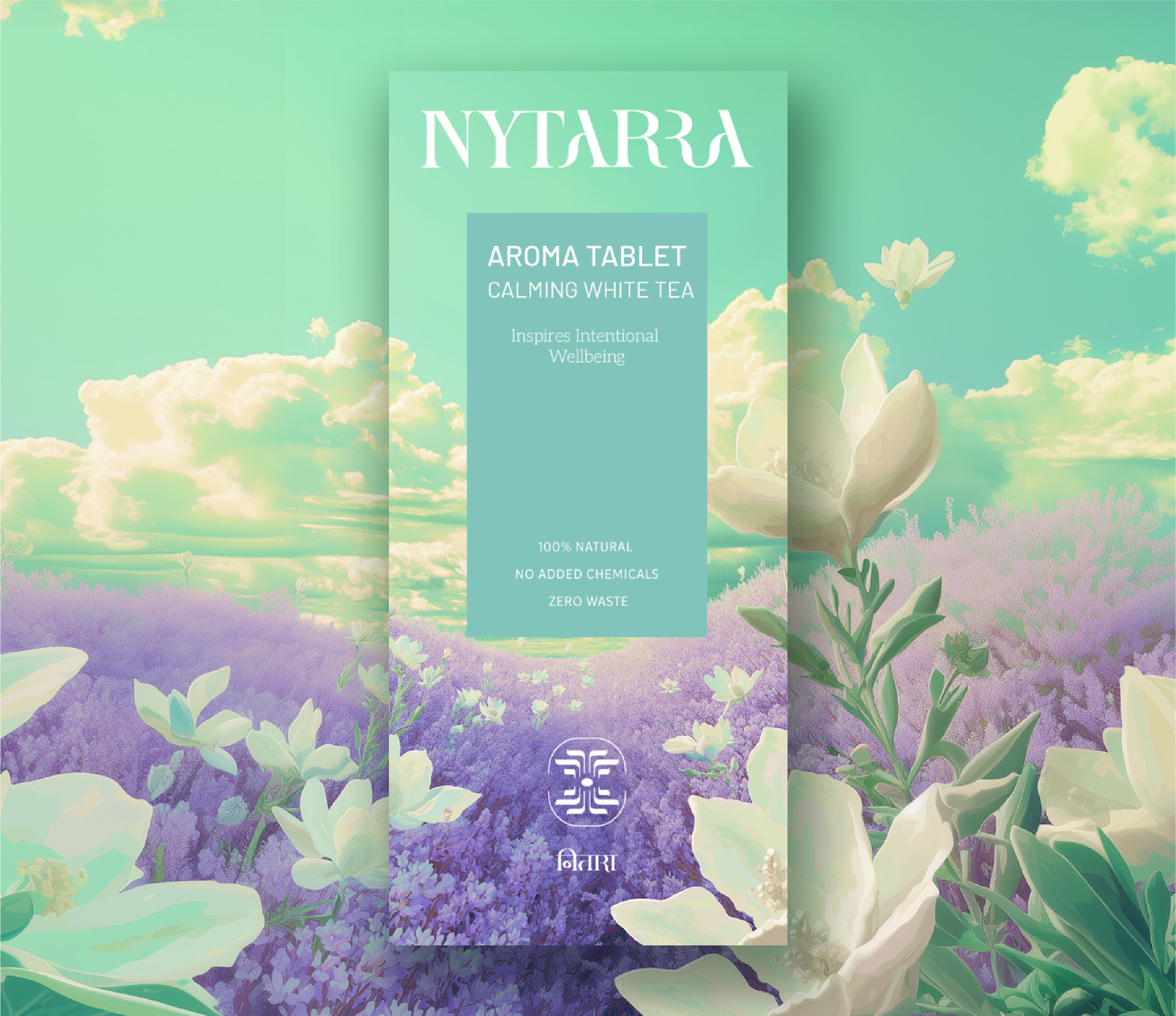
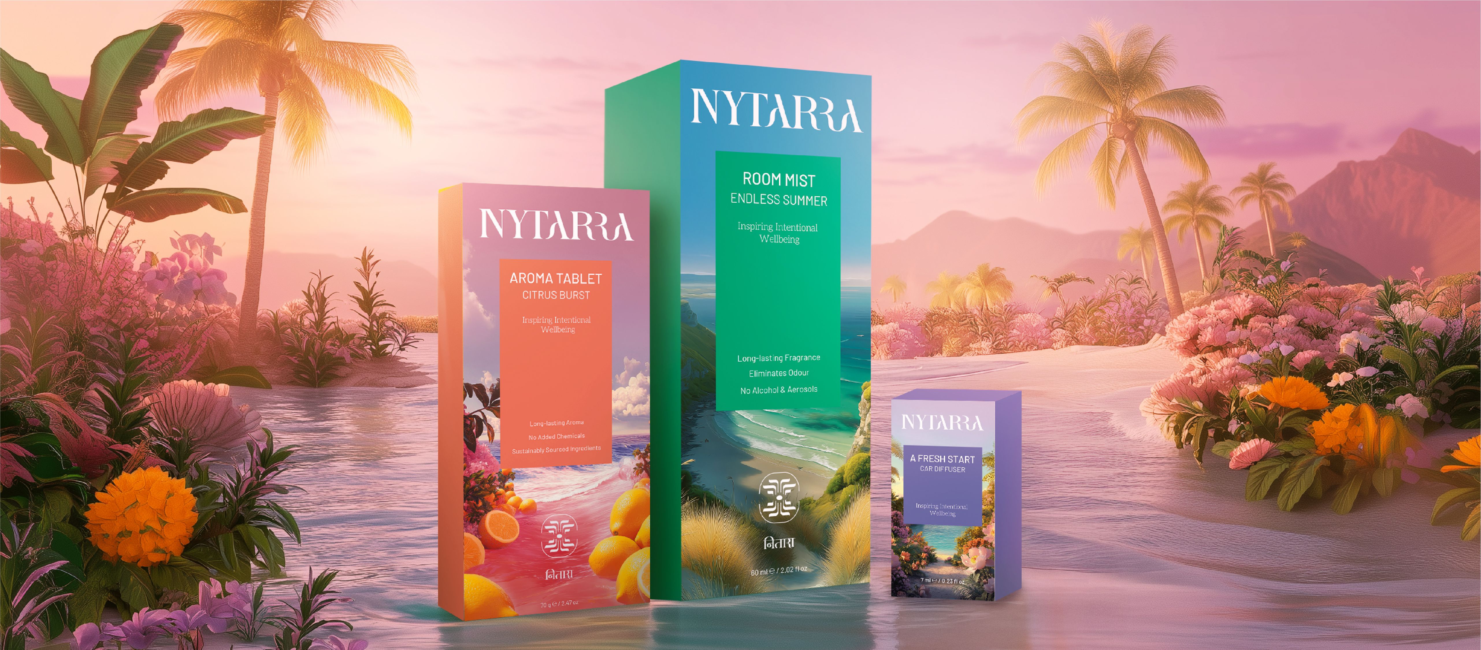
The modern range
The modern range takes a more expressive route, using surreal, transportive landscapes to evoke emotion and imagination.
A digital space designed for meaningful exploration
The website extends the brand into an immersive digital experience, not just a platform to browse products. Designed for ease and clarity, it allows users to move through content without friction. Clean layouts, generous spacing, and a restrained visual system create a sense of openness, while subtle transitions guide the journey. Every element works together to maintain a steady rhythm, encouraging users to explore at their own pace and engage with the brand in a more thoughtful, unhurried way.
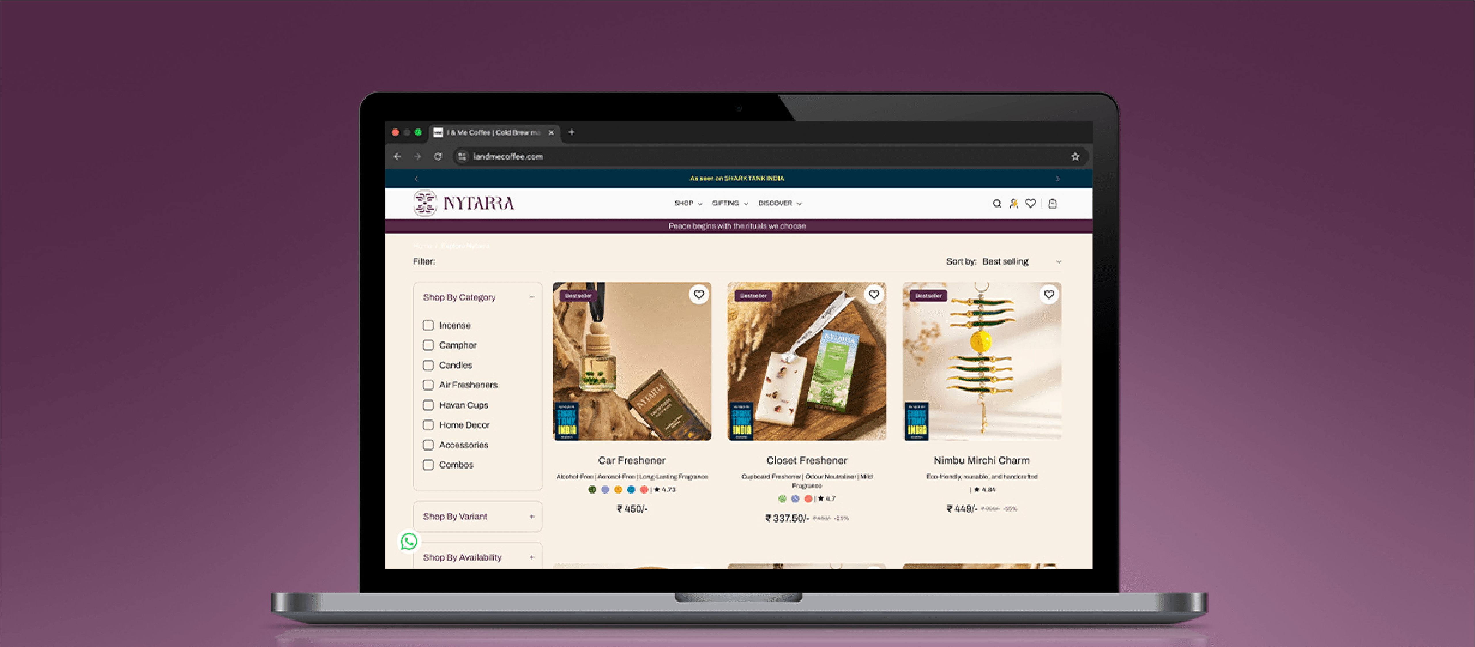
The website is built with functionality at its core, making browsing and purchasing simple. Product pages present all variants in a single view, reducing friction and making decisions easier. The experience is optimised for mobile, ensuring smooth navigation and a convenient shopping journey.
An intro video welcomes users as they land on the website, setting the tone from the very beginning. It captures the essence of Nytarra and creates an immediate sense of calm, offering a glimpse into the brand’s world and shaping the experience that follows.
The website follows a clean, clutter-free design that makes browsing feel calm and effortless. By keeping the experience simple and focused, it extends the feeling of using the product into the shopping journey, creating a more relaxed and intentional way to explore.
Related case studies

Like our work? Give us a little ting.
