














Translating the balance of movement and stillness into Wiselife
Services
Strategy
Identity
Packaging
Communication
Client
Wiselife
Sector
Healthcare & Wellness
Question
In a market of wellness promises, how do you shape a brand that carries the depth of the practice?
Answer
By grounding the brand in balance, within and without, and expressing it through mindful living.
Wiselife is a premium, eco-conscious yoga brand that believes the mat is where the transformation begins. In a category led by performance and price, we recognised what was missing: a voice that speaks to the person, not just the practice.
Our goal was to shape a brand that reflects not just what they make, but why it matters, for practitioners and a growing community seeking a more honest, sustainable approach to their yoga journey. The strategy anchored this purpose, positioning Wiselife as aspirational yet accessible. Here, the mat goes beyond being a space for practice; it becomes an island of calm and grounding energy. So when one steps on to it, they step into the ‘Wiselife’.
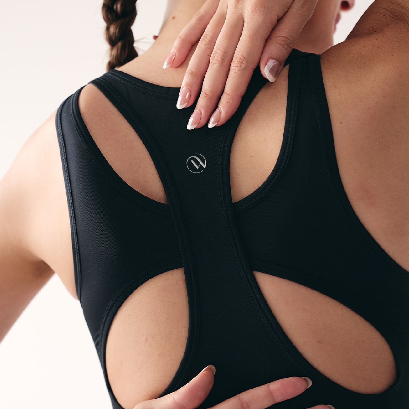
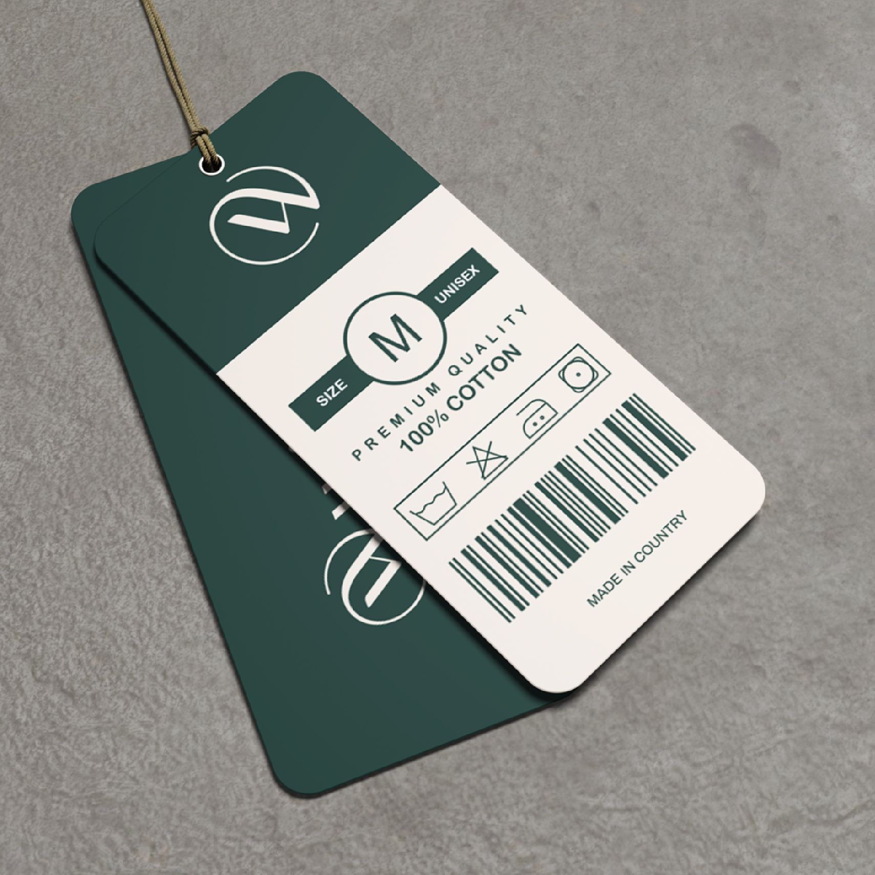
This sentiment was carried forward in design, translating it into an identity anchored in clarity, balance and ease. From the apparels to the accessories, our packaging aimed at delivering the experience of stepping into the ‘wise life’ through warm, inviting and inspiring communication and grounded design. Turning the act of receiving into the beginning of a more mindful practice.
Fluidity and form, all in the same breath.

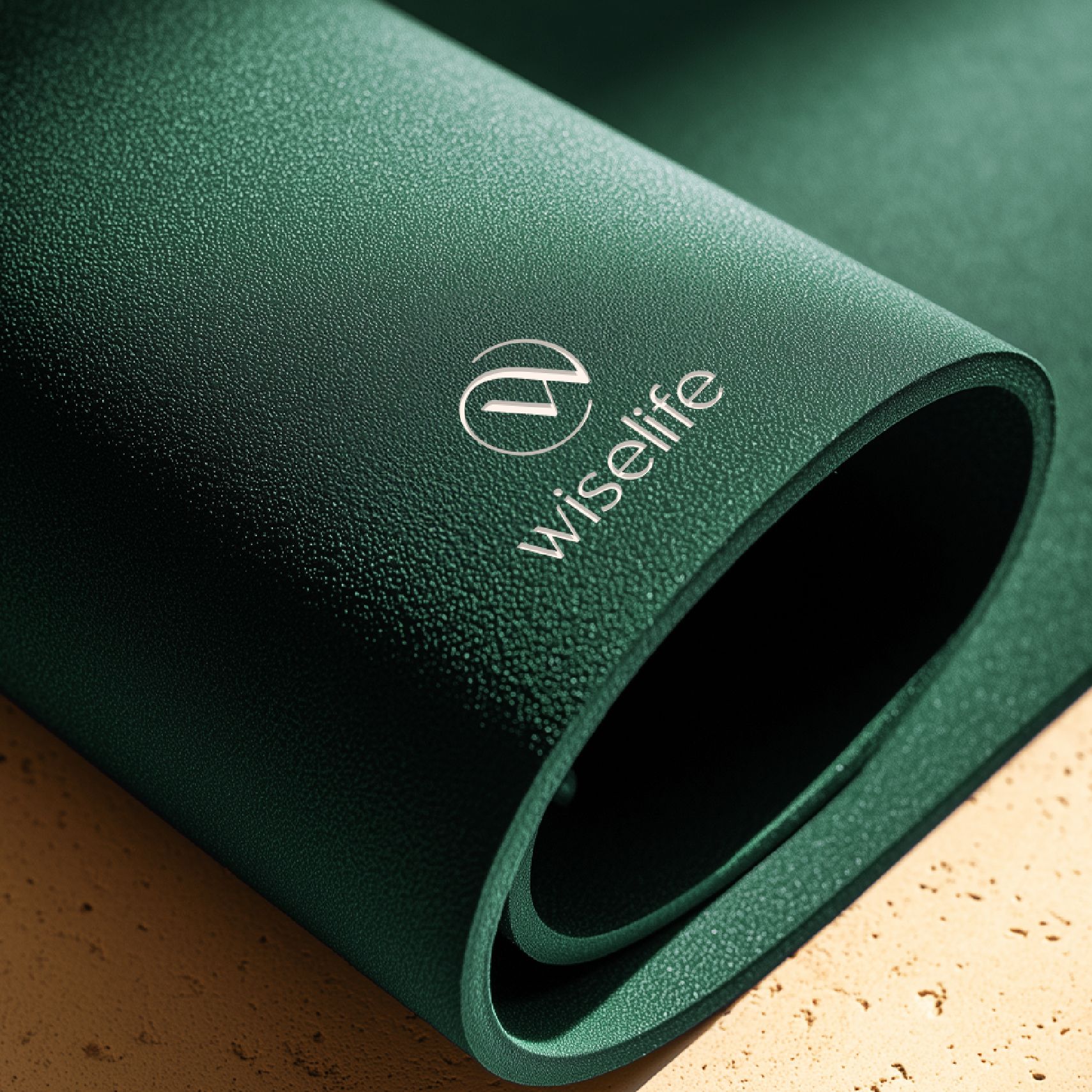
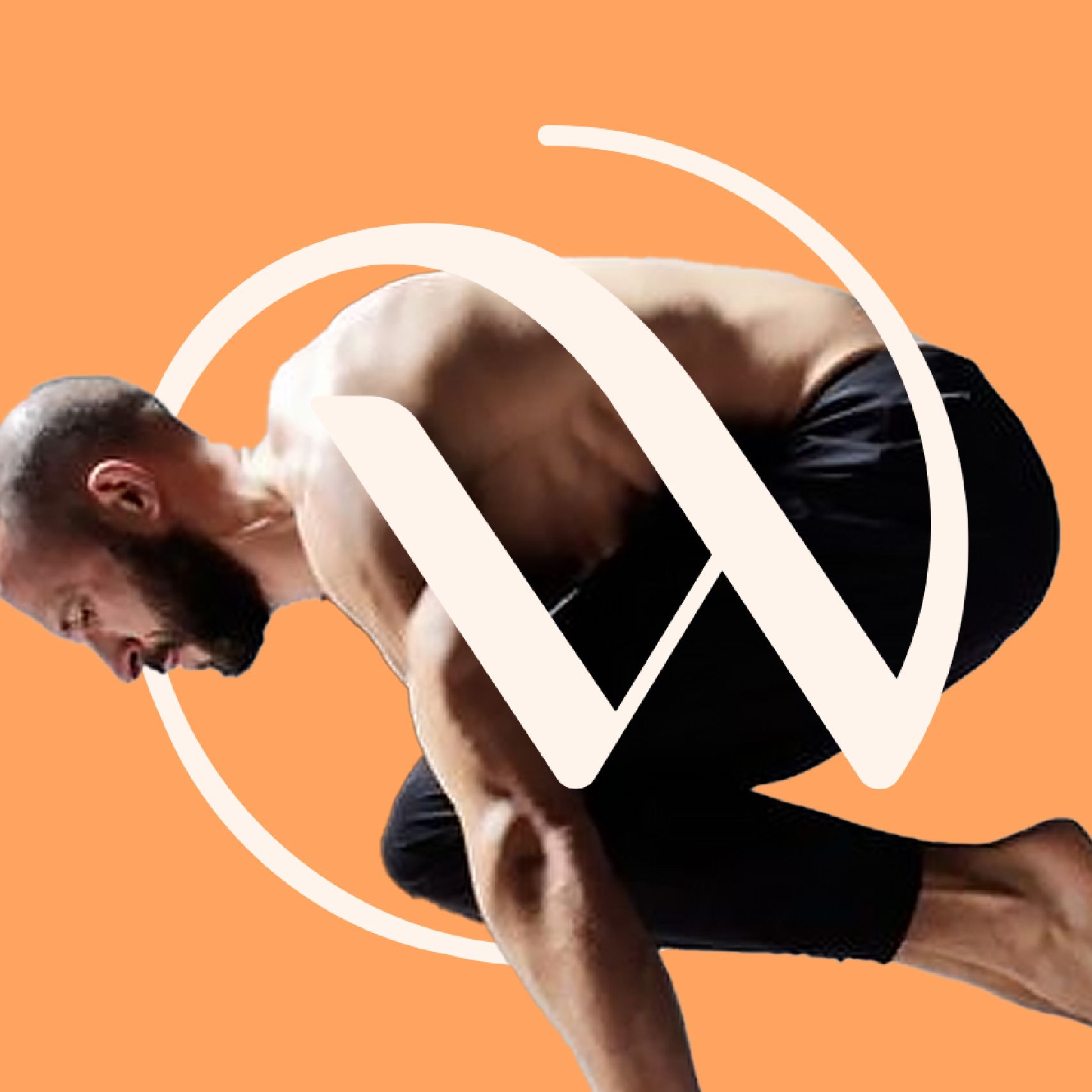
The Wiselife logo reflects balance, mindfulness and connection. The circular emblem encasing the stylised W symbolises harmony, reflecting the balance between flow and pause in yoga. The letter W is set in a font that conveys both strength and elegance, enhancing brand recall while staying true to what the practice stands for.
The earthy green reinforces Wiselife's commitment to sustainability and eco-conscious living. Drawn from nature and grounded in the brand's values, it brings a calm confidence to the identity that carries across every application.
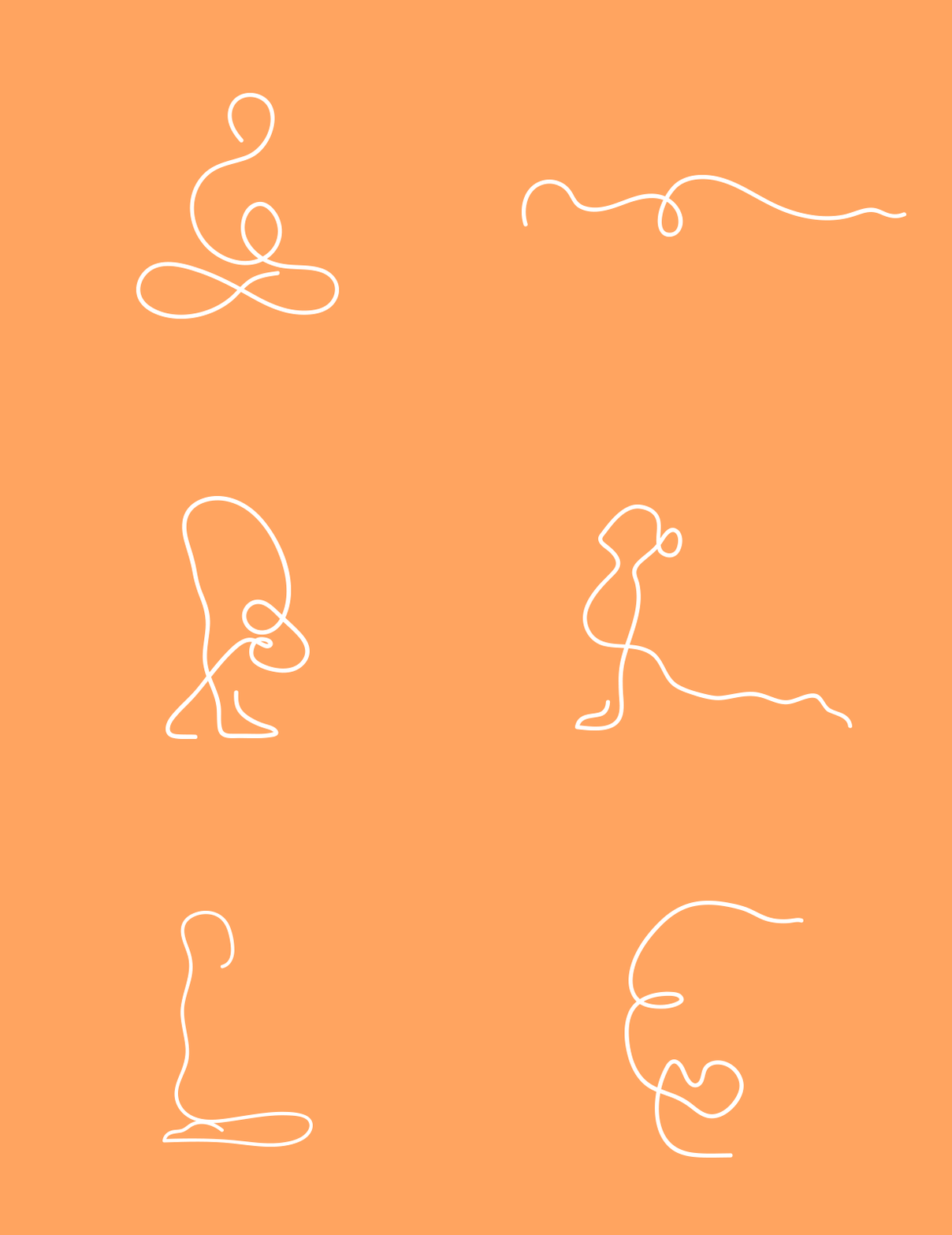
Our design language is crafted to evoke the feeling of stepping into the ‘wise life’, warm, inviting, and inspiring in visual expression. Fluid lines and hand-drawn forms reflect the natural rhythm of movement and breath, echoing the seamless transition between poses and the harmony between mind, body, and self.
The warm earthy palette creates a sense of grounding and comfort, while balanced compositions and intentional simplicity bring softness and flow to the overall experience.
Move mindfully. Live wisely.
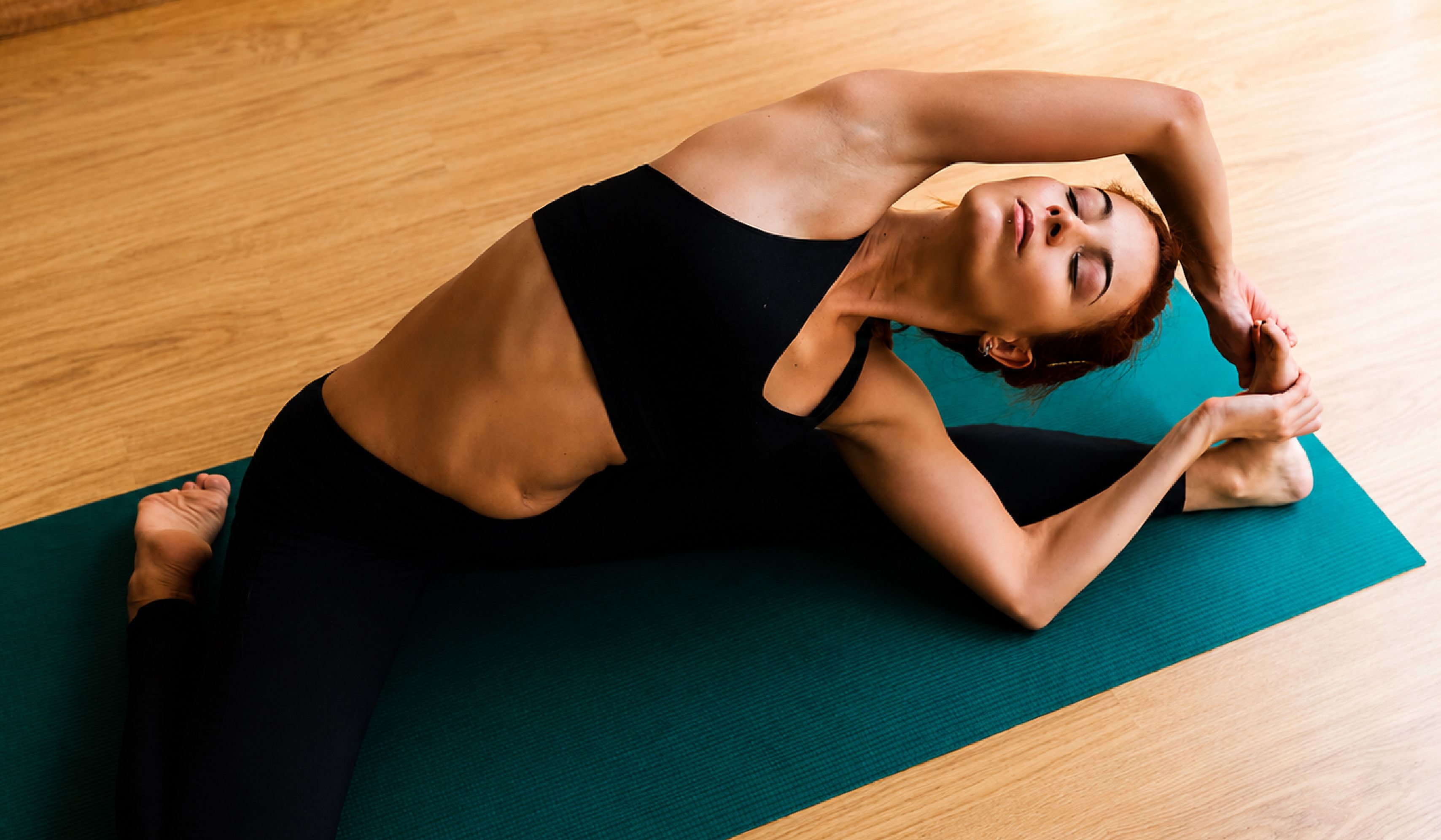
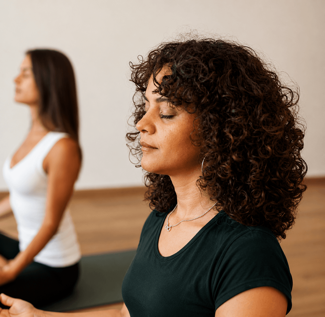
Every visual choice was made to hold the same balance the brand lives in, aspirational but never cold, premium but never distant. Warm light, natural settings, authentic movement. Real people in real moments of practice. A world that doesn't perform wellness, it lives it fully, one breath at a time.
Made with intent, by design
Related case studies




Like our work? Give us a little ting.