


Turning jewellery into an affirmation of self
Services
Strategy
Naming
Identity
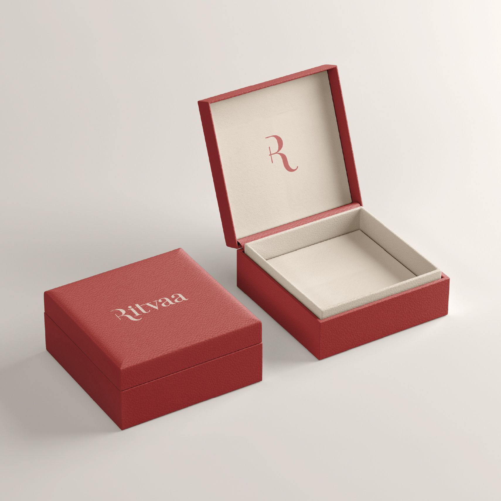
Packaging
Client
Ritvaa
Sector
Fashion & Lifestyle
Question
How do you position a gold-plated jewellery brand as a meaningful real gold alternative without losing its cultural importance?
Answer
By building an identity that carries the emotional resonance of real gold while being more accessible and ownable.
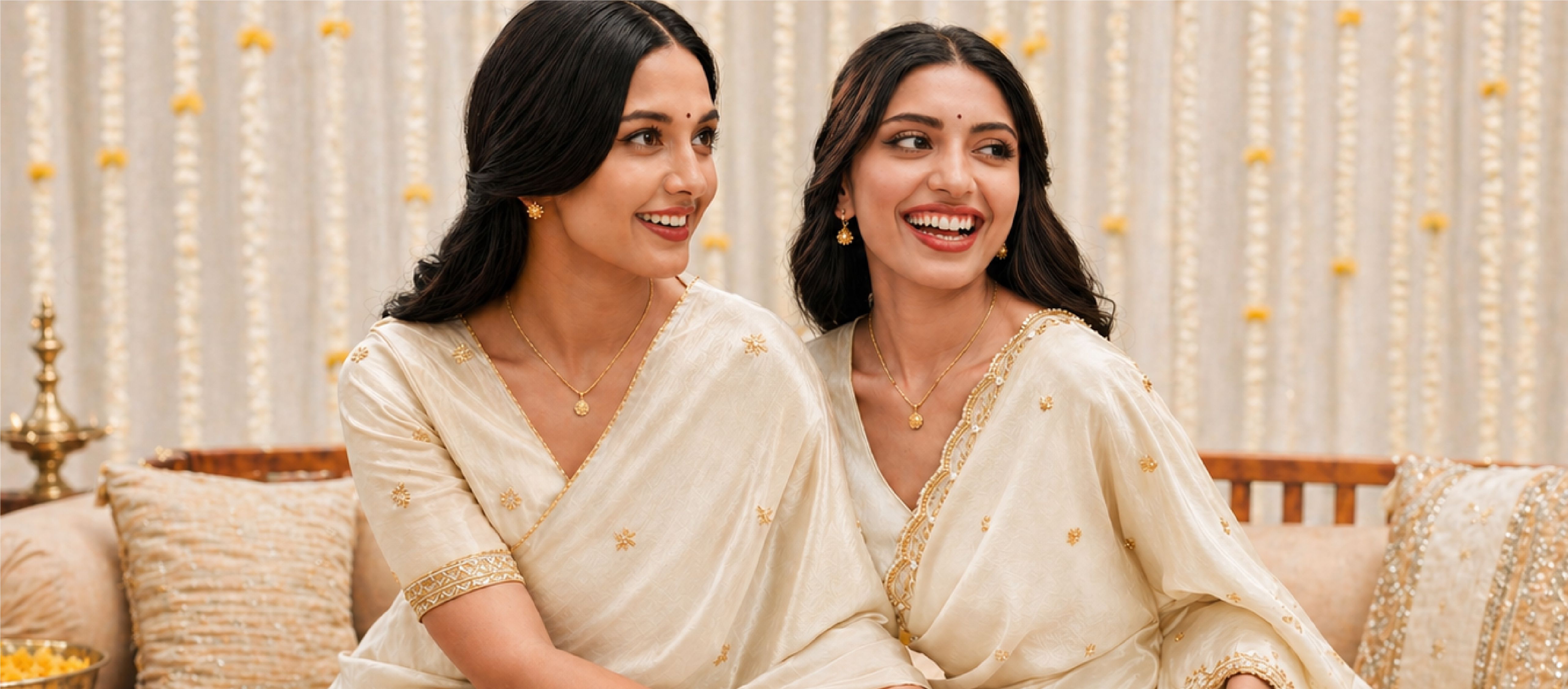
Ritvaa was built at the intersection of aspiration and accessibility, where the emotional value of real gold remains strong, but ownership feels increasingly out of reach. The opportunity was not just to create another gold-plated jewellery brand, but to redefine how it is perceived. In a category often split between expensive legacy players and unbranded, low-trust alternatives, Ritvaa needed to establish credibility while feeling deeply personal.
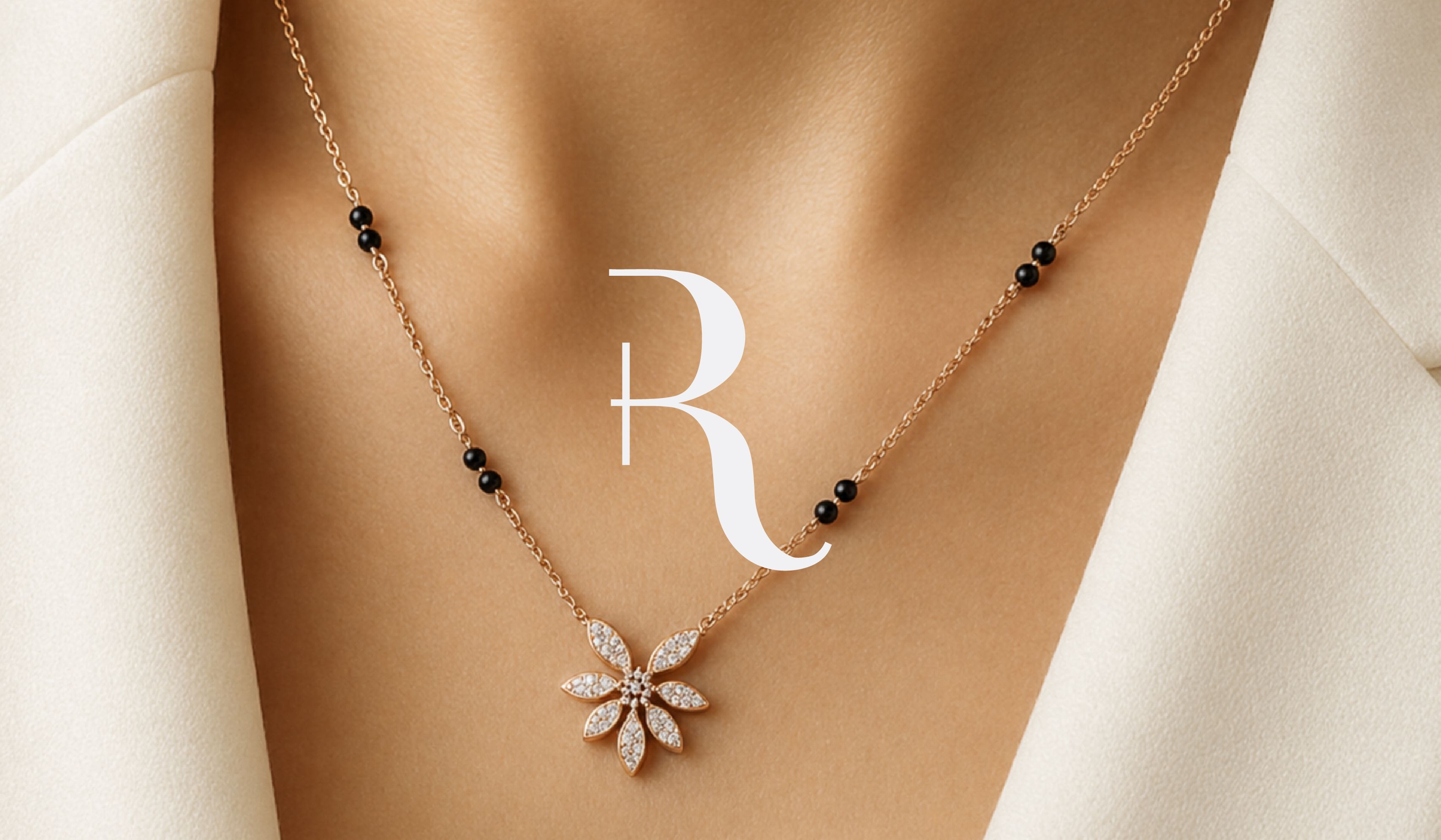
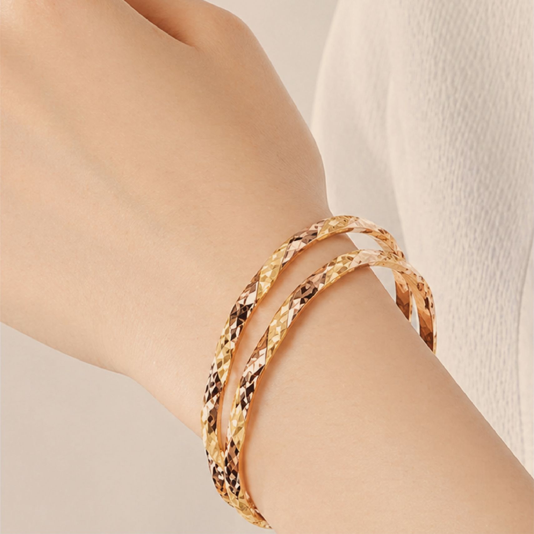
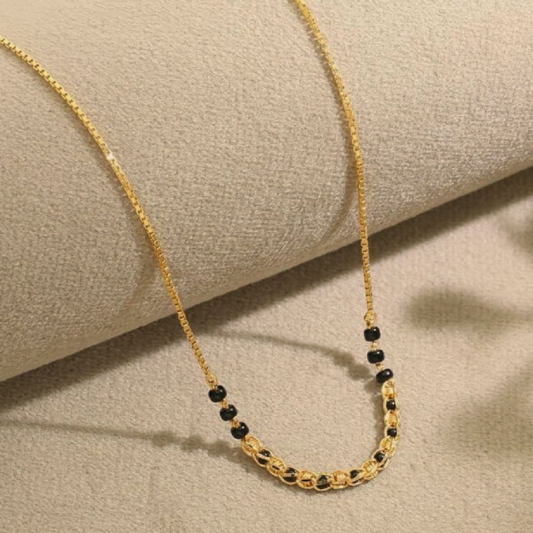
We approached this by grounding the brand in a simple yet powerful idea: jewellery that feels as real emotionally as it does visually. The name, identity and packaging were shaped for the woman rooted in tradition yet shaped by her modern mind; quietly confident, intentional, and self-assured. Every touchpoint was crafted to move away from loud expressions of luxury and instead embrace warmth, confidence, and meaning. The result is a brand that doesn’t just offer an alternative to gold, but restores its emotional relevance in a way that feels honest, modern, and enduring.

An identity rooted in duality and balance
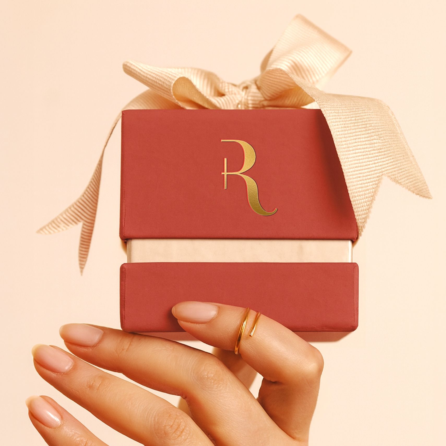
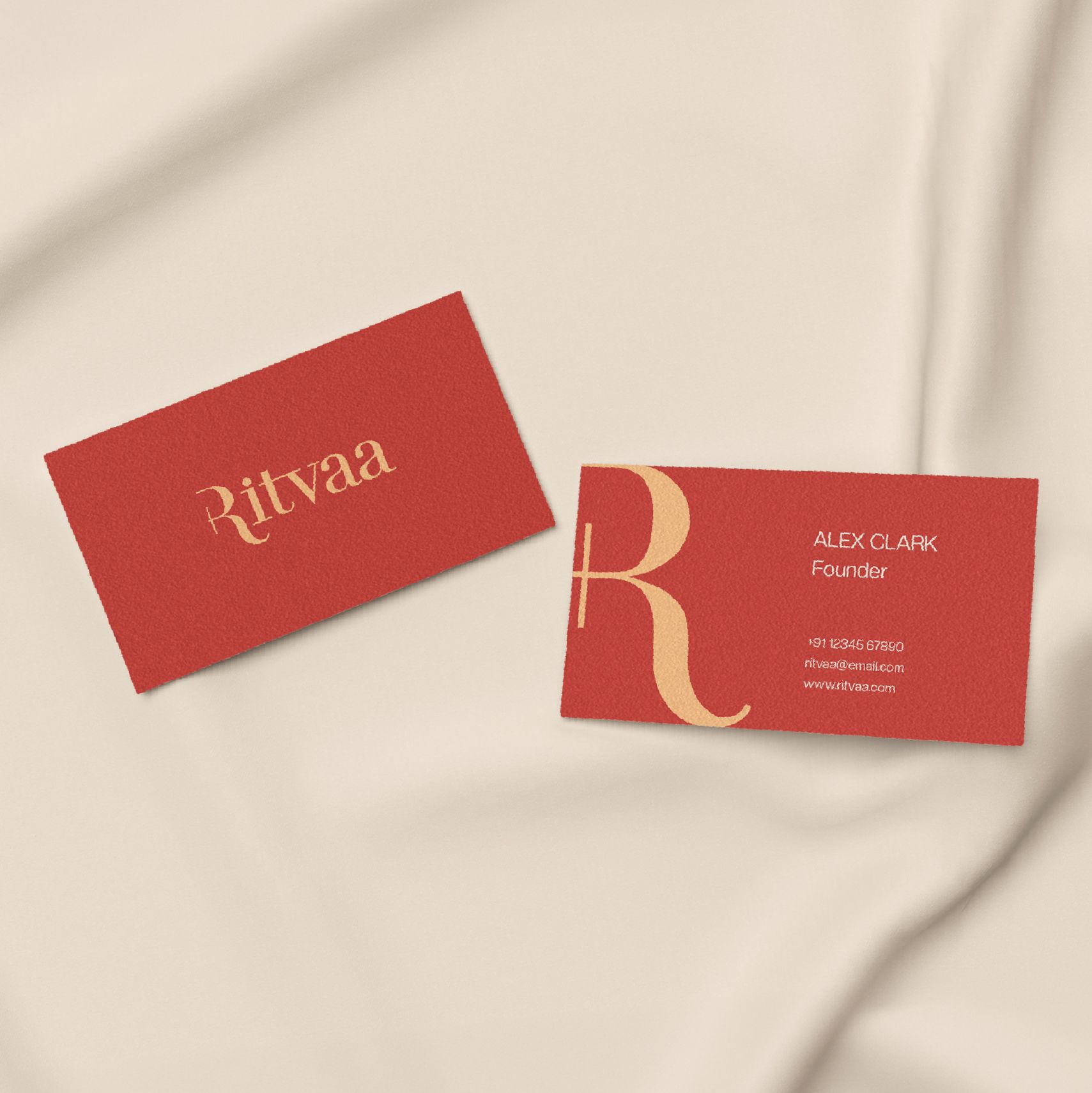
We designed the identity of Ritvaa as a reflection of the women that wear it, rooted in tradition yet shaped by modernity. The wordmark brings together Devanagari and English scripts, holding both visual languages in balance without choosing one over the other. Soft curves add warmth, while clean lines bring clarity, creating something that feels composed and complete. The deep earthy red is drawn from Geru, a traditional Indian pigment used by women for centuries during festivities. The Geru glows with warmth, mirroring the quiet radiance of the women Ritvaa stands for. The typography establishes a strong cultural connect without being overly ornamental.
Quiet confidence, rooted in modern tradition
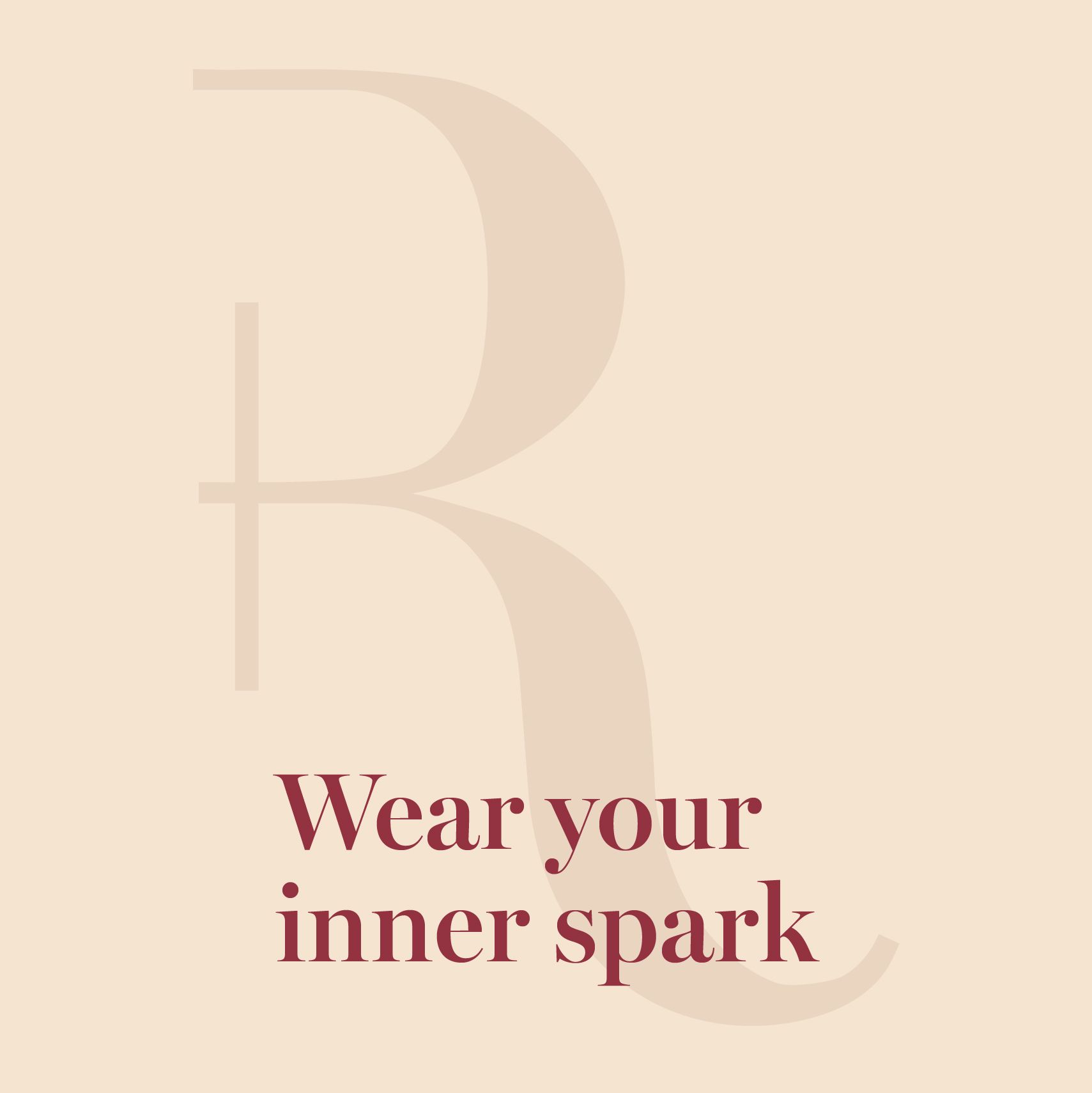
Not just jewellery. Affirmation plated in gold.
Related case studies


Like our work? Give us a little ting.
