














Redefining the path to progress and self-reliance

Services
Strategy
Identity
Brand Architecture
Client
Swan Corp
Sector
Corporates, Institutions & Industrial
Question
How do you rebrand a diversified conglomerate into a force behind creating a self-reliant India?
Answer
By balancing legacy with momentum, building a unified brand system that reflects their strength and vision.
Swan Corp is a diversified Indian conglomerate with a legacy spanning over a century, operating across manufacturing, defence, energy, and real estate. Guided by a bold vision for scale and a deep sense of purpose, its ventures are rooted in creating long-term value and advancing national self-reliance. As they stepped into a new era of growth, the need was to unify its legacy, purpose, and future ambition into a powerful brand system and positioning that could represent its role in shaping India’s progress.
We began with clarifying the brand’s perception. For Swan Corp, this meant leadership and mastery for CXOs and strategic investors; social responsibility for the general public; and a company ready for the future, for all stakeholders. Understanding their ambition and desired perception, we crafted the brand’s distinct character. A blend of the Hero and Explorer archetypes, an exploratory pioneer that takes on bold challenges with courage and ventures where others hesitate.
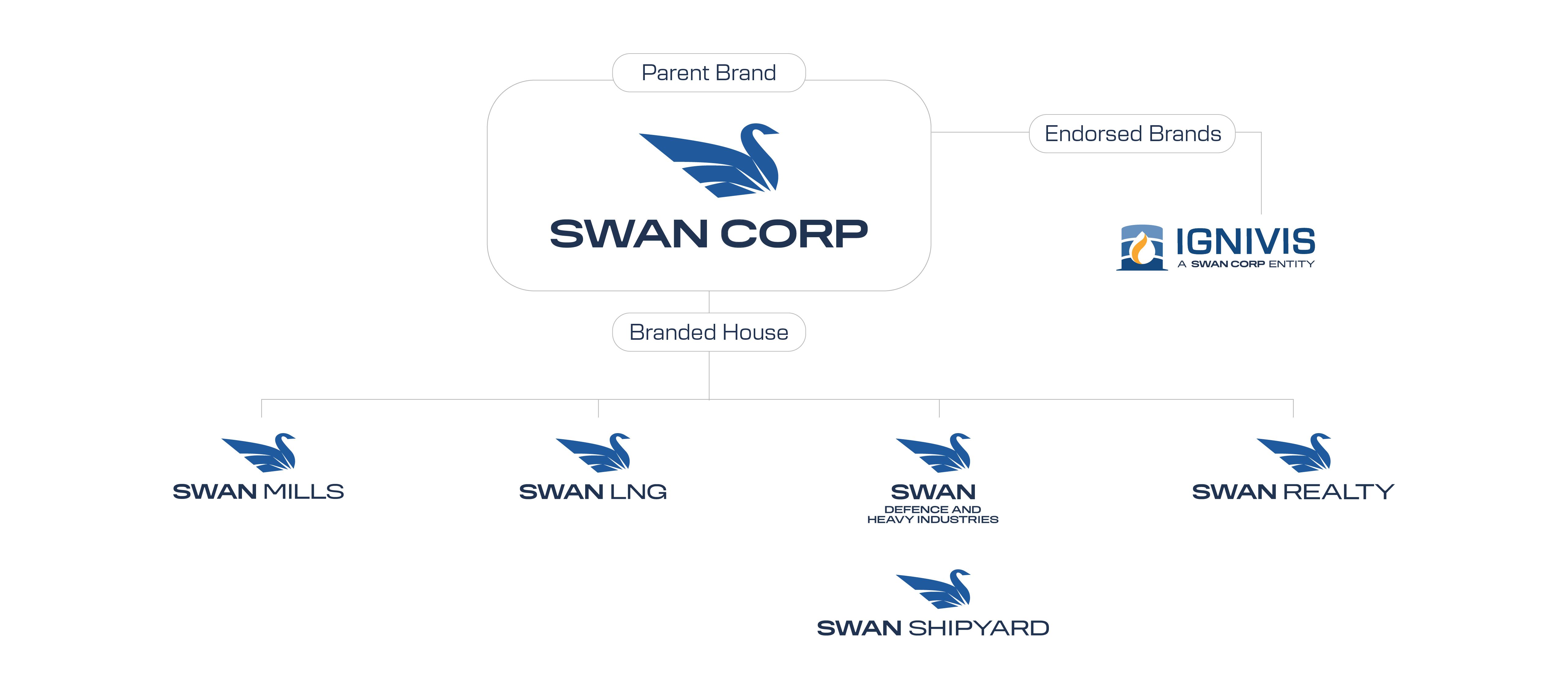
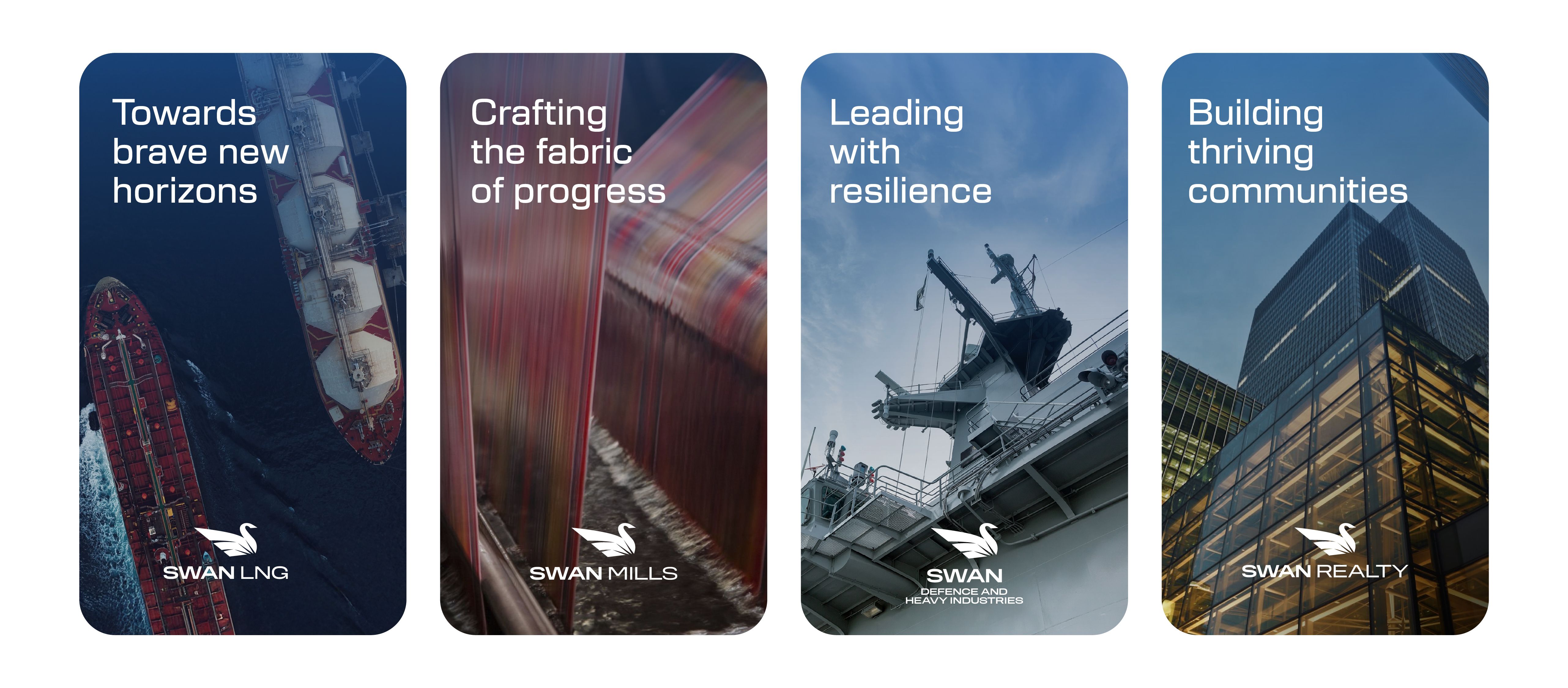
Finally, we designed a hybrid brand architecture where each sub-brand was mapped to the parent's values and given its own persona. We created a system where every venture expresses one vision across many frontiers. The result is a clear, purpose-led brand that balances legacy with bold, futuristic intent.
The ascent of courage
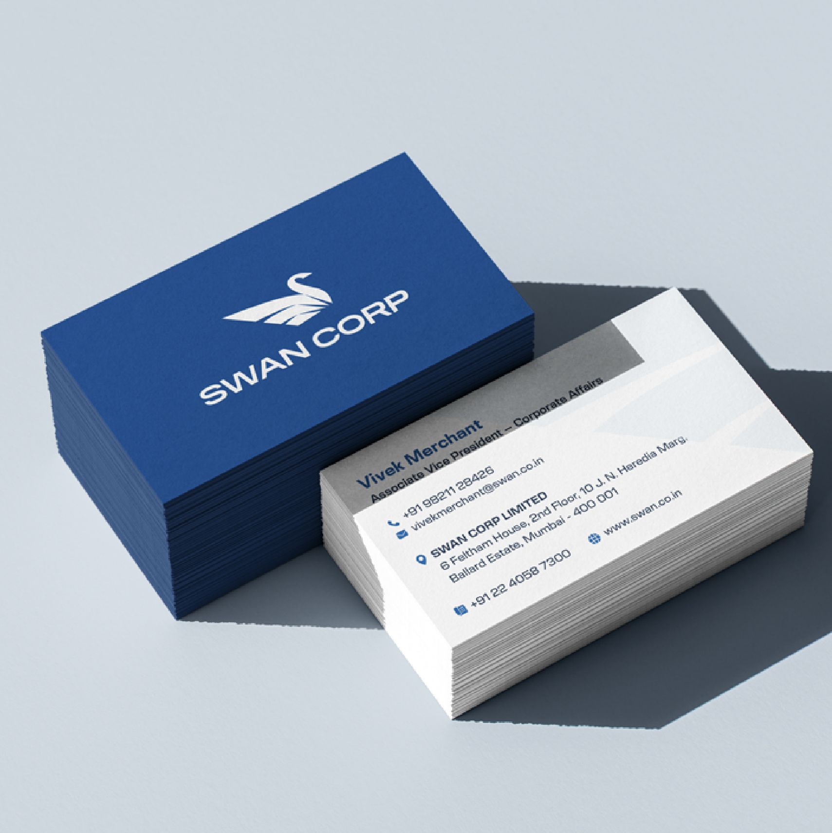
The old identity felt decorative and static, lacking industrial authority and forward momentum. It needed a more modern and assertive appeal that aligned with the brand’s ambition. We transformed it into a future-ready system, reshaping the swan form into a forward-leaning stance with raised wings to express leadership, confidence, and an explorer mindset. The new identity captures a swan in motion, moving towards progress. It is modern in its approach, embodying the spirit of building a bold, self-reliant India. The wordmark features a wide, structured sans-serif typeface that balances boldness with clarity. Its extended proportions give it a strong, grounded presence.
Strengthening presence across ventures
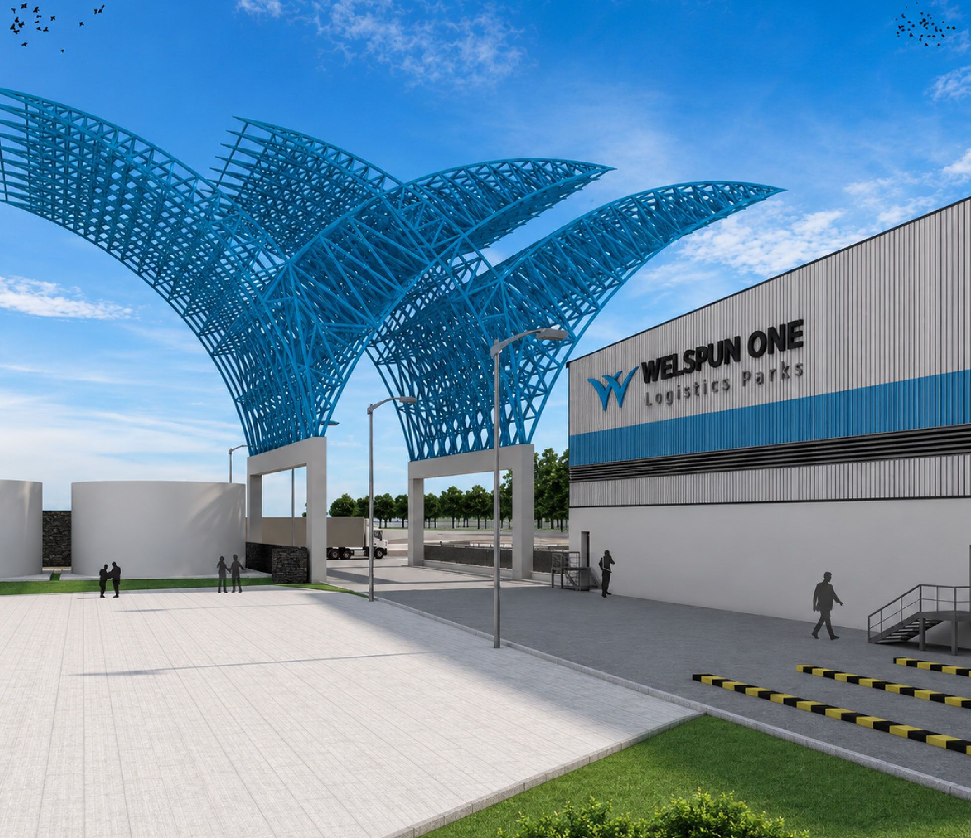
A hybrid architecture allows sub-brands to build their own identity and connect with their audiences, while remaining strategically aligned with the parent brand.
One vision. Many frontiers.
Designed for the next era of growth


Related case studies

Like our work? Give us a little ting.